How to Add a Drop-down Navigation Menu in Squarespace
But let’s discuss why you shouldn’t do it in the first place
To tell the truth, here at Applet Studio, we are not fans of adding drop-down menus to the header menu of a website. So before heading into our tutorial, let's discuss the drawbacks of the drop-downs first, so that you can make an all-informed decision.
While you want to organize and categorize your website pages in the neat drop-down menus, your website visitor might not enjoy this care and guidance of yours. Even though the drop-downs are so ubiquitous on the web and are present on almost every website, we wouldn’t recommend having them in your website architecture. What is wrong with drop-down menus, you ask? A couple of things.
Why you shouldn’t add drop-down menus to your Squarespace website navigation
They are annoying and confusing. Drop-down menus often hide options from view until the user interacts with them. This means that users can't see all their options at a glance, which can lead to frustration and disorientation.
They draw attention away from the top-level pages. When drop-down menus are present, users tend to navigate directly to lower-level pages, skipping the top-level pages entirely. This means that any important information or context provided on the top-level pages may be missed
They complicate the search process. When a drop-down menu has too many options, it can overwhelm users and make it difficult for them to find what they're looking for. This is particularly problematic when the options are not sorted logically (your logic may also differ from your customers’ logic), or when the main navigation says obscure things like "Pages" or "More".
Difficulty in navigation. Navigating through a drop-down menu can be tricky, especially on mobile devices. The small size of the options can make them hard to tap accurately, leading to mistakes and even more frustration. Additionally, they lower your website's accessibility, as they can present challenges for people with disabilities. For example, they can be difficult for people with motor control issues to use, and screen readers may not read them properly for people with visual impairments.
They signal that you have to redesign your website. If you have drop-downs, your website pages might be low-quality with content that has little or no value to the user. Too many pages often equals too much clutter, and it is a sure sign for you to review what needs to go down.
Try Squarespace for free – and save 10% when you purchase a subscription with code APPLET10
(Rare) exceptions of when you can add a drop-down menu to your website
We won't argue, there are some advantages to having drop-down menus, and users know how to use them to find their way around.
There is no escape from adding them if you have a large website. We are talking about medium to large e-commerce or media websites, where users can drown in information. Here, drop-down menus could be lifesaving as they allow users to jump down a level or two to get to the content they seek.
On the large websites, there could be related options, which still require separate pages. Drop-down menus allow grouping them together to make it easier for users to understand their choices and make a decision.
Dropdowns can also help you reduce visual clutter and make the interface cleaner. Head navigation should always stay as neat as possible, as it impacts the visual style of your website. The fewer items there are, the better.
Redesign ideas to escape or improve drop-down menus
Since we are criticizing the drop-down menus, we should suggest ways to escape them. And we will.
Firstly, try using landing, long-form service, or sales pages to introduce your offerings. This can help move information from your drop-down items to the page in the top-level navigation. In other words, make a long page out of many short ones. We definitely advise this if you have many pages that contain few sections (God forbid, it’s only one or two). You can successfully combine them into one, thus reducing the number of clicks users have to take and making the customer journey smoother.
The second piece of advice is a more radical one: put your drop-down item in the top-level navigation. It should go up if it is important enough. If it isn't, then you shouldn't have had it on your website in the first place – delete it. This works well with one-item drop-downs.
Another key to successful implementation of drop-down menus is to limit the number of options to choose from. We recommend staying between 5 to 8 items in a drop-down menu. Any more than that number is harder to digest.
If you have a lot of items, consider using a mega menu. You have seen it many times on retailer websites, e.g., when you shop for clothes. It is easier to navigate and looks better than just a regular (insanely long) drop-down. We will explain how to add a mega menu to your Squarespace website in this blog, too.
How to add a drop-down navigation menu in Squarespace
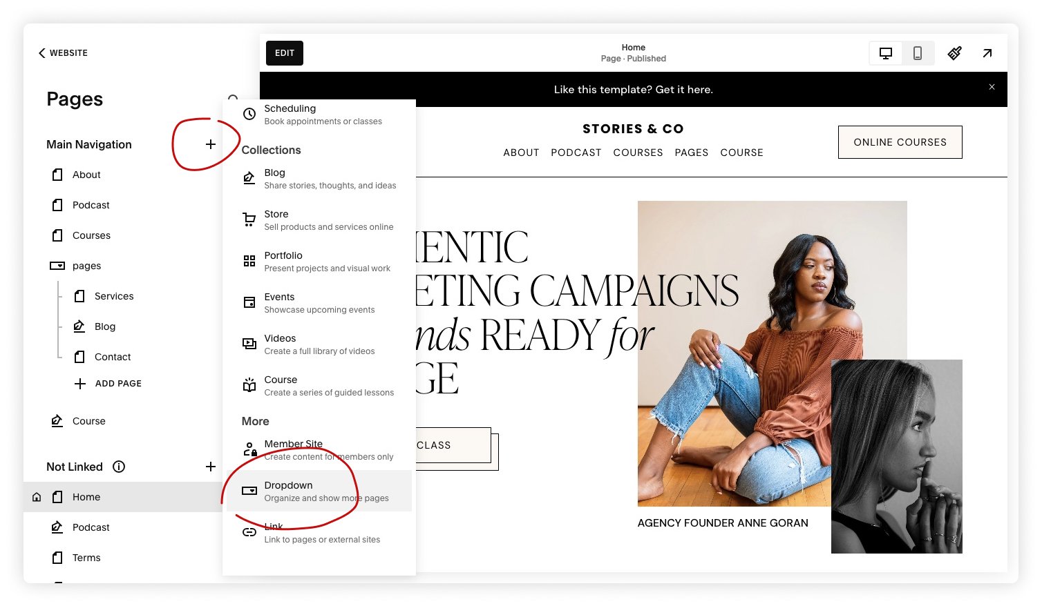
To create a drop-down navigation menu on your Squarespace website, head to the Pages menu. Click the plus icon next to the Main Navigation (where the pages of the header menu are stored). Scroll down to More to find the Dropdown option. Click it, and an empty “folder” will appear in the pages panel. You can either rename it right away to do it later. Drag the needed pages there, and that’s it – you created a drop-down menu.
Note: you can have several separate drop-downs, but you cannot nest drop-downs within drop-downs.
Drop-downs aren’t pages themselves; they basically function like folders on your computer. If you need to change the order of the pages in the drop-down navigation, drag and drop them again the way you like.
If you decide to rename the folder later on, simply click the gear icon next to it. You will be able to change the Page title, Navigation title, and URL slug there.
How to style your drop-down menu with CSS
Let us give you a free CSS snippet to make your drop-down menu look polished. We use it in every template with drop-downs in our shop.
This CSS snippet customizes the look of a Squarespace drop-down menu. It adjusts the spacing between menu items, adds a slight indentation to make the hierarchy clearer, and sets the background color of the drop-down panel. Essentially, it lets you make your drop-down menu easier to read and visually consistent with your site’s design.
//This changes line height and color in dropdown memu
.header-nav .header-nav-item--folder .header-nav-folder-content .header-nav-folder-item {
    line-height: 2.5;
    margin-left: 12px;
}
.header-nav-folder-content {
   background: #fff !important;
}
Useful menu plugins for Squarespace
Mega Menu for Squarespace 7.1 by Will Myers
This is a great mega menu plugin with two layouts to choose from. It transforms the way your menu looks when someone points at it with a cursor. Check out the preview video on the plugin’s page to see how it functions irl.
Easy Header Navigation Icons by Ghost Plugins
If you want icons above your menu links, this plugin makes that possible in Squarespace 7.1. It’s compatible with all desktop header styles and lets you adjust how the icons appear. Just keep in mind that you’ll need to bring your own icons.
Mobile Menu (on Desktop) by Square Refresh
Want a cleaner-looking navigation on your Squarespace site? This plugin lets you swap your regular menu for a hamburger icon that expands into a full menu that looks like mobile menu on desktop. With it, your website visitors can easily find the information they need without getting lost in lots of tabs and links.
Frequently asked questions
Can I create a drop-down menu in Squarespace without plugins?
Yes. In Squarespace 7.1, drop-down menus are created inside the Main Navigation of the Pages menu. Squarespace automatically turns the drop-down in the left-side menu into a hover-based drop-down in the header of your website on desktop and a nested accordion on mobile.
Are drop-down menus good for SEO?
They don’t directly improve SEO. What matters is a clear site structure and easy navigation. If a drop-down helps users find important pages faster, that supports SEO indirectly. If it makes the menu cluttered or overwhelming, it can hurt usability.
Should I use a drop-down or a simplified menu?
For most websites, a simpler top-level navigation works better — especially on mobile. Drop-downs are for the big websites, e.g., a shop with multiple product categories. If you have only a few core pages, keep them all visible in the main menu.
Can I nest multiple levels of drop-downs in Squarespace?
No, you can’t. Squarespace only supports one level of nesting in the main navigation. You can nest pages inside a drop-down, but you can’t nest drop-downs inside drop-downs. For deeper structures, consider index pages, summary blocks, or reorganizing content.
How does the drop-down menu behave on mobile?
On mobile, drop-downs turn into a tap-based accordion. Users tap the parent item to reveal its child pages.
How many items are too many for a drop-down?
If a drop-down contains more than 6–8 items, it might feel long or hard to scan. In that case, consider creating long-scroll pages out of several short pages, or reorganizing the top-level navigation so users don’t have to hunt through a long list.
What if I want a different type of menu (full-screen, hamburger, icon-based, mega menu)?
Squarespace doesn’t offer advanced menu layouts natively, but third-party plugins can expand what’s possible. Check out the plugins in this article.
Can I hide certain pages from the header menu but still use them?
Yes. You can place pages in the Not Linked section of your Pages menu. They remain live and indexable but won’t appear in the header.
Why doesn’t my drop-down appear?
Common reasons include:
The folder is placed under Not Linked instead of Main Navigation
A conflicting custom code snippet is overriding the header
You’re using a plugin that replaces the default header