50 Creative Squarespace Websites for Your Inspiration
Do you need to scroll through some Squarespace website examples to get fresh design ideas for your project? You came to the right place!
When you first open Squarespace and browse through Squarespace website templates you wonder, how on earth a website made from standard blocks can ever look and feel authentic. Will it look like a generic website everyone else has? Is it even possible to design a cool website on a DIY platform?
Then you open one of the basic Squarespace templates and create a new page only to understand that you have no clue how you want your website to look. You do not know what layouts, color palettes, page structures will work for you. And now you are staring at a blank page with a few spacers and a text block.
Let us show you some examples of both custom and DIYed Squarespace websites. Looking at someone else’s work helps to understand how these building blocks can come to life to create a beautiful and functional website.
Here we gathered many Squarespace portfolio examples created for different types of businesses. We hope they will inspire you to start building your website.
Modern Squarespace Website for a YouTube Accelerator
Betterfly by Jnomics Media is a one-page website we designed for Jnomics’ new venture — a YouTube accelerator helping creators grow their channels. As one of our long-term clients, Jnomics first partnered with us back in 2020 for their main consultancy site, and later returned for a redesign in 2024. In 2025, they approached us with a new project – YouTube Accelerator. This time they needed a design that stood apart from their media consultancy brand while still reflecting the credibility and results they’re known for.
We built a bold, trust-driven design centered around real performance stats like “+771%,” “+418%,” and “29x income growth.” These numbers stand out against generous white space, balancing confidence with clarity. To make the most of the single-page layout, we used accordion-style sections to present multiple services neatly, ensuring the site feels light and easy to explore.
Personal touches were key to creating authenticity. Professional headshots and concise bios add a human element, showing that real experts stand behind the service. The consistent CTA — “Let’s grow your YT channel” — keeps the message focused and motivating without feeling salesy.
Visually, the site draws inspiration from the Launch Day Squarespace template, blending a purple gradient hero section with film grain texture and color accents of sky-blue, baby-blue, and blackberry for an energetic, modern look. The result is a sleek, scroll-friendly site that captures Jnomics’ forward-thinking energy and builds instant trust with potential clients.
Refined Squarespace Website of a Storytelling Photographer
Our recent project for UK-based photographer Jonny Donovan presented a refresh opportunity: he already had a working Squarespace site — but wanted something updated, refined, and capable of showcasing both wedding and event photography under one roof. We re-worked the site structure into three long-scroll landings — Weddings, Events, Headshots & Branding — with separate portfolio pages for each to keep things organised and immersive.
The visual identity leans into elegance and restraint: a neutral base palette of ivory and dark charcoal paired with soft-gold, taupe and warm-beige accents to create contrast without overpowering the imagery. Typography plays its part too — an elegant serif for headings brings a high-end feel, balanced by a clean sans-serif for body copy, ensuring the photography remains the hero throughout.
Large, high-resolution visuals dominate the site, alternating between black-and-white and colour to match the mood of each section, letting the emotion in Jonny’s photo work shine through. The result is a sophisticated, approachable website that speaks to premium storytelling photography and gives Jonny a platform that reflects the quality of his craft.
Vibrant Squarespace Website for a Sports Program
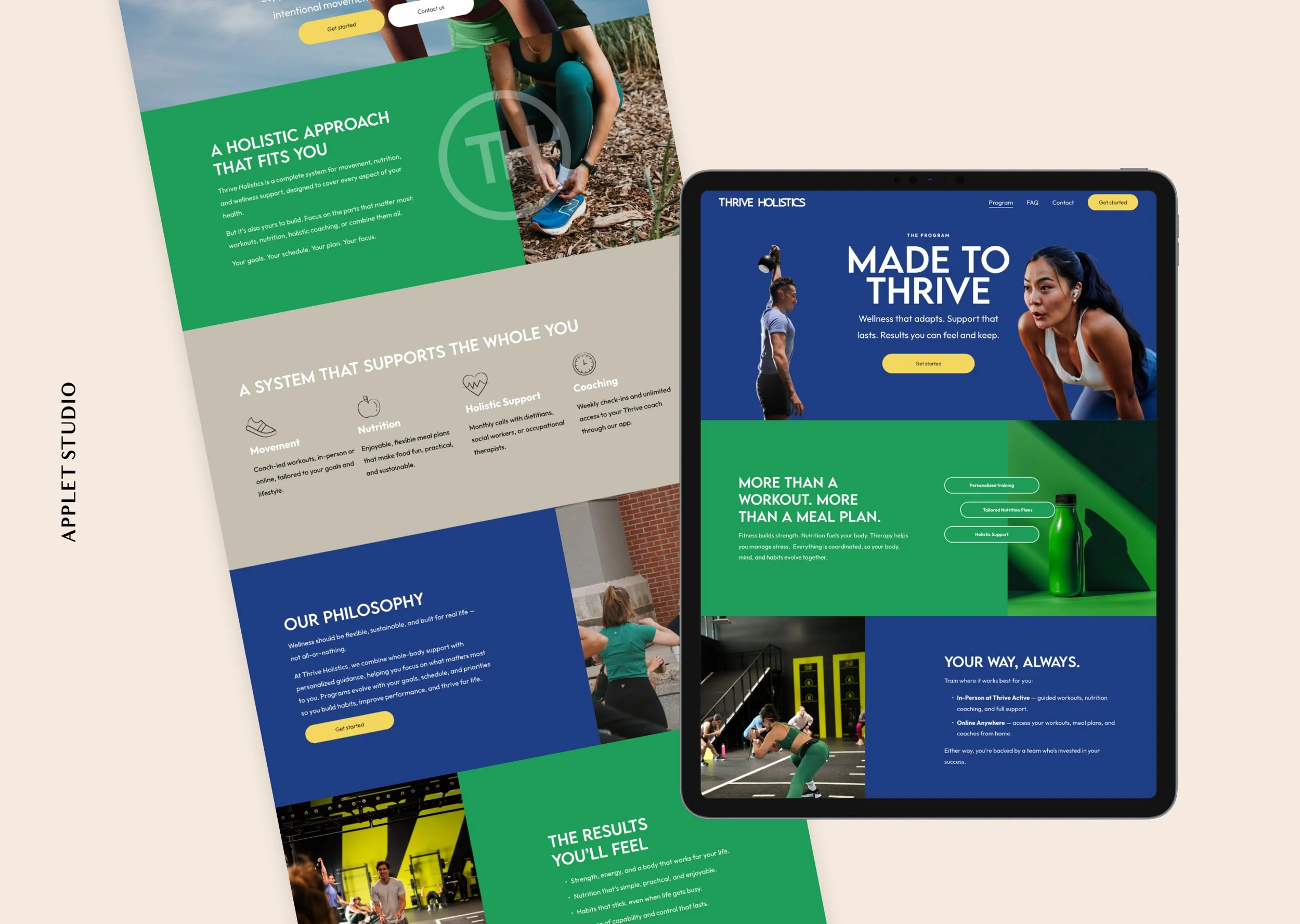
This project for a dynamic sports-program business required a vibrant, action-oriented online presence. Using the Squarespace platform, we built a streamlined website with two main pages — Home and Programs — complemented by FAQ, Contact and a Booking page integrated with Calendly. The decision to keep the site focused and concise allowed us to deliver a fast turnaround during a VIP day.
Visually, the design leans into energy and movement: bold colour palette of vivid blues, greens, and yellows, paired with ample white space and structured greys to give the eye a rest.
Images are carefully selected for their sense of motion and space — think cut-out collages in the hero section and asymmetrical split-layouts that place visual weight on the imagery while keeping text clean and minimal.
Structurally, we emphasised modularity and ease of navigation: each content block is self-contained (image + text), enabling fast scanning and decision-making for visitors. With minimal pages, anchor links within the page help users move quickly to relevant sections instead of hopping between separate pages. This enhances user flow and reinforces the website’s purpose: to inspire action and engagement.
Try Squarespace for free – and save 10% when you purchase a subscription with code APPLET10
Colorful and Optimistic Squarespace Website for a Coach and Personal Assistant
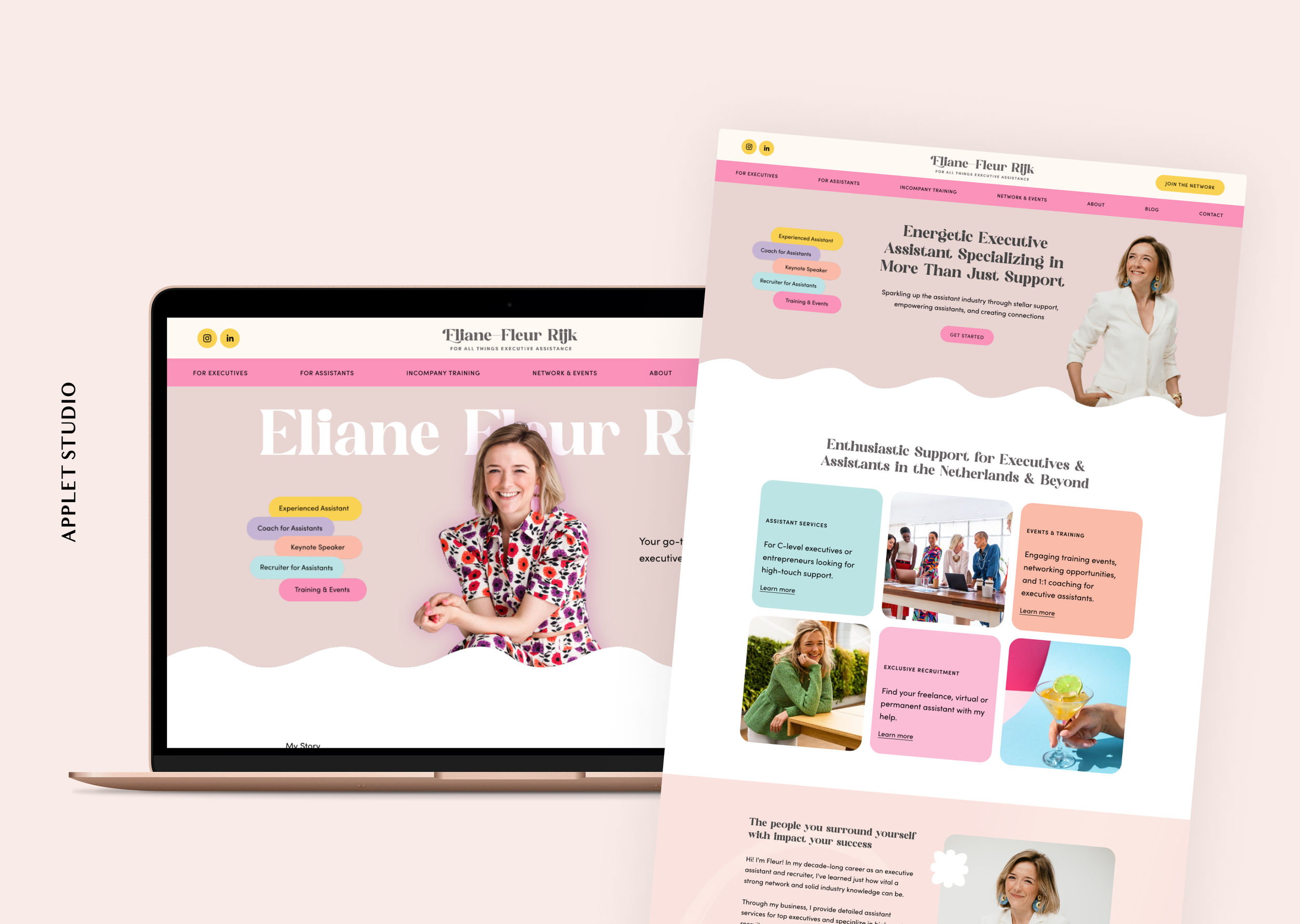
Fleur Rijk came to us with a vision for two interconnected brands: one for her personal identity and another for the community of executive assistants she’s building. With over 12 years supporting C-level executives, Fleur needed designs that reflect her expertise, passion, and leadership in the assistant profession.
Her personal brand is colorful, feminine, and vibrant — trendy yet professional. The community brand takes a more relaxed, approachable tone while remaining cohesive with her overall vision. Together, the two identities clearly differentiate her personal work from her broader initiatives.
We delivered print materials, social media templates, and presentation assets to bring both brands to life. The result is a cohesive, thoughtful system that equips Fleur to grow her personal presence and nurture a thriving, inclusive community.
Classy Squarespace Website for a Wine Estate
In summer 2024, we created a custom website for Casa La Rad, a premium Rioja winery, with one goal: showcase the estate as the true star. Unlike typical wine sites, the focus isn’t on bottles or production — it’s on the landscapes, terroirs, and natural beauty that make this winery unique.
The design is calm and refined, using a palette of dark grey, beige, and white to reflect the luxury aesthetic. Dedicated pages highlight the estate, vines, terroir, and winery, while each wine — Casa La Rad, Casa La Rad “Alma,” and Vina Solarce — has its own product page with detailed connoisseur information.
High-quality photography and clear structure let the vineyard team’s passion shine through. Beyond wine, the site celebrates their commitment to biodiversity and stewardship of Rioja, creating a refined, immersive experience that reflects the estate’s authenticity and care.
Modern Website for a Media Consultancy
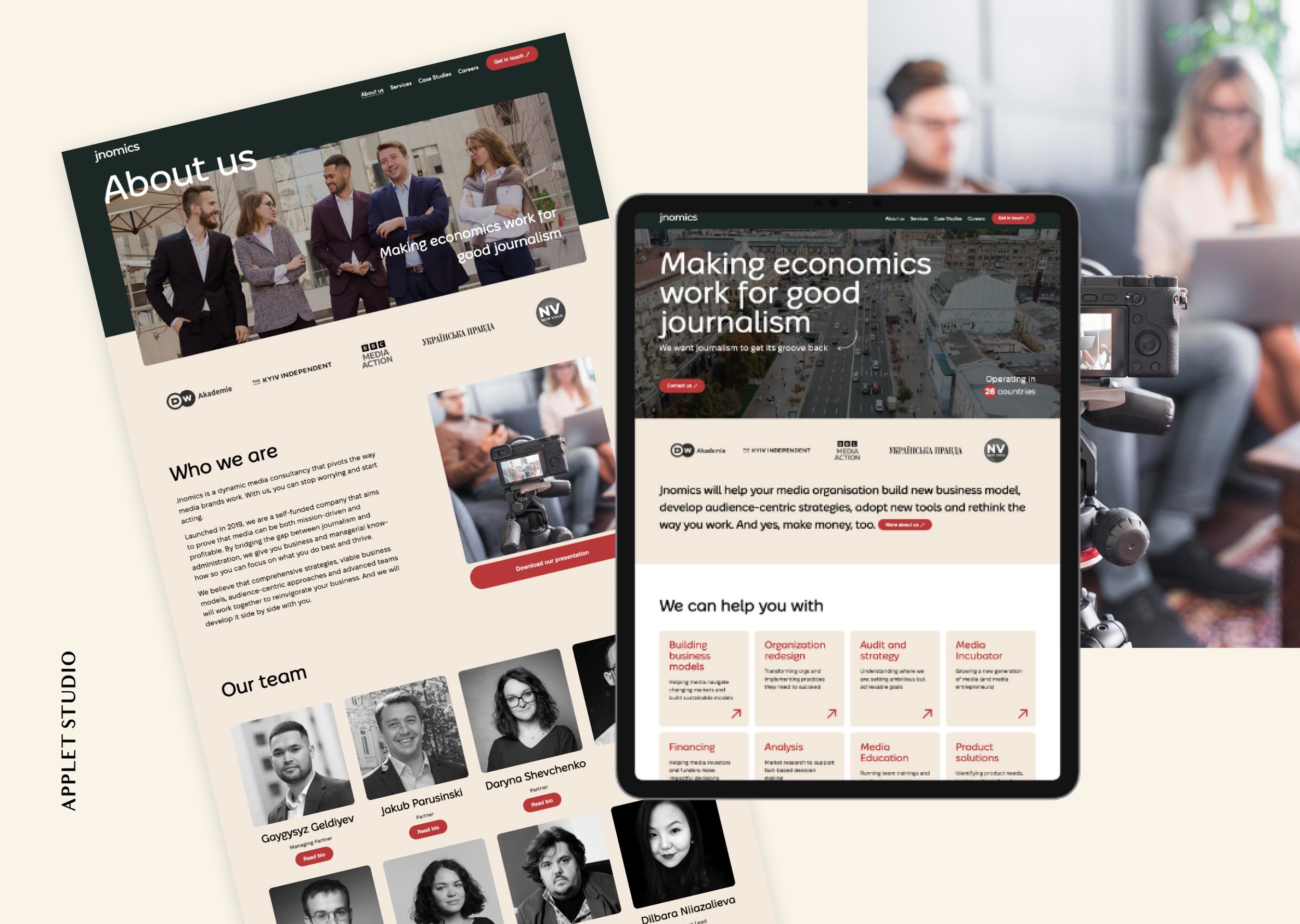
Jnomics Media is a self-funded company that aims to prove that media can be both mission-driven and profitable. This media consultancy is one of our recurring clients. We built their first website back in 2020, and now, four years later, they returned to us with a request to redesign their website. They didn’t have a major rebranding over these years, nor did they massively change website copy, but they have grown a lot so the new website needed to reflect the changes in their business. On top of that, the Jnomics team also wanted to keep up to date with the latest web design trends.
Jnomics has its style guide so we had something to start with. In their palette, they had deep cherry red that we used for accents on the website. We had to figure out which other colors would work well with it, and we came up with solemn dark green and playful beige.
The homepage opens up with a big headline and a CTA on an impressive video background. Jnomics team provided us with videos which we cut into pieces and composed into one that would suit the background. We also compressed the video so that the website would load quickly while saving the quality.
We made sure the website looked cutting-edge by using a modern grid and fonts. The emphasis is put on bold headlines and prominent buttons. We also enriched the design with interactive elements like rotating arrows and emerging strokes around the blocks in the “We can help you with“ section. See more images on our portfolio case.
Sleek Squarespace Website for a Therapist
In summer 2023, we had a blast teaming up with the lovely Dallas-based therapist, Michelle Turner, to breathe new life into "The Therapist Within" website.
We updated Michelle’s brand and rebuilt her Squarespace website which she had for over 8 years.
The new Therapist Within website showcases a modern, clean, and professional design, catering to therapy and counseling services.
We used a harmonious combination of muted blues and grays, suggesting trustworthiness and calm. These colors are thoughtfully accented with black typography, ensuring readability and elegance. The use of varied font sizes and weights effectively draws attention to important information while maintaining an organized and cohesive look throughout.
All the images chosen resonate with the theme of relationships, connection, and well-being. They evoke emotions and create a sense of trust and reliability. The visuals are intimate and genuine, with a focus on human connection. Whether it's a couple sharing a moment or hands held together in support, they encapsulate the essence of therapy – understanding, connection, and healing. The choice of using a simple plant photograph further enhances the brand's commitment to growth, healing, and organic development. See more here.
Trendy Squarespace Website for an App
Squarespace Template: Perfectionist
Unstoppable is an app and platform that focuses on bridging the gap between work and well-being, particularly for small businesses and their teams. This is a mighty tool that seeks to empower small business owners.
As any app or platform Unstoppable needs to be present on the internet. To build their website, they chose Squarespace and a premium Squarespace template from our shop the Perfectionist. Bold and trendy, this template is fit for a tech startup or any innovative business that looks to stay en vogue brand-wise for the next several years.
To demonstrate the app, Unstoppable uses many images of smartphone mockups of the app around the website as it is important to visually showcase the product and not only explain how it works in your copy.
Many details make this website look modern and up-to-date with the latest web design trends: bold all-caps headlines, vibrant background gradients, and a contrasting color palette that accommodates dark grey and delicate lilac at the same time. There are also vivid aquamarine accents used for buttons and headlines that give liveliness to this website.
Apart from being an app, Unstoppable strives to build a community, to become a movement and a support system for their clients. To demonstrate a sense of connectedness and kinship they use many photos of people working together in a group, team meetings in the office, as well as meetups in more informal settings.
Eye-Catching Squarespace Website for a Brand Manager
Squarespace Template: Social motion
Morgan of Bloom Social Studio helps her clients transform their brands into something they are proud of and ready to show off to the world. She also teaches them to master their marketing and attract the right clients.
Morgan currently has a website built with Squarespace and a premium Squarespace template from our shop Social Motion.
Morgan wants to diversify her income so she needs pages for many services and products. She offers web design, branding, and social media management services on her Services page, but she also needs a shop page to sell website templates, Instagram templates, brand kits, and stock images. On top of that, she has a Coaching page because she provides coaching help and calls. And she also has a resources page to host her affiliate marketing links. Even though Morgan’s website contains numerous services and products it is simple to use and easy to navigate.
If anything, Morgan’s website is far from boring. She makes it eye-catching and fun to explore with a combination of regular and irregular grids in sections and differently shaped images. If you want to follow her lead, learn how to easily shape images on your website in our tutorial.
Morgan makes her website look friendly and inviting with warm colors of deep yellow and peach pink, soft but bold typography, and wavy section dividers.
Details matter, that is why Morgan beautifully designed her favicon to match her website and her brand.
Inviting Squarespace Website for an Educator
Here’s a project we helped design back in 2023 – a website for a counselor and educator Alexandra Greer. Alexandra sells workbooks and digital resources online for teens and adults. As a counselor, she focuses on emotional safety and emotional relating.
Alexandra had purchased a Squarespace Template two years prior she contacted us. The template had worked for her but after a while, she felt she wanted a redesign because her website wasn’t converting sales for her. She needed a more user-friendly design and a better mobile version. Alexandra also wanted to give her Modern Intimacy Education website more cohesion. In addition, she had several features in mind: long-form sales pages with a custom checkout experience, integration with a CRM, and her email marketing tool, free opt-in (lead magnets), PDF delivery, and an email sequence.
Alexandra had brand guidelines for us to use and a prototype in Adobe XD. On a tweak session, we modified the prototype and helped her bring her vision to life. The result – is a modern and vibrant website that is aligned with Alexandra’s business goals.
With its monochrome red palette that includes peach, warm pink, burgundy red, and a pair of cheery fonts the website looks very snug and inviting. Soft lines of bent section dividers and photographs of Alexandra smiling add to the heart-warming atmosphere. See more here.
Lively Squarespace Website for Coach
Squarespace Template: Perfectionist
Hailey Magee is a certified coach, author, teacher, and speaker, dedicated to helping people break the people-pleasing pattern and master the art of self-advocacy. She is dedicated to offering clear, research-supported strategies for change, helping recovering people pleasers rediscover not only their power and agency, but their pleasure, joy, and sense of wonder.
Hailey built herself a professional website using Squarespace and one of the newest templates from our shop – the Perfectionist. We have recently released this stylish Squarespace template for experts, service providers, and influencers.
Now, that her first book Stop People Pleasing and Find Your Power is coming out soon this year, it is important for Hailey to promote it digitally and to have as many pre-orders as possible. She mentions her upcoming book around the website in text and separate sections and also has a page solely devoted to it with a CTA to pre-order it in different bookstores.
The website also provides options to read Hailey's blog, watch her workshops, work with her in private coaching, and access a free guide.
The striking contrast of dark blue and white plays out well as the base of the color palette of the website. Turquoise and warm yellow accents make the website lively and vibrant.
Beautiful portraits of Hailey help connect with the audience and support her personal brand.
Soothing Squarespace Website for a Marriage Therapist
Squarespace Template: Social Motion
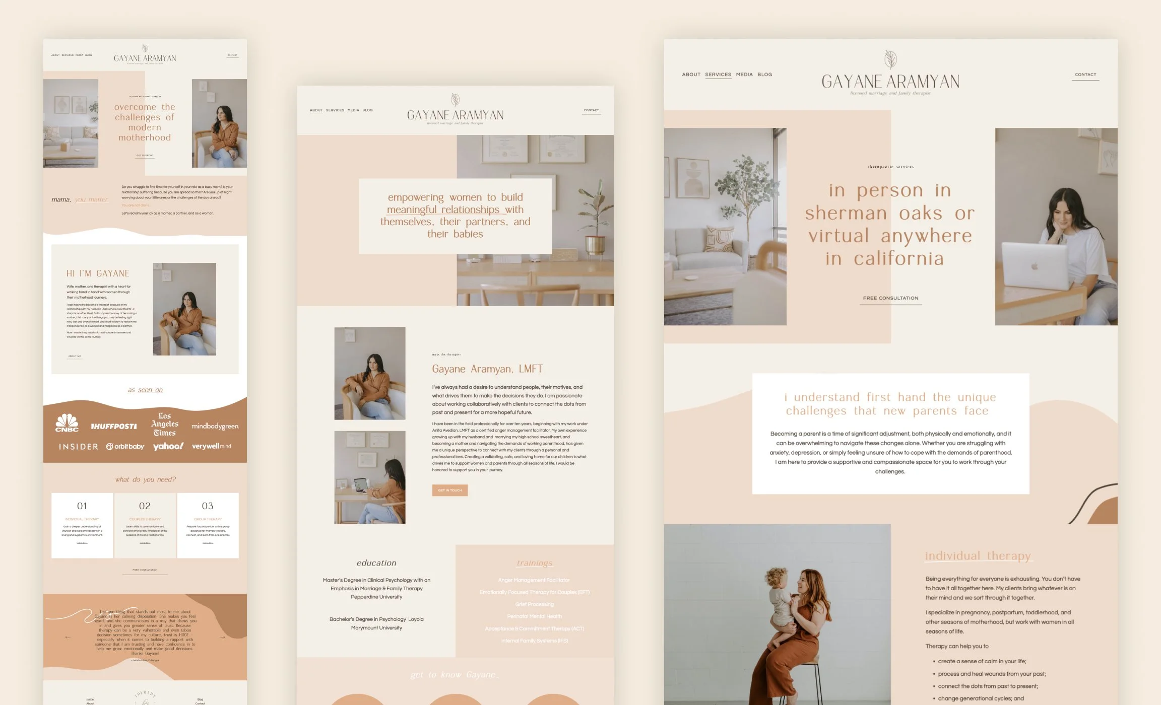
Gayane Aramyan is a licensed marriage and family therapist based in Sherman Oaks, LA. She also consults virtually in California. Gayane is passionate about working collaboratively with clients to connect the dots from past and present for a more hopeful future.
Built with Squarespace and our template Social Motion, her website has a clean and modern design, focusing on providing a comfortable and welcoming atmosphere.
The overall color scheme appears calming and soothing, featuring a combination of soft pastel hues and caramel accents. Gayane had a photo shoot in her brand colors so that the color palette fits her photos perfectly.
Gayane leveraged the template’s signature collages, split sections, and doodles.
She has also added a page that she needed – to list all the media mentions. A simple grid worked well for this task.
Testimonials from former clients are prominently featured in the slider on the homepage, adding credibility and trustworthiness to the therapist's practice. These testimonials help potential clients gain insight into the therapeutic experiences and outcomes that others have had with Gayane.
Overall, her website offers a professional and inviting design, with a focus on creating a supportive space for individuals and couples seeking therapy. It is a sweet virtual home for her practice.
Bright and Unapologetic Squarespace Website for a Marketer
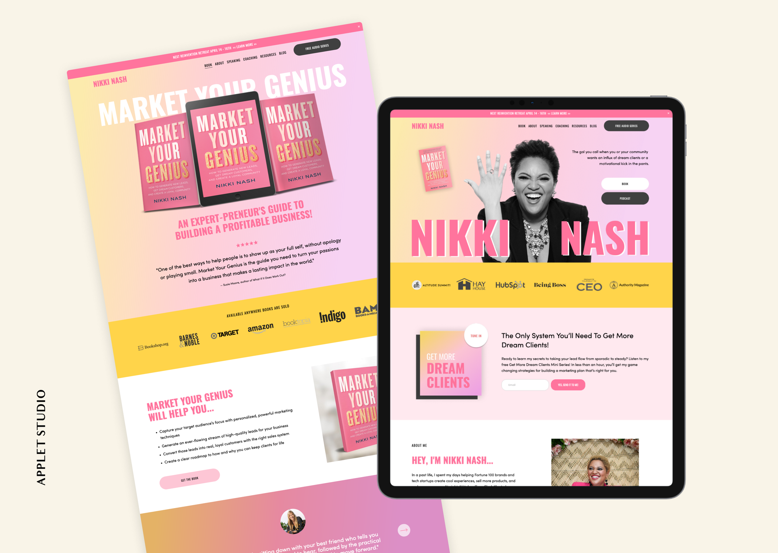
Here's another one of our cool projects of early 2023 – a website design for Nikki Nash. Nikki is a veteran marketer, long-time entrepreneur, and co-founder of The Wealth Builders Collective. Before entrepreneurship, she worked at various companies where she had experience cooperating with such brands as Intel, InStyle, Travel + Leisure, and Louis Vuitton MOET Hennessy.
Now she has embarked on her own journey doing things she loves and wearing as many hats as she wants – she is an investor, speaker, author, podcaster, coach, business builder, and strategist for entrepreneurs who wish to change the world.
When she came to our studio, Nikki was at the point where she was moving all of her services to a different brand, which is her personal brand. She wanted her new website to be a reflection of her personality and communicate her energy. As it was Nikki's main goal, we needed to do some work to ensure her website sticks to her brand identity.
The homepage of the website opens up with a powerful first screen that consists of her b&w cut-out portrait, buttons leading to her book and podсast, and a bold headline with hard shade, which is also a key visual of the website. Straightforward and to the point Nikki's homepage instantly shows what she is capable of.
The typography comes strong not only in headlines – we have added an accent handwritten font – Headstone – and thought through the choices for the body of the text and buttons.
To convey Nikki's energy we chose a vibrant color palette featuring hot and pastel pinks, warm yellow, strengthened by yellow-to-pink gradients for some of the section's backgrounds. There is also dark grey and white to make up for the intensity of the accent colors.
This vibrant website embodies the spirit and the mission behind Nikki's brand. Function-wise it should help her grow her newsletter list and close more speaking engagements. See more pics here.
Warm and Welcoming Squarespace Website for a Copywriter
Squarespace Template: Good Vibes
The Creative Marketing Co. specializes in content and copywriting services for entrepreneurs. The business is run by Felicity Haylock, a professional copywriter with a passion for content creation. Felicity helps her clients with website content, social media management, blogs, and newsletters. Based in Dubbo, she serves business owners Australia-wide.
The site features a clean, professional design. To bring her vision into reality Felicity used Squarespace and one of the premium templates from our shop Good Vibes.
The services page clearly showcases what Felicity can offer her clients. These include website content creation, social media management, blog writing, and newsletter creation. Each service takes up a separate section on the page and is separated by elegant wavy dividers.
There are testimonials from satisfied customers featured on the homepage. These testimonials provide potential clients with an idea of the quality of service they can expect when working with Felicity.
The site also offers resources like a blog with articles about copywriting and a free download titled '5 Prompts to Beat Your Writers Block'. These resources provide value to visitors, demonstrate Felicity's expertise in her field, and help her better connect with her audience.
Felicity uses the color palette to create a welcoming and friendly atmosphere on her website. There are many warm shades of pink and yellow.
With white frames around photographs, sleek black borders on some elements, and wavy dividers, her website feels and looks very feminine and elegant. She has also added many sketch drawings of work objects and stationery around her website.
Joyful Squarespace Website for a Course Creator
We are happy to show you one of our custom projects of early 2023 – a website for Galaxy Bomb Studio. Its founder, Tamara, is a mom of 2 amazing boys, graphic designer, and entrepreneur from the west coast of Canada. Tamara is on a mission to teach creative women how to earn extra passive income from home with digital products. She is passionate about showing stay-at-home moms how to work smarter, not harder.
Tamara has three hugely successful Etsy shops and also sells her digital products on Creative Market. For a long time, she didn't feel the need for her own website because she conveniently used these platforms. However, when she decided to expand her business to offer more product types, she decided she needed a Squarespace website for her ever-growing venture.
Tamara was about to launch several courses and at that time, she grew her newsletter list as a pre-launch activity. She had recorded a class she gave out as a freebie in return for customer emails.
We've built a short and sweet Sales Page for this freebie class. The page has all the strategic sections to nudge people into subscribing to it, including the pain points, personal story, nice mockup, course content, the offer itself, CTA, and more. This page is designed to gently nudge Tamara's customers into her marketing funnel.
The design brings Tamara's cheerful personality to the forefront of the website. We used many vibrant colors – bubblegum pink, electric blue, warm yellow, with lots of white space to balance them out. There are also funky graphic elements – simple geometric shapes, like half-circle, stars, thick wavy lines, and rectangles. The colors and the shapes are playfully copied from Tamara's outfits in her photos, which gives the website a consistent, well-designed look. Check out more pics here.
Authentic Squarespace Website for Magicians
Squarespace Template: Arch&Gold
See Magic Live is a group of professional magicians based in Orlando, Florida, with astonishing audiences worldwide. They provide professional magicians for a variety of events. The company offers magic shows that are as captivating as those seen on TV, aiming to impress and entertain audiences with the skills of their magicians and mentalists. The CEO of See Magic Live is Kostya Kimlat, who has been recognized globally for his talent in magic.
Kostya and his company have a Squarespace website built with one of the Premium templates from our shop – Arch&Gold. With its luxurious color palette and elegant layouts, this template suits their business perfectly.
The website features several testimonials from satisfied clients, praising the company's professionalism, engaging performances, and easy booking process. The positive reviews indicate that See Magic Live's magicians successfully engage and captivate all types of audiences.
The website also includes a section for booking a magician for an event. You can fill out a form with details about your event, and the See Magic Live booking team will get back to you soon.
The company provides three types of magical services: Interactive Close-Up Magic, Group Magic Shows, and Virtual Magic Shows. These services are neatly organized in three columns on the homepage with CTA buttons to get more information. Each of the services has a separate long-form page that explains all the deets to the potential clients.
Overall, the new website helps the company to present itself as a reliable, professional, and expert provider of magical entertainment, perfect for corporate events, private parties, or any gathering that could benefit from a touch of magic.
Sleek and Professional Website for an Attorney
The Carter Firm’s website is one of our custom projects of late 2022. Isaro Carter, the firm's founder, is the attorney for creatives and business owners. Based in New York City, her practice covers the intersection of intellectual property law and entertainment law through services focused on creative entrepreneurs — specifically trademarks, copyrights, music, and television. She aims to empower her clients by ensuring they understand the purpose of the legal processes surrounding their work to protect them.
Isaro has come to our web design studio before. Back in 2021 she bought a Premium Squarespace template and DIYed the first iteration of her firm's website out of it. This was a pretty solid website and we showcased it as an example of what can be built with our Squarespace template Lora.
When Isaro's law practice took off, she decided she was ready for some custom work.
While designing this website we strived to create timeless big-city life look. We also needed to highlight Isaro's expertise and competence in her field.
With cappuccino, beige, and ink-blue colors we aimed for a high-end, classic palette. You will find black and white photos skillfully mixed with color ones to bring out the "old money" style. We also put some of the photographs in black sleek frames to play up the atmosphere.
At the same time, there are many modern features to the website: asymmetrical split sections, collages, and small headlines in a handwritten font.
We chose a classic editorial-style font pair – a serif Roxborough CF Font and a sans serif Halyard Display. With its chic vibes, Roxborough brings out the headlines in an elegant and feminine manner, while Halyard Display makes the paragraphs easy to read.
The website's structure is simple and effective, there are ever-present home, about, and contact pages, but also several pages to showcase Isaro's array of services, a blog for better SEO, and a soon-to-be-launched contract template shop. See more images here.
Approachable and Friendly Squarespace Website for a Mentor
Squarespace Template: Social Motion
Rochelle Olsen is a pregnancy and infant loss practitioner, clinical pharmacist and advocate for baby loss mums. As The Baby Loss Mentor, Rochelle educates, supports, and guides mums by being a lamplighter and mentor, walking beside them on their journey.
To build her website Rochelle approached a website designer Digital by Kreete who did a beautiful job of putting it together based on one of our Premium Squarespace Templates – Social Motion.
Digital by Kretete’s main goal with this design was to make it feel calming, soothing, and solemn which she accomplished by the choice of the initial template, soft color palette, friendly fonts, and symmetrical layouts.
She made this design unique by adding moving elements throughout the website, mostly self-scrolling text blocks.
At the same time, the website has a very clean and elegant look achieved by sleek black photo frames, decorative font for h4, and underline button style. The logo gallery is color-corrected in one style, which makes the design extra polished.
Photos from Rochelle’s personal photoshoot are skillfully combined with stock images. Rochelle holds dearly the metaphor of being not only a mentor, but also a lamplighter for the baby loss mums, and this is the leitmotif of the website as candles and lanterns keep appearing on the photos.
Heartwarming Website for a Podcaster and Course Creator
This website is one of our favorite designs of 2022. Adam Rosante is an entrepreneur and humanitarian who needed a new website for his Season of Giving project. The Season of Giving is a podcast and a platform that inspires and empowers people to make an impact in the world.
Adam needed a website that could host a podcast and a course. Squarespace is the perfect platform to meet these needs, and with the custom work of a Squarespace designer, it is easy and relatively inexpensive to have your website up and running in no time.
Adam's website comes across as friendly and inviting with an optimistic color palette of cheerful warm yellow and classic navy blue. All the photos are made black&white in order not to interfere with the rest of the website color-wise. Adam was planning to have many guests on his podcast, meaning that he would receive portrait photos from them, all shot on a different background, with different cameras, and light. Turning all the pictures b&w by default solves the problem of color-correcting.
For headlines, we chose Bebas Neue font which is both straightforward and warm at the same time. It has clean lines, elegant shapes and looks good in all-uppercase. We used the same font to design a text logo for the website's header and footer. For paragraphs, we used Sofia Pro which looks friendly and modern at the same time and has great readability.
Even though Adam's new course The Giving Formula is free it still needed a sales page to pitch it to the potential audience. The page follows the logic of the usual sales page – it is a long scroll that describes pain points, depicts the ideal future situation, explains the content of the modules, etc.
For the podcast page, we created a mobile phone mockup, designed a section with the latest guests and featured episodes, an about host section, and added the right CTAs.
Doodles, drawings, and Adam's smiling portraits add to the overall heartwarming atmosphere of the website. Check out more pictures of this project here.
Classy Website for Interior Designer Firm
The Pinched Pleat is one of the first clients of our web design studio in 2023. Its founder Dana Newsom contacted us in early January with a request to refurbish a Squarespace website for her young, yet already established business. The Pinched Pleat provides custom drapery to its customers in Greater Indianapolis, IN. It is an accessible source for well-made and custom-fit soft furnishings. Being a lifelong seamstress, Dana founded her interior design business back in 2021, aiming to make houses feel like homes with personalized soft decor.
Dana came to us with the first iteration of her Squarespace website. After a few calls, we decided to adjust the strategy and revamp the website copy to increase online sales before we dived into styling and embellishing.
Design-wise we came up with a perfect couple of editorial-style fonts pairing a serif and a non-serif, giving the website a classy feel. We have also added sewing-related elements to the website: doodles of stitches on the section backgrounds, wavy dividers as hems of cloth, collage cut-outs of cushions, etc. We had a lot of fun imagining and creating these small pieces of decoration.
While working with the brand’s primary brand color blue we added an elegant dark blue-to-turquoise gradient that subtly highlights the class of the business. The result is a sleek and stylish website.
We enjoyed working with Dana Newsom – go check out her website and shop her custom drapery. See more pictures of this project here.
Lively Squarespace Website for a Color Analyst
Squarespace Template: Social Motion
Louise of How To Not Hate Your Clothes is dedicated to helping busy modern women gain confidence in their personal style by offering various services such as color analysis and wardrobe edits. She aims to address the common struggles of people who feel stuck in a style rut or overwhelmed by the task of shopping and dressing.
For her business website, Louise went with Squarespace and Social Motion – a premium template from our shop.
Louise’s website has a clean and modern design. The homepage features a welcoming banner that consists of a collage, a bold headline, and a call-to-action button. Scrolling down the homepage, you'll find testimonials from satisfied customers, highlighting their positive experiences with the services. The testimonial section adds credibility and converts prospects into customers.
Throughout the website, there are images showcasing different aspects of Louise’s work, such as color drapes, fabric swatches, and in-person client work. These visuals explain the gist of her services.
The color palette doesn’t differ much from the original template. It is primarily composed of soft, muted tones that create a calm and inviting atmosphere. The dominant colors include shades of pastel pink and vivid orange. There are also many blue accents in the photographs. The same colors are used strategically throughout the website to create a consistent visual identity.
The typography choices further contribute to the overall aesthetic of the website. The main body text uses a clean and legible sans-serif font, ensuring ease of readability for visitors. This choice promotes clarity and professionalism.
Headings and titles use a slightly bolder and more stylized font. This contrast in typography helps to draw attention to important information and creates visual interest on the page.
Overall, the design of the website is well-organized, visually appealing, and effectively communicates the services offered by Louise.
Elegant Squarespace Website for an Elite French Bulldog Breeder
Bijou Frenchies is a french bulldog breeding business based in Houston, TX. Its owners Angel and Quinton Bijou came to us with a need to build their Squarespace website from scratch. This is actually not our first website for french bulldog breeders as we have already created a website, brand identity, and copy for Olga Lazareva, the founder of Country Club Frenchies, at the end of 2021. This was Olga of CCF who referred our studio to the Bijou family.
We started building a custom Squarespace website for Bijou Frenchies in June 2022. One of our suggestions was to concentrate our efforts on a one-page website which is more than enough for many new businesses. As a result, we’ve designed a long-form page website (15 sections) with a few short pages for Contact, Waiting list, and a Blog, in case our client starts working on content marketing for their business.
We have experience with building long-form sales pages, and have Squarespace Sales Pages templates in our shop (check out Terranova and Evergreen), and we know how to make them interactive and engaging. To facilitate the navigation around the website we included anchor links menu that jumps to specific sections on a webpage, instead of taking users to different pages.
To keep potential clients engaged and scrolling we have incorporated many visual sections with photos of the pups and directing arrow indicators.
To highlight the high quality of the breeding services we have added elements that speak upper class: subtle golden elements, French aristocracy symbol fleur-de-lis, and a graceful handwritten font.
The color palette is on other hand more classical and balances out the decorative elements. It consists of navy blue, warm yellow, beige, and white.
Crispy and Concise Website for a Housing Consultancy
Squarespace Template: Studio89
Frah Consulting is a strategy and operations consultancy providing support for universities, lenders, developers, operators, and other stakeholders involved in the UK student accommodation sector. They provide support to organizations, including universities, in optimizing their approach to developing and operating student accommodation in the UK.
Frah Consulting came with a request to build a new website for them to a Squarespace designer Clare Butler of Calmwork, whom we are very delighted to have as our client. In her work Clare sometimes customizes Squarespace Templates from our shop, and we are always excited to see brilliant results of her work.
For this website, Clare went with the Studio89 template with a sleek design that is perfect for established brands.
Studio89 is a dark moody template with rather a reserved color palette, that consists of different shades of grey, terracotta, and white. Clare decided to tune down it even further swapping the terracotta color accents for the taupe grey to give the design a more formal look.
Clare added some texture to the website by choosing the crumbled paper background image for the testimonial section, which suits the mood of a consultancy office.
Since it is a housing consultancy she chose the fitting images – architecture, campuses, and office pictures.
The result is a first-rate, professionally-looking website that functions as a business card on the Internet: it provides all the necessary information about the firm while bringing future leads and work connections.
Elegant and Classy Website for a Web Designer
Squarespace Template:
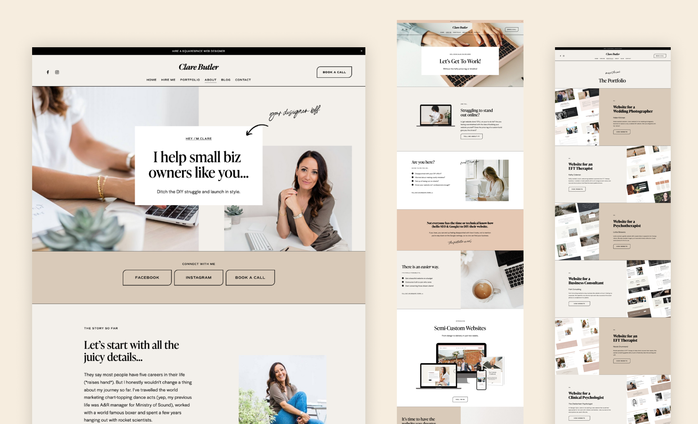
Squarespace designer Clare Butler has created yet another masterpiece from one of our templates – this time a website for herself. Clare is based in the UK and she creates beautiful on-brand, on-budget websites for small biz owners.
Previously, Clare had a website designed with our template Lora, but when one of our newest templates Identity came out, she took it into the works to refurbish her website. It was also time for a business model and branding change – as Clare shifted her focus from mostly working with therapists to working with small business owners from different niches.
Clare’s website looks very classy: she works with a neutral color palette using lots of camel, mocha, beige, black, and white.
One of the template’s signature features – thin, black section borders – gives the website elegant look. The template also has outline buttons that go together with section borders well and contribute to the website’s casual chic.
Clare also kept the script font for some of the headlines. It gives a website a nonchalant atmosphere because text written in h4 looks like handwritten notes on the page.
We love how Clare works with images – every photo seems to be in its right place. She shows enough of herself in the portraits to build a trustworthy connection with potential clients.
Stylish Squarespace Website for a Handmade Jewellery Supplier
Squarespace Template: Pink&Navy (No longer available)
Kreete is a handmade jewelry supplier from Australia. Her modern handmade accessories are inspired by everyday women and are handcrafted in her home studio in Dubbo, NSW.
For her website, Kreete chose to customize one of our premium Squarespace templates – Pink&Navy. This is a great choice because we created Pink&Navy specifically for handmade artists and online jewelry shops. You can see it from the template’s original content.
Since the template suited Kreete’s business, she didn’t have to change much and the customization process was easy.
All she had to do is to upload her goods in the online shop, swap pictures in the galleries, and change some copy. The store was basically ready to launch.
Of course for a product-based business, you have to have all the images ready long before the launch. Imagery is the most powerful sales tool of any online shop. And Kreete has all her jewelry professionally photographed in the same style.
Kreete also made her website fit her brand more. She changed the font pair for her brand fonts and added dark peach accents around the website.
Bilingual Squarespace Website for an Online Career Consultant
An online career consultant Annie Gomes came to Applet Studio in January 2022 with a request to redesign her website. She already had a Squarespace subscription and wanted to continue using the platform but needed a designer’s hand to make things right.
Annie is an experienced recruiter and HR professional who seeks to equip men and women with the tools they need to get hired. She helps professionals land a job in 3 months through the power of storytelling, networking and personal branding. In other words, she teaches people to manifest their dream jobs.
Annie is an accomplished professional with over 10+ years in HR & Recruitment in companies such as Adecco, Lee Hetch Harrisson, Novares, and Arkema. There she discovered her passion for coaching individuals and helping them to develop their careers in various industries by unleashing the power of their personal brands. During her experience in HR, she coached and consulted more than thousands of professionals seeking new or different career opportunities.
Annie wanted her website to reflect her personal branding and messaging. It also needed to present her professionalism and experience.
With its blue and cappuccino tones, the color palette suggests comfort, calm, and reassurance, as many job seekers look for support on their journey.
On her website, you may find some of the best converting and proven-to-work sections we use in our custom Squarespace templates such as Rosée and Huslte&Heart. You will notice top-drawer card image hero, split, freebie, newsletter, and services, testimonial sections.
This is a service-based business, which is why we needed to take special care in presenting and explaining Annie’s packages. They are listed on a home page in a 3-column section as well as on a separate Services page. Each package then leads to a shop page completing an elaborate marketing funnel.
Annie is bilingual, and so is her website. To install two languages on a Squarespace website we used Weglot translation plugin.
Feminine and Joyful Squarespace Website for a Digital Content Creator
Squarespace Template: Social Motion
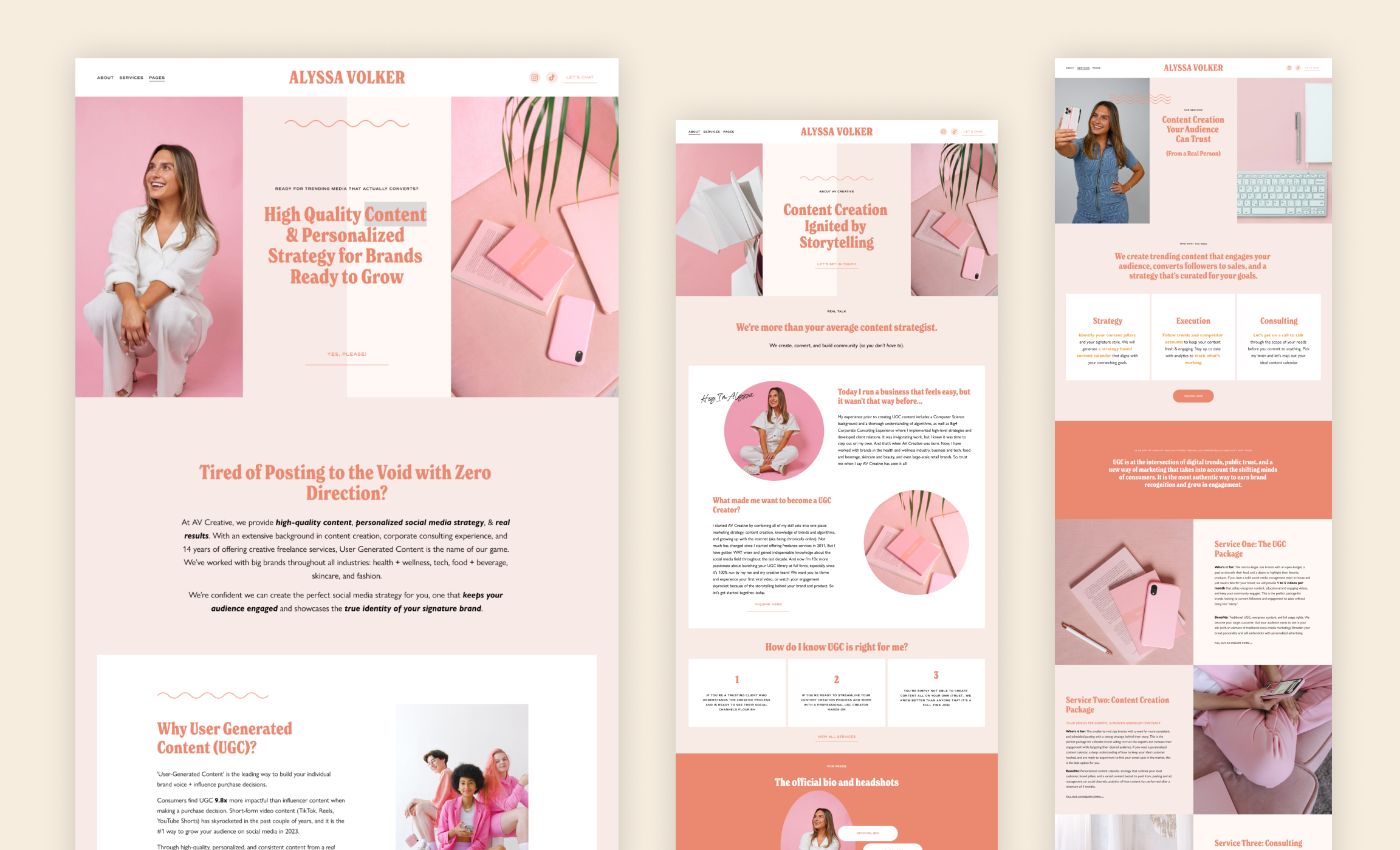
Alyssa Volker is a Digital Content Creator based out of Los Angeles. She provides high-quality content and personalized strategy for brands ready to grow. Since she is LA-based, she works with a lot of LA local brands.
Alyssa wanted to build a branded website that showcases both her content creator side and content creation business (as a freelancer). She was looking for a website, that would hold everything she does in one place. She was also planning to launch her podcast at that time.
For her website, she chose one of the newest Squarespace templates from our shop – Social Motion. This is a great choice because we conceived this design with social media managers’ needs in mind.
Her color palette embraces her aura – there are lots of deep powder pink shades as well as vivid peach accents. Pastel pink and white space balances the intensity out.
Her own photos already contain a lot of pink and white, and look very harmonious together with the website’s colors. She also needed some extra object photography, so she added matching stock photos of stationery and interiors.
The website’s visual language features round and oval picture cutouts that add up to the feminine vibe.
Alyssa made sure the website not only looks trendy but also functions its best. She filled out the Home, Services, and About pages with all the information she needed to publish online.
Funky Squarespace Website for a Food Hall
Squarespace Template: InstaWorthy (no longer availible)
Mission + Garnet is a six-concept food collective located on the iconic Pacific Beach corner in San Diego, CA. It was created as a dining and meeting place for Pacific Beach. They brought together several food options to ensure there was something for everyone to eat. With quick and easy walk-up windows and counter service, locals and visitors alike can enjoy nearly 24 hours of delicious dining.
Restaurants don't always need an online presence, and if they do, they often get by with socials. However, if you also provide catering services, delivery, and pick-up, as Mission + Garnet does, you need your own website. For their website, they use Squarespace and one of the premium templates from our shop.
Mission + Garnet’s website has an easy-to-navigate structure that includes a home page, catering, six pages dedicated to concept restaurants, and a contact page. Each restaurant’s page uses a bold split as a hero section with an appetite-enticing picture of the delicious food they serve. These pages have a simple, yet effective structure: they contain detailed menus and CTA buttons for pick-up and delivery.
The website comes across as optimistic and cheerful. The homepage greets you with a fun gif framed as a polaroid photo. Mission + Garnet’s team also uses a fun and easy-to-read handwritten font for some of the headlines as well as for the logo. The color palette is on the buoyant side and includes pumpkin orange and aquamarine.
Mission + Garnet used the signature graphic elements of the original template and remastered them to fit the brand. They have recolored the wavy divider and redesigned the little stars that serve as graphic embellishments.
Sophisticated Squarespace Website for a Florist
Squarespace Template: Indie Studio
The Naked Florist is a team of florists based in Newcastle, Australia. They decorate ceremony spaces and receptions. The Naked Florist uses their clients’ inspiration, their imagination, and nature’s seasonal standouts to create personal designs.
The Naked Florist commissioned their new website to Australian marketing agency Business Brother. For the website platform, they chose Squarespace. Business Brother is a team of talented and high-skilled marketers who created a perfect website for their client The Naked Florist. They have bought one of our Premium Squarespace Templates – Indie Studio – and redesigned it to the marketing needs of the florist business.
Our Squarespace template Indie Studio is a stylish and sophisticated website design for photographers, artists, event planners, and other visual businesses. We have built its pages and its structure around the visuals to give our clients the space to showcase their work. The template is easy to populate with images. The Naked Florist’s work is all about beauty and visuals, so we think it is a perfect Squarespace template choice for their business.
The color palette of the new website differs from the original template, but it still gives you the same feel, because of the deep, saturated colors. We see a nature-inspired autumn color palette that features bog-green, carrot-orange, and beige. The colors of the website are well paired with the photographs, they compliment each other well. We think Business Brother used the images of The Naked Florist’s work to create a suitable color palette.
The marketing agency has also successfully incorporated custom graphic elements into the design. There are artsy floral elements in the different variations of the logo.
The first-screen banner images on the Home and Services page add texture to the design.
The font pair has also shifted to a more ornamented side. Business Brothers changed the headings and button font to a more decorative one but stayed with Karla as a paragraph font.
The website design reflects The Naked Florist’s work and creates a celebratory, festive feel.
Fun, Quirky, Feminine Website for Doula
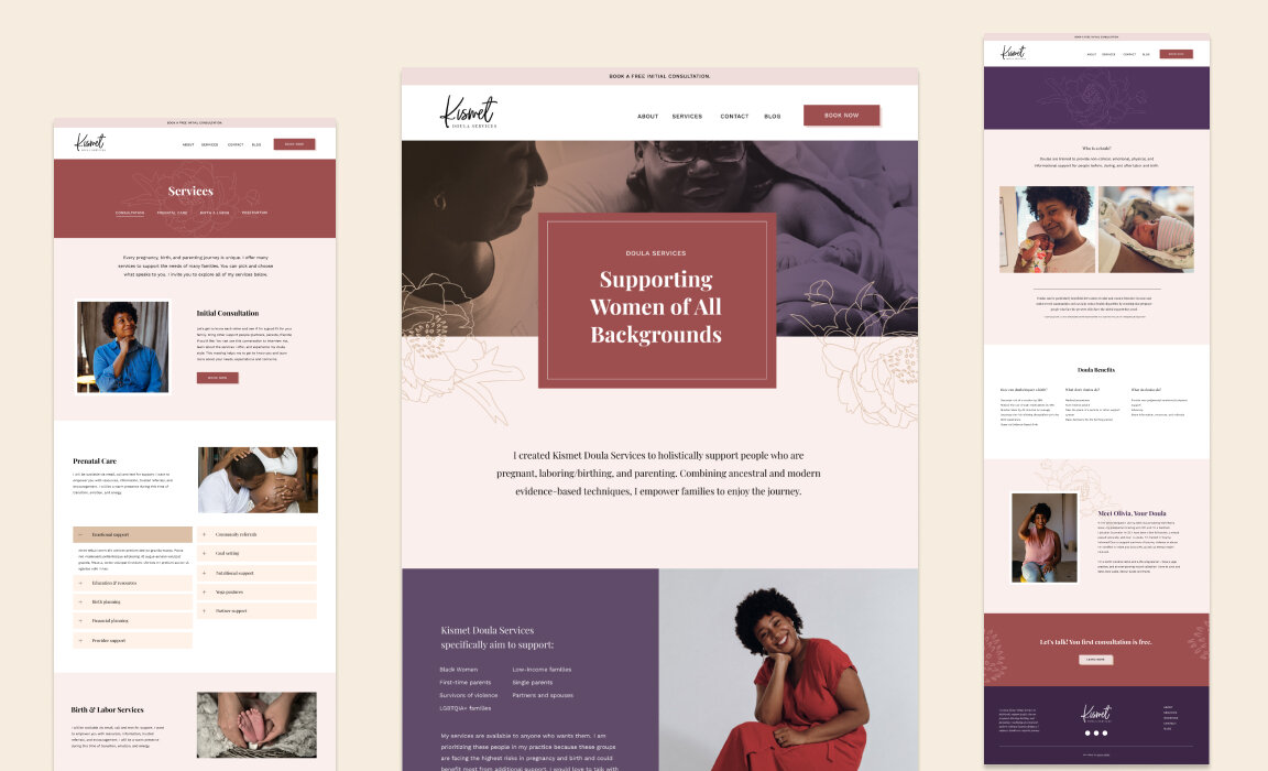
This website is a custom project we did for Kismet Doula services in 2020. Kismet Doula Services is a doula service that wants to holistically support people who are pregnant, laboring/birthing, and parenting in Greater Des Moines, Iowa.
The Squarespace website we created aims to explain doula services and their benefits. Every pregnancy and parenting journey is unique, and Kismet Doula services are customizable and include many options. That is why it was important to give an overview of all the available service packages
For this service-based business, we wanted to establish easy navigation and a friendly-looking design.
The website itself looks very feminine: soft, but contrasting at the same time. It features dark-red and violet color accents combined with floral sketches. The other colors we use are beige and white. All together comes to an elegant result – a website, that aims at the target audience of the services. Take a closer look here.
Simple Sacred Spaces, Holistic Therapy Practice
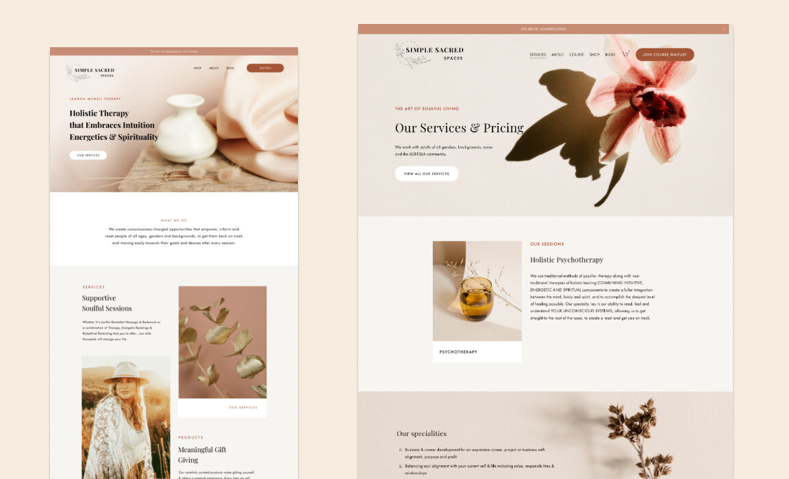
This is another custom project of ours, this time for Simple Sacred Spaces. The founder of this business Leanna McNeil specializes in holistic therapies that embrace intuition energetics & spirituality. She has a practice in East Toukley, Australia, but also consults online worldwide.
A starting point for this website was our Premium Squarespace Template Rosée. We have customized the template to fit the needs of Leanna’s business.
As this is a service-based business, it was important to present all the packages in a convenient way.
The design features a soft feminine color palette, dreamy sunset photography, and botanical illustrations. Take a closer look and read the client’s review here.
Kelsie Herzog, fashion photographer
Squarespace Template: Indie Studio
Kelsie Herzog is a Milwaukee-based fashion and portrait photographer. Her goal as a photographer is to make her subjects feel powerful, beautiful, and confident.
For her professional website, Kelsie went with Squarespace and our Premium template Indie Studio. Indie Studio is a trendy and sophisticated Squarespace 7.1 template for photographers, artists, event planners, and other visual businesses. The pages and their structure are built around visuals so that you can display your work in the best possible light. You can populate this template with your photos or pictures and, generally, you are good to go.
Kelsie does a fine job in customizing the template. She worked on her fun and quirky logo with a professional designer. A professionally created logo means she has it in different sizes and colors with all the variations needed for a website, including a favicon.
Kelsie customized our pre-made collages in Figma with her vivid portrait photography. This made the Indie Studio template look very unique and hers.
She has a passion for bold color schemes in her work and this translated into a website. The colors are a bit muted but very light and vibrant at the same time, they work together really well.
This is a great example of how you can customize a Squarespace Template pre-made for your industry, making it truly your own, without changing much in the template itself. We love Kelsie’s result very much.
Dantus & Co., Wedding Planner
Dantus & Co. Events serves couples planning their weddings in Maryland, Northern Virginia and Washington, D.C. We worked on their website redesign in 2020.
Dantus & Co. provides wedding planning support and it is important that the company's website is easy to navigate, user-friendly, clearly reflects its purpose and values. Moreover, we needed a website that reflected the brand and spoke to the firm’s ideal customer.
We also ensured that the copy on Dantus & Co. Events website paired well with the imagery and design.
The starting point and the overall inspiration for this website was our Squarespace template Hustle&Heart. But in the end it turned out to be a totally custom project. Take a closer look and read the client’s review here.
Country Club Frenchies, elite dog breeder
Country Club Frenchies is an elite French bulldog breeder based in Atlanta, GA. Olga Lazareva, the founder of CCF, came to us with a request to create her first Squarespace website, new brand, and help her with copywriting for the website.
Olga offers top-notch and luxe service for people who care deeply about their pets. Country Club Frenchies takes special pride in breeding the prettiest and healthiest dogs.
At the end of 2021, we started the work on the custom Squarespace website for Country Club Frenchies.
Designwise, we wanted to create the atmosphere of a family-based business whose owners care for their dogs deeply. The website gives the air of a loving pet-friendly home. This mood was achieved through setting up a soft warm color palette, adding frames to pictures, and designing custom graphic elements.
We have made lots of space for images and galleries to show dog photos, professionally taken by brand-photographer Katya Vilchyk.
When putting together website content, we aimed for an appealing copy. To learn the inner workings of the business we interviewed the owner and sent her a few rounds of clarifying questions afterward.
We used elements of the Internet slang DoggoLingo to establish a connection with dog parents by speaking the same language as they do between themselves. Slang adds some fun and liveliness to the website, as it shows that there are real people behind the website and business.
At the same time, we offered clear and understandable instructions on how to reserve and adopt a puppy, described the shipping procedure, and did our best to reply to potential prospects’ questions. Clarity of the copy was our foremost priority since the selling process is more difficult than buying things on Amazon in one click.
As a result, we created a website that immediately started generating leads and selling the puppies from the next available litter. A dog-breeding type of business generally relies heavily on leads as you cannot buy a puppy immediately – they are not always on sale. There are in-between litters periods and waiting lists. It is important to build the lists and communicate effectively with your prospects. Creating a fully-functioning marketing funnel guarantees sales once the puppies are delivered. We are glad that the website proved to be profitable at once.
Dreamy Squarespace Website for a Life Coach
Custom website by Nancy Siegel
This is a website created by our fellow web designer Nancy Siegel. Nancy has created a beautiful feminine Squarespace website for her client Laura Enzor who is a life coach. Laura didn’t have a website when she contacted Nancy as she was only starting out her coaching business. Together they created a brand and a website that Laura feels represents her and speaks to her ideal clients.
Nancy did a great job encorporating the feaures needed for a coaching business, for example it is easy to make appointments as well as buy packages. She has also created opt-in pdfs in form of freebies to build a solid email list. Nancy has also designed Instagram templates for her client.
It is our pleasure to mention that Nancy at one point was a listener of our Squarespace Mastery course.
Eye-Catching Squarespace Website for a Financial Coach
Squarespace Template: Lora
Marjolein is a financial coach that helps young women take charge of their finances. She uses our Squarespace template Lora, which is a sound choice for digital consultancies like hers.
Marjolein makes maximum use of split sections layout to present herself and her business. She changes Lora’s signature deep yellow to a softer paler tone and adds many bright and light-colored photographs that suit the overall palette of the website. The lemony colors feel fresh and energizing. She stylizes images of her blog and her Instagram feed in the same colors and fonts as her website, which gives her business an overall neat, put-together look.
We like the way she uses her photos very much. She took her own photos, which gives her website a very intimate, personalized look. After visiting the website, it feels like you’ve met Marjolein more in person, rather than digitally.
Read our interview with Marjolein about her website launch.
Well-Balanced Squarespace Website for a Yoga Teacher
Squarespace Template: Boho Social
Briana Jenkins is a certified Mental Health Peer Specialist and a yoga teacher. For her website, she chooses our template Boho Social, and God, she makes the most out of it.
From the website's original color palette she decides to concentrate on deep yellow, taupe, and white. She throws the green into the equation by adding photos of herself in lush vegetation. She also uses photos of the greenery for some sections’ backgrounds, instead of using a color background. Those photos really compliment the design and vice versa.
As always, a photo session does the job of making a website look really good. We advise you to take Briana’s example and treat yourself to a photoshoot. Your photos will be in tune with each other, as they will be in the same style, with a thought-through concept, and can be easily edited to look the same way.
While looking at Briana’s website and did you notice the little illustrations around? Four angled stars and dashed circles look like magic effects. We explain how to edit your photos to have illustrations on them in the design tool Figma in our tutorials for the Boho Social template.
Aesthetic Squarespace Website for a Wedding Photographer
Squarespace Template: Hustle&Heart
Jolene Barker is a lifestyle and wedding photographer based in Canada. Her website is our Hustle&Heart Squarespace template put to work.
Jolene makes good use of overlay images and collages, which are truly the heart of this template. Her website is full of attention-grabbing pictures on every page, which gives her the opportunity to showcase her work to potential customers.
Muted but deep color palette gives the website a high-end professional look. White and light pink with a beige tint remind us of the solemnity of a wedding ceremony.
Attractive Squarespace Website for a PR and Digital Marketing Agency
Squarespace Template: Rosée
Fox+Fleur is a Melbourne collective of PR, marketing, branding, and design pros with creative prowess. Their number 1 objective is to ensure their clients’ brand’s voices are heard above the noise.
Fox+Fleur had already had a Squarespace 7.0 website but wanted to redesign it. For their website refurbishment, they went with our premium Squarespace template Rosée that we have in our shop in both Squarespace 7.0 and 7.1 versions.
Fox+Fleur did a fine job of customizing the Rosée template for their business needs. They leveraged the layouts of the original template filling sections with their content – copy, and photography. Alternating stack images design that is a hallmark of the Rosée template works well for representing the agency’s services and highlighting the expertise.
The website itself is generally quite neutral in terms of colors – white&gray – but it has numerous accents in different shades of pink, culminating in a bubblegum pink footer at the end of the page.
Templates original font pair Playfair display and Futura PT suited Fow+Fleur’s brand.
This soft and modern design with a little bit of edge is definitely attractive to their potential clients and target audience.
Feminine Squarespace Website for Brand Photographer
Katya Vilchyk is an Atlanta-based photographer and brand strategist. She helps women feel confident when they show up and grow a business they love.
We met Katya when she was transitioning from family to branding photography (she currently does both!). She pivoted her business during the pandemic and was getting ready to add courses, workshops, and coaching to her business.
For her new Squarespace website, Katya chose our Indie Studio template. We reworked the template to fit her new branding.
We kept the original monochromatic look of the template for a multi-layer effect, added swooshes of paint for background graphics, and created image collages using Katya’s brand photos.
The result is a peach and feminine website that shows Katya’s vibe - warm, friendly, and easy-going. Take a closer look.
Squarespace Website Glow Up for Wedding Planner
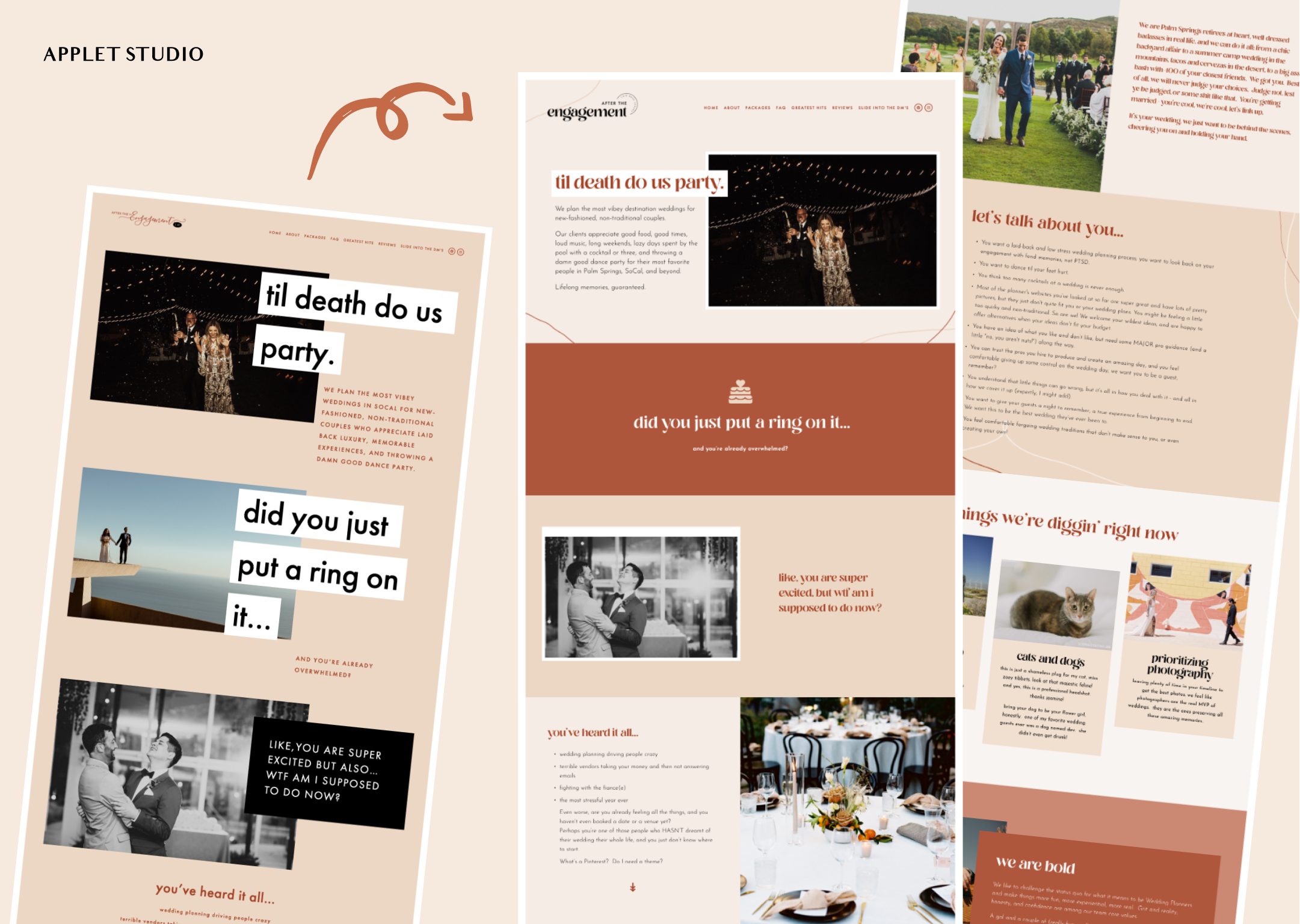
Courtney Tibbets of After the Engagement came to us with a special request. She had an existing Squarespace website that was actively bringing her leads. Her copy was effective but she wanted the design to be more polished and sleek. She also wasn’t sure if she wanted to switch templates.
Courtney runs a successful wedding planning business (100+ positive reviews on WeddingWire and 450+ weddings under her belt). Her copywriting makes you read every last letter on the website - it’s like a dance party! Her website is bursting with personality due to clever words and engaging imagery.
We wanted to give her website a facelift without disturbing her business as the website is actively booking clients.
Our solution was to gently polish the design while keeping all copywriting and images in place. Courtney wanted to slightly update the logo and the look and feel of the website while keeping the vibe.
We used her existing brand colors and tweaked fonts. For the main headline font, we chose Losta Masta – a playful serif font with a slightly retro feel. For the paragraph font, we chose Josefin Sans - a free Google font with geometric and vintage feeling. We also created a wordmark logo using the fonts.
As copywriting takes the central stage on the After the Engagement website, our job was to make the text more readable and more easily digestible. So we re-worked some of the pages’ sections to break down huge amounts of text into several parts.
We also added wiggled line elements to the branding and used it throughout the website to spice up the layouts. Take a closer look.
The best part – we did all of the changes totally behind the scenes without messing with the website’s regular work!
Reassuring Squarespace Website for a Childcare Service
Squarespace Template: Boho Social
Harmony Baby Concierge is a childcare agency that specializes in giving care to newborn babies and comfort to their families. Their goal is to leave parents feeling confident about their parenting skills, with balance and harmony for the whole family.
For their website, Harmony Baby Concierge restyled our Squarespace template Boho Social to fit their business needs.
The website’s color palette is very comforting and relaxing. To achieve the warm and approachable feel HBC used greyish beige, brown, and orange. These colors project confidence but also friendliness and reassurance much needed by the new parents. The website feels like a warm hug and a pat on the back.
The lightweight and breezy grid of the template gives the website a professional vibe.
HBC customized lovely floral sketches for CTAs and decorative elements that suit their business so well.
To make the website really stand out, HBC leveraged the template’s overlap images that take the first screen of several pages. They added high-quality pictures of caregivers with babies alongside comforting headlines.
Special attention goes to the ‘Our Team’ page which is done the best possible way. Every caregiver on the team has her own picture, name, and professional qualifications listed, to foster trust and connect with families on an emotional level.
Minimal Squarespace Website for a Handmade Skincare Brand
Squarespace Template: Pink&Navy (No longer availible)
Sugr Salt is a handmade skincare brand from Florida. For their new website, they chose our Squarespace Template Pink&Navy.
Pink&Navy template works great for any e-commerce business and this skincare shop is a great example of template’s customization. Sugr Salt uploaded their photos and products to the shop without the need to change the design. The result is a clean and minimal website that represents their business well and helps them grow their sales.
The homepage gallery pictures are stunning representations of beautiful and healthy skin.
Soft and Feminine Squarespace Website for a Digital Planner Business
Squarespace Template: Lemongrass
The Pink Ink helps clients create digital planners to simplify their lives and scale their businesses. It is also on a mission to support creatives with solution-based digital planning products.
The Pink Ink website is a great example of a Premium Squarespace Template customization. In this case, it is our template Lemongrass. This Squarespace template works great for coaches, course creators, podcasters & bloggers. We are glad that The Pink Ink’s founder Shay chose the template that suits her business so well.
The Pink Ink’s business is very versatile. Shay needed her website to host her courses, webinars, freebies, shop, blog, and more. Shay ended up using almost all the Lemongrass pre-made pages and leveraged its numerous layouts.
Shay went along with the general direction of the original color scheme of the template. In Lemongrass, we use light pink/peach and turquoise accents. Shay changed the hues, where she needed, and the template really started looking like her own. We bet it made the customization process so much easier.
For the split sections and other imagery, she chose beautiful pastel watercolors, delicate flowers, stationery, and workstations.
Authentic Squarespace Website for a Design Studio
Squarespace Template: Lora
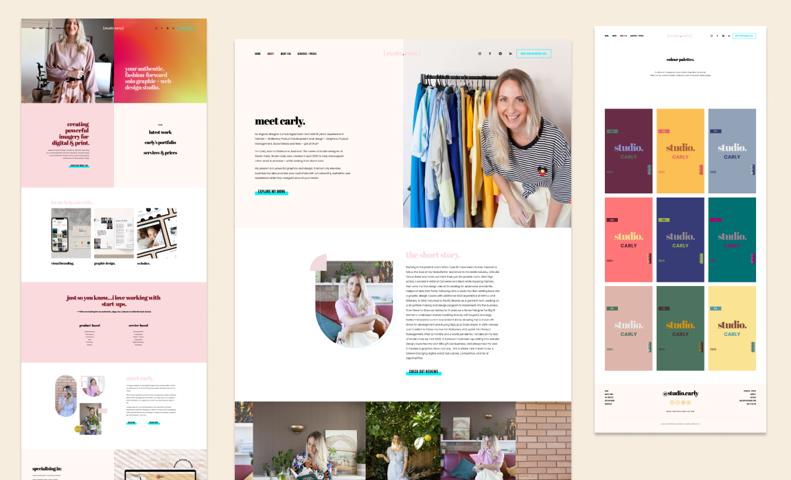
Carly is the owner and solo designer at Studio Carly in Melbourne, Australia. She created her studio in April 2020 to support other small businesses. She wants to help them look their best.
For her professional website, Carly went with Squarespace and our template Lora. This is a very trendy and modern template, the vibe Carly was looking for.
Dynamic split layouts and geometric shapes of the template give the possibility to break away from the Squarespace default design. Carly leveraged the power of the split sections on her website. To make them really stand out she loaded the sections with personal video and photo content. She also added a textured gradient with a moving ripple-like effect, that created a modern and technology-driven atmosphere.
Carly uses many bold color accents, which seems risky at first. But she knows how to work them because she professionally works with visuals and web design. The result – authentic, edgy, and fresh website – like nothing else.
Carly used all the features template could give and added playful elements like arch crops to make her design truly unique. She also created Instagram highlights with the same colors and typography she has on her website, which is great for the visual cohesion of her brand.
Amiable Squarespace Website for a Doggy Lifestyle Brand
Squarespace Template: Hustle&Heart
Geraldine and Nicole are two friends, who started a business together when their careers in events and sports took a major pivot in 2020 as a result of COVID-19. When they found themselves with more time to create things they loved, they started a business they had been dreaming about for a long time. Making things dogs love makes their days more fulfilling.
For their website, the two Canadian friends started with Squarespace and our template Hustle&Heart. The website had to host their shop of homemade dog goods, describe their services, and be home to their blog. The template they choose fulfills all these needs.
Geraldine and Nicole leveraged the image space of the template. They put lots of dogs on display making the pups the true stars of the show. This canine focus makes the website very sweet and friendly.
The neutral color scheme plays along with the nonchalant atmosphere of the website. The tones are soft and mild. Geraldine and Nicole swapped the greenery background images of the template for an abstract design that supports the general amiable mood.
Dynamic Squarespace Website for a Sports Trainer
Squarespace Template: Lemongrass
Gabrielle is passionate about her clients’ physical and spiritual well-being. She teaches how to build stronger bodies from the inside out with exercise and natural remedies.
Gabrielle has chosen our template Lemongrass for her website Gabbiathletics, because it suits her needs. For example, she has a podcast, and our template already has a page that is built specifically to fit the needs of podcast creators.
As Gabbie works in the sports industry, she added a lot of great portraits of herself in sportswear, as well as photos of her clients. These are not photoshopped pictures of sports models, these are photos of the real-life women that use Gabrielle’s services. The pictures depict true bodies and proclaim self-love. They make this website very authentic.
Dynamic Squarespace Website for a Sports Trainer
Squarespace Template: Boho Social
Summer Alvarez runs the skincare and makeup business in Arizona and teaches women how to find success in business and on social media.
The Squarespace website template of her choice is Boho Social from our shop. You may not recognize it at first glance because Summer drastically changed the color palette to suit her brand. It is now mostly pink, white, and grey with just a touch of aquamarine blue. Looks very vibrant and girly!
On the second look, you will totally see the layouts and graphic elements of the Boho Social.
Summer didn’t change the structure of the pages that much, she just filled the website with her copy and images. And this is the best way to customize a Squarespace template because everything is already thought through by a Squarespace designer for you.
Summer has definitely watched Boho Social template tutorials and maybe even the Squarespace Mastery course. She learned how to customize graphic elements on her photos and refreshed them with diamond and other geometrical shapes.
We like how Summer leverages the rubrication of the blog by swapping the photos. It makes her blog very personal without that much effort.
This is a great example of a Squarespace website for a makeup artist and skin care professional.
Magnetizing Squarespace Website for a Meditation Coach
Squarespace Template: Lemongrass
The Soul Sage Collective founder Racquel González is based in Santo Domingo, Dominican Republic. She is a meditation coach and modern mystic who helps others reach their potential and reconnect with themselves through spiritual practices. She teaches her clients awareness through energy healing, tarot reading, and mediation practices.
To connect with her target audience Racquel needed a website. She chose to build it with Squarespace and our premium template Lemongrass. Lemongrass is a versatile Squarespace 7.1 template for coaches, course creators, podcasters & bloggers. Racquel is on a coaching mission and she has a Soul Training online course, so our template had suitable pages and essential layouts for her business.
Racquell skillfully filled the Lemongrass pages with her content. She wrote a precise amount of copy to fit the pages and used many layouts.
She filled the website with topic-related images: crystals, tarot cards, breathwork, essential oils, yoga poses, singing bowls, incense, as well as beautiful portraits of herself. The images work great as part of alternating split sections, especially when she lists her services.
The website enchants with its color pallet: different hues of lavender and violet calm the eyes, while the white gives lots of room for air. Racquel also added several gradient patterns, for example, the background of the footer.
She has recolored the graphic elements for her collages into lavender to fit the website’s color palette. And swapped template’s icons to little stars to match the website’s magical mood.
Romantic Squarespace Website for Enneagram Coaching Brand
Jen Meeks of Pursuing Conscious Living is a certified Enneagram Coach – she helps individuals and corporate teams reach new heights by facilitating personal growth.
“To my surprise and delight, over the last couple of years, Pursuing Conscious Living has grown into an official business. I’m living with even more intention and purpose by working with others as a coach, speaker, and facilitator”, says Jen.
It was time for her work to be reflected officially online, so she decided to re-design her website.
Jen chose our Rosée template as a base for her custom website. The template features feminine visuals and a monochromatic, calm palette. We reworked the template to fit Jen Meeks’ branding and helped her with the copywriting strategy. We kept her existing branding but added swooshes of gold paint and more shades of her core brand colors to the palette. With gorgeous photos from Katya Vilchyk Photography, the project came to life.
Comment which website did you like the most in the section below
We have linked all the Squarespace templates in this article in case you want to check them out. Each template has a demo version to walk around and have a full experience of using the website. We’ll be glad to see you in our shop, or in our inbox requesting the custom websites.
If you want to DIY your Squarespace website but you are lacking design and Squarespace skills, we have a web design course for you. Squarespace Mastery is a Web Design 101 class that teaches how to design a website from scratch using an easy-to-implement template system & creative process (no extra tech skills required)!
Frequently Asked Questions
Do I need to hire a designer to customize a Squarespace template or can I do it myself?
You absolutely can DIY your Squarespace website with one of the templates. Check out our Showcase blog where our customers customized Squarespace templates from our shop themselves. That said, hiring a designer helps when you want deeper customization (animations, code snippets, complex layout changes). Check out our Squarespace customization services on this page.
Can the templates shown work for all types of businesses (e‑commerce, service, membership, etc.)?
Yes — the beauty of Squarespace and the templates in our showcase is flexibility. For example:
Service‑based businesses (coaches, therapists) benefit from long‑scroll pages, clear CTAs, and booking integrations.
E‑commerce or product‑based businesses can use shop pages, galleries, and strong visuals.
Memberships or content creators can combine blog/newsletter features, landing pages, and community elements.
The key is matching the template’s structure + functionality to your business model and customizing accordingly.
I’m already using a Squarespace site — can I switch templates without losing everything?
The answer is both yes and no. In Squarespace (and similar platforms like Wix), templates aren’t standalone themes that you can swap in and out. Instead, they’re fully customized websites that exist separately in your account. You can have multiple sites in your account, but you can’t just switch templates automatically. However, there are workarounds. We have a blog post that explains the process of switching Squarespace templates.


