Podcaster Websites on Squarespace for Your Inspiration
Stylish podcast website examples, built on Squarespace!
Podcasts are a great way to share your thoughts and insights with the world, and they have evolved into a powerful marketing and brand awareness tool.
If you want to set up an engaging and stylish podcasting website, Squarespace is the perfect ally for you. With its key features, you’ll be able to create and manage a seamless podcast website very fast.
We’ve gathered some amazing examples to inspire you. Take a look at how these podcasts found a home with Squarespace.
Ebb and Glow with Jenelle Tremblett
The Ebb and Glow website was built using our premium Squarespace 7.1 template Lemongrass, designed specifically with podcasters’ needs in mind. Jenelle refurbished the original template’s feel and made it look her own with beautiful light blue backgrounds and accent dusty pink details. She leveraged Squarespace’s promotional popup feature to immediately lead visitors to her latest episode, and she reused the blog to organize her entire collection in an innovative way. When checking out her website, you'll notice a stunning full-bleed Instagram block and a comprehensive footer that has a lot of information, but still is very clean and organized.
Forever35 with Doree Shafrir and Kate Spencer
The Forever32 is Squarespace 7.0 website that features huge headlines, trendy and clear typography, and a clean footer with all the relevant info. It’s a neat and feminine site that hosts each podcast episode as a blog post and includes eye-catching buttons linking to Apple Podcasts and Spotify. Visitors can listen to the most recent episode right on the homepage thanks to an embedded audio player.
Re:considering with Meredith Black, Bob Baxley, and Aarron Walter
The first thing you see when visiting the Re:considering website is an illustrated full-bleed section showcasing a host of buttons to listen to the podcast on different streaming platforms. The episodes are styled in a blog grid and include pictures of guests in black and white, providing consistency across the entire website. Each episode is a blog post with a smart layout: it is divided into two columns with an image and embedded audio on the left and the episode description and transcript on the right.
The Hustle Sanely Podcast with Jessica Massey
Jessica Massey has a very versatile business – she has courses, shop, memberships and so much more. That is why she has a very multi-purposed website. Design-wise, she has two blogs on her website, one has her podcast episodes, and another one holds her regular blog entries. Her podcast page features a captivating hero section with buttons and her portrait. She uses a carousel summary block to display the episodes and adds some basic information about herself on the page.
The Things We Didn’t Do by Elise Danielle
Elise Danielle is a coach who also has a podcast on her website because podcasts can drive a lot of business opportunities her way. On her podcast page, she uses full-bleed images with overlaying text on the hero section and showcases her podcast episodes in a summary section as blog posts. On each episode’s page, you’ll find an embedded audio player with an episode and a full transcript, as well as a lovely sidebar she added using a plugin.
The Refined Collective Podcast with Kat Harris
Kat Harris included a list of her most recent episodes on the homepage of her website using a summary block. Her podcast has a separate page featuring large images, a split section, and a terracotta color palette, along with well-placed buttons to guide her audience to their favorite streaming platform.
Congratulations with Chris D’Elia
The website for the Congratulations podcast is very uncluttered and up to the point. It includes a large embedded audio player with all the podcast episodes for people to listen to as soon as they land on the website, as well as large headings with clear typography and CTAs.
The NewsWorthy with Erica Mandy
The NewsWorthy is a podcast by an experienced broadcast journalist Erica Mandy. Her website is fresh and clean, and it combines a white, blue, and bright green color scheme with large, striking images. At the bottom, you can find an embedded audio player to listen to the podcast and an Instagram carousel block showcasing The NewsWorthy’s latest posts.
Twenty Thousand Hertz with Dallas Taylor
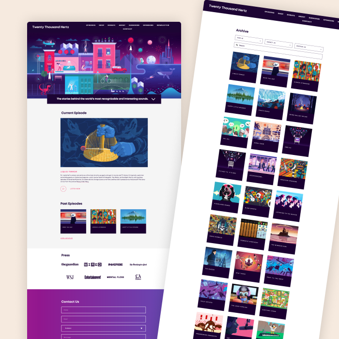
The website for the Twenty Thousand Hertz podcast welcomes visitors with a visually stunning and colorful hero section, followed by a short recap of their latest release and a summary block showing previous episodes — which are organized as blog posts on the website. It’s packed with amazing illustrations and it even has a built-in shop to purchase merch.
The Friday Habit with Benjamin Manley and Mark Labriola
The Friday Habit website offers visitors a seamless browsing experience, with a hero section that subtly leads them to the “Listen to the podcast” button. By its structure, the home page is a long-scroll sales page. The website has an invigorating color palette where vivid yellow contrasts with dark blue. The latest episode is featured in the embedded audio player, while previous episodes are styled as a grid summary block on the homepage.
Work in Progress with Sophia Bush
American actress Sophia Bush also has her podcast website built with Squarespace. The website for the Work in Progress podcast is clean and monochromatic, but it doesn’t fail to catch your attention. It features large titles in a fancy font and a host of buttons leading visitors to the podcast on different platforms, as well as Squarespace’s newest scrolling blocks with CTAs. It also includes a built-in store with podcast merch so that visitors can get a nice t-shirt or hoodie.
The Influencer Podcast with Julie Solomon
Julie Solomon’s website has a dedicated page for her podcast which features overlaying text and a large, subtly animated image in the hero section, followed by a brief presentation of her podcast in prominent typography. She also included a carousel summary block to showcase her podcast episodes both on the page itself and in the footer, so you can’t miss it!
WorkParty with Jaclyn Johnson
The WorkParty website features a lavish logo and an overall clean look in a bright pink color scheme. WorkParty has leveraged Squarespace’s audio block to share their latest release on their homepage while showcasing other episodes as blog posts. Each blog post includes some information on the episode and an embedded audio player to listen to it. Below that, you’ll find a blog grid highlighting other episodes.
The Freedom Babe with Kelly Marcyniuk
Kelly Marcyniuk’s website features a separate page for her podcast with a clean hero section packed with pictures, soft colors, and elegant animations. Kelly has placed large button blocks in all the right places to gently nudge her visitors to their favorite streaming platforms, and she highlights her episodes in a well-structured blog grid.
Chakra Girl Radio with Amber-Lee Lyons
The podcast section of Amber-Lee Lyons’s website presents visitors with a sophisticated design made up of large images, relevant quotes, and muted colors. Podcast episodes are styled in an animated blog grid, with an embedded audio player, big CTAs, and even a comment section on each episode’s page.
Jar Audio Podcast Production
The Jar Audio website is designed to immediately catch visitors’ attention with its futuristic looks created by a combination of layouts, trendy fonts and neon-blue color accents. The homepage highlights the podcasts produced by the company with a carousel summary block, followed by testimonials and a massive footer. It also makes the most of Squarespace’s form blocks to offer visitors a freebie in exchange for their emails.
The Freelance Fix with Rossana
Rossana’s website features a dedicated page for her podcast, which is structured as a blog. Each episode page is organized in two columns: on the left, it features a Pinterest image, and on the right, you’ll find a customized audio block to listen to the podcast. Also, as Squarespace allows for more than one blog, Rossana has an actual blog on her website to share valuable insights.
The BrandWell Podcast with Victoria
With an eye-catching hero section packed with muted images and well-placed buttons, the BrandWell podcast page is a great example of how to use Squarespace for podcasting. Victoria organizes episodes with the help of basic greed layout on her blog page. There is an embedded audio player on each episode's page. It also includes clear CTAs and a nice image carousel in the footer linking to Instagram.
Recovering From Reality with Alexis Haines
The page for the Recovering From Reality podcast includes earthy tones, overlaying images, and large quotes. Episodes are showcased in a blog grid, with black-and-white pictures of her guests that provide a sense of consistency across the whole website. At the bottom, it includes a massive footer with an Instagram carousel section and a newsletter block inviting visitors to subscribe to the newsletter.
The Work Well Podcast with Brian Crooke
The Work Well podcast provides that “wow” factor as soon as you land on their homepage. With huge typography, bright colors, and a parallax, this website showcases content in an engaging and fun way. The homepage has summary blocks to highlight recent episodes and well-known guests, and also has testimonials.
Rethinking Development
The Rethinking Development website has a clean, animated hero section with lovely illustrations. It leverages many of Squarespace’s features for podcasters: carousel summary blocks to call attention to their episodes, newsletter sections, image grids, and button blocks to link to streaming platforms.
Armchair Expert with Dax Shepard
The Armchair Expert website clearly conveys the show’s vision of celebrating the messiness of being human with striking colors and cluttered sections. It includes an embedded audio player with all the episodes, an Instagram block with their latest posts, and a Twitter block sharing their most recent tweets. Also, visitors can purchase merchandise directly on the website with its built-in store.
Secure The Seat by Minda Harts
Minda Harts’s website is colorful, cheeky, and optimistic. While charged with animations, images, and bright tones, it doesn’t feel cluttered at all. On the homepage, Minda included a section dedicated to her podcast, with an embedded audio player and an elegant CTA.
Crackdown with Garth Mullins
The Crackdown website is monochromatic and clean, but it does a great job at engaging visitors: it makes the most of Squarespace’s audio blocks by placing one right on the hero section, along with buttons to subscribe to their podcast or donate to their cause.
Campside
Campaside Media’s website goes straight to the point – Episodes are showcased as pictures that turn into short summaries once you hover over them, which adds a nice touch to the overall vibe of the website. Their media section is also worth noting: it features incredibly engaging animations that are impossible to ignore.
Creative Workshop Series for Squarespace
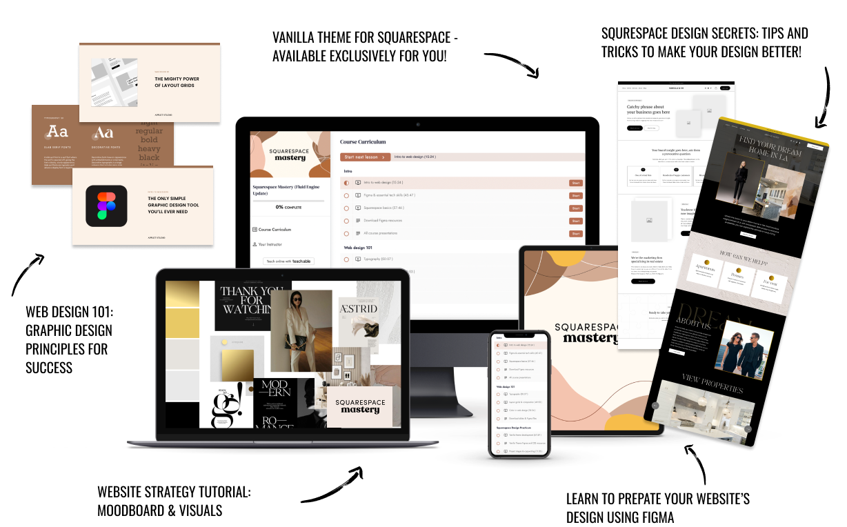
The workshop is jam-packed with design goodness. Inside, you’ll find the following topics:
What size should I design for? Responsive layouts and industry standards
Typography 101: How fonts can elevate your design & look professional
My approach to using colors in web design
Complete Figma tutorial
How to use layout grids to direct the attention of your website visitors
How to create a mood board and plan your website visuals
Squarespace Vanilla theme build-out: Complete walk-through, CSS snippets and Figma wireframe
Massive Squarespace design practicum: We go from a mood board to a finished design on Squarespace in a matter of an hour. Two designs included along with CSS plugins and Figma templates
Redesign 2 real websites with me in real time
How to grow as a designer and how to look for creative inspiration
Plus, there are some really helpful documents included: Complete Squarespace development checklist, copywriting and branding guides, sample client questionnaire and so much more!


