25 Inspirational Squarespace Websites for Wellness Niche
Top stylish health and wellness Squarespace websites
We live in a fast-paced world that is driving more and more people to engage in activities to improve their well-being and find their peace of mind. To tap into that audience and expand your reach, your wellness business needs a seamless website that can attract visitors and get them to convert.
Luckily, Squarespace offers fantastic features to make your wellness website pop. In this article, we’ve compiled a list of the top 25 most inspiring Squarespace websites from wellness brands so you can draw inspiration for your own.
Before we dive into the examples of the published websites, let us show you our new Squarespace Templates for wellness niche – Balance, Live Love, and Nourish. Maybe this is just what you were looking for to build your website.
LiveLove – Squarespace Template for Holistic Practitioners
The LiveLove Squarespace Template features a serene, modern design with a clean layout that can highlight your offerings. It includes easy navigation to classes, memberships, and pricing. The site uses soft, calming tones that align with the yoga theme, creating a welcoming atmosphere. Features like testimonials and detailed class descriptions make it easy to explore options. This user-friendly design reflects a balance between professionalism and warmth, enhancing the visitor experience.
Balance – Squarespace Template for Yoga Instructors
The Balance Squarespace Template blends soft tones and spacious layouts to reflect a focus on mindfulness and balance. It has engaging calls to action, detailed service sections, and a clean navigation menu leading to programs, retreats, and blog posts. Imagea and concise copy emphasize a holistic approach to well-being, while testimonials and instructor highlights add a personal touch. This friendly design is ideal for attracting wellness-focused audiences.
Nourish – Squarespace Template for Nutritionists
The Nourish Squarespace template is a flexible and user-friendly design tailored for nutritionists, therapists, and coaches aiming to sell their services online. The template features bold typography with big spacy headlines and modern layouts based on the irregular grid. Green and red bursts of color on a beige background together with numerous placeholders for your imagery will make your website a sanctuary of all things healthy for your clients.
Karma Yoga
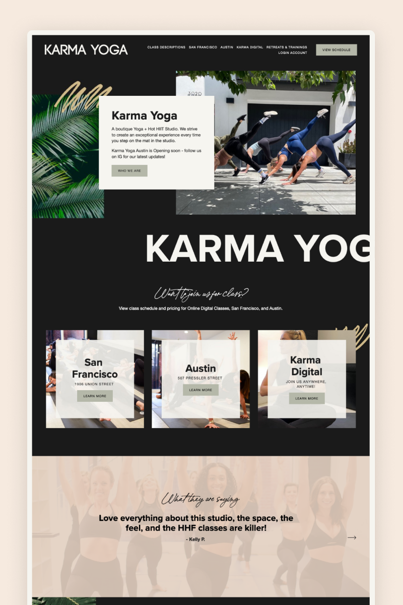
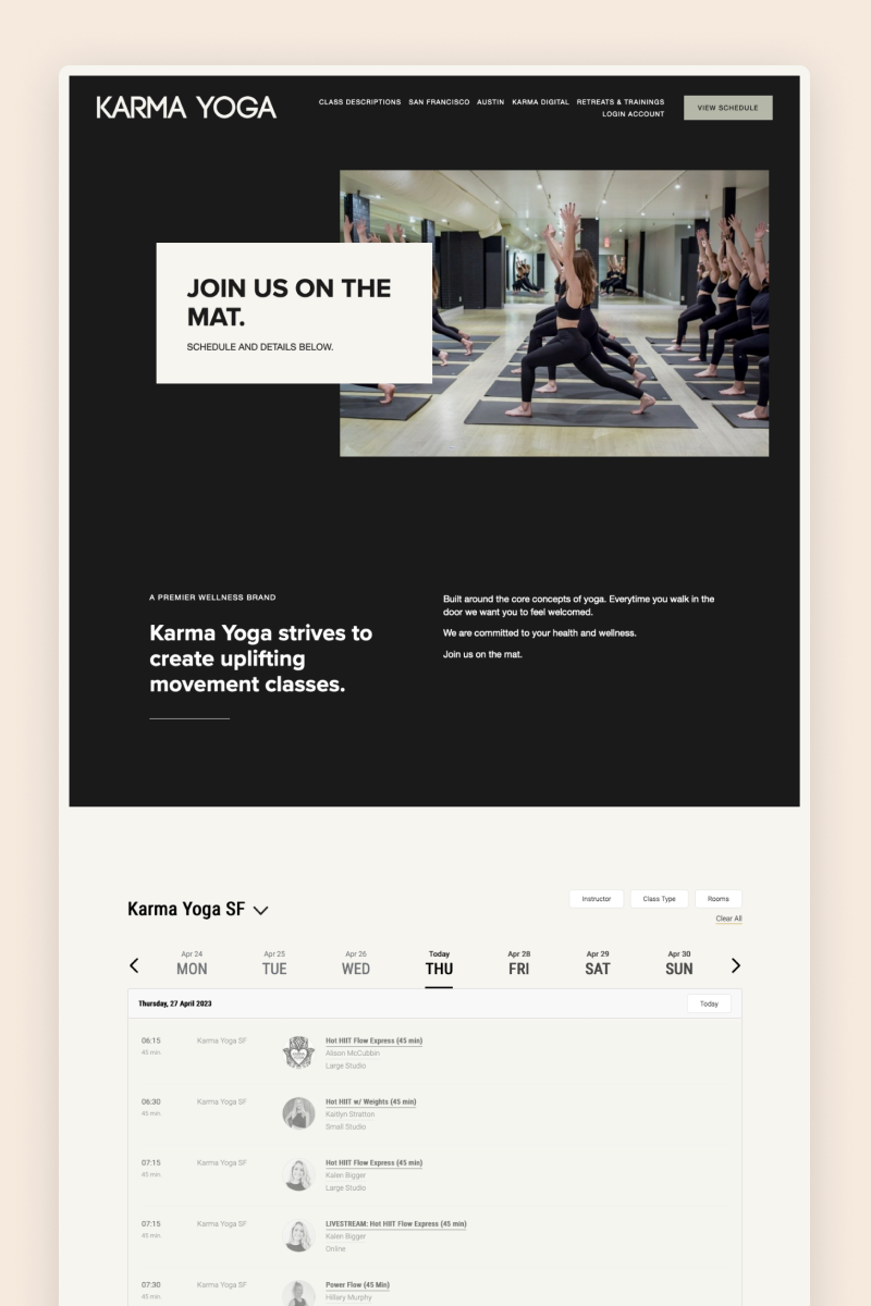
Karma Yoga's website boasts a visually striking design that immediately captures your attention. The website uses subtle animations to make the browsing experience more dynamic and leverages Squarespace’s Instagram and newsletter blocks to further engage visitors.
Its color palette is bold and contrasting, with a black background and shades of gold and muted pink, creating an energetic and vibrant atmosphere. The result is a website that perfectly embodies the spirit of the yoga studio.
MASAJ
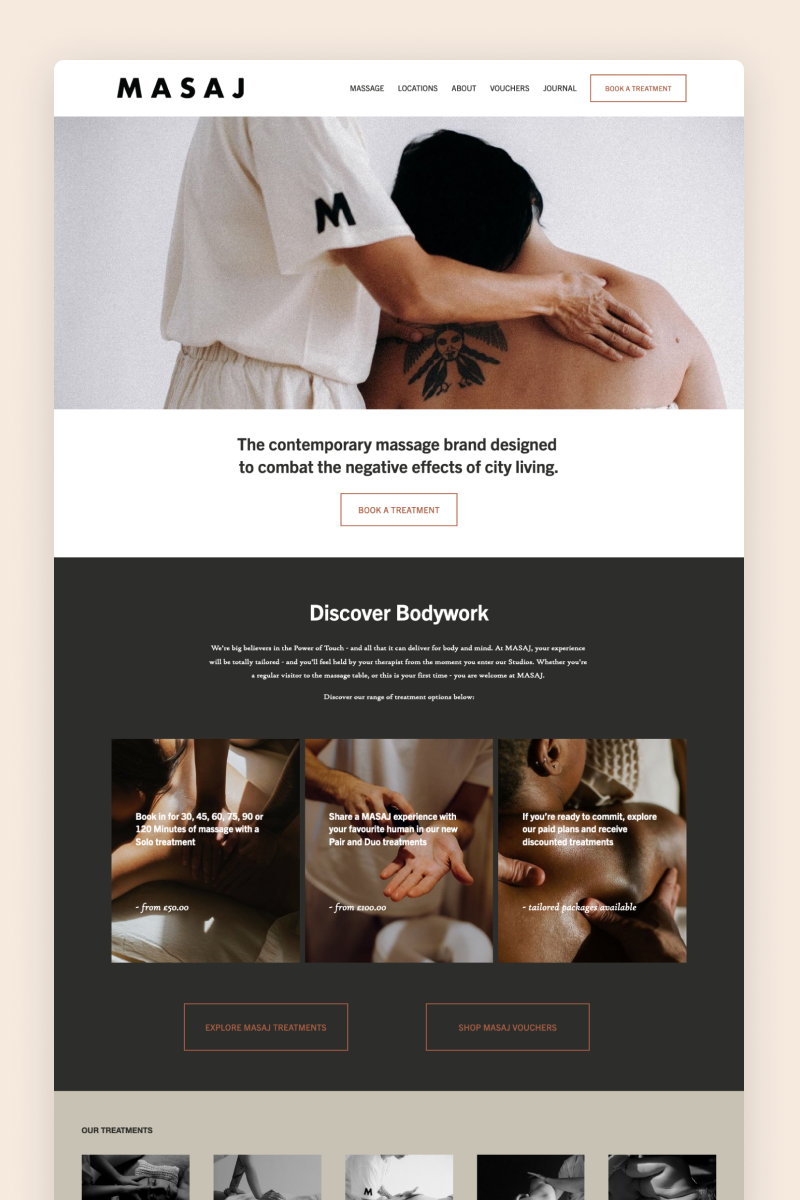
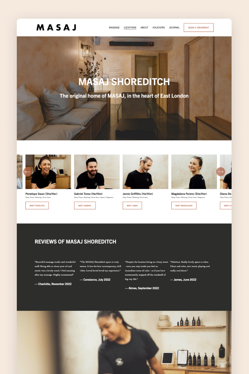
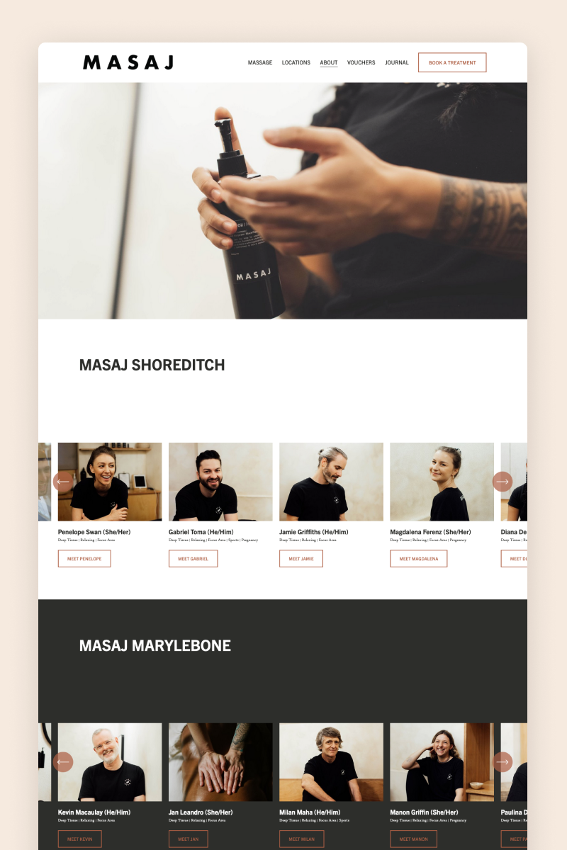
The website for MASAJ is a stunning showcase of minimalist design for a massage studio. The color palette has a muted grey and white scheme combined with touches of terracotta, creating a clean and sophisticated look. These features blend into a website that exudes understated luxury and perfectly aligns with MASAJ’s refined aesthetic.
MASAJ’s website leverages Squarespace’s summary blocks to briefly showcase its services and a gallery block to boast its media presence.
Longevity
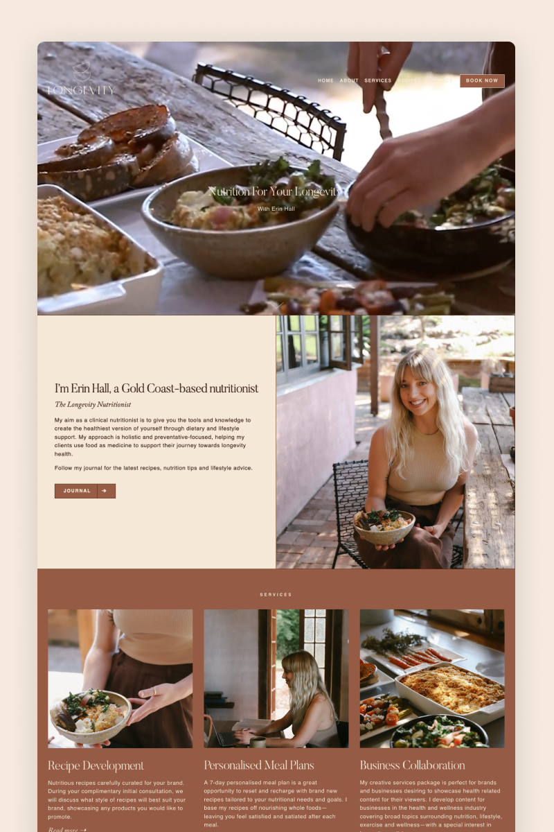
The website for Longevity welcomes visitors with a video-based hero section that immediately catches their attention. The color palette is dominated by earthy tones, creating a calming and refreshing atmosphere and perfectly reflecting the business's focus on health and wellness.
To grow the business’s mailing list, the website displays an offer for a free ebook using Squarespace’s pop-up feature. The website also leverages its e-commerce capabilities to sell personalized meal plans.
Alice Mackintosh
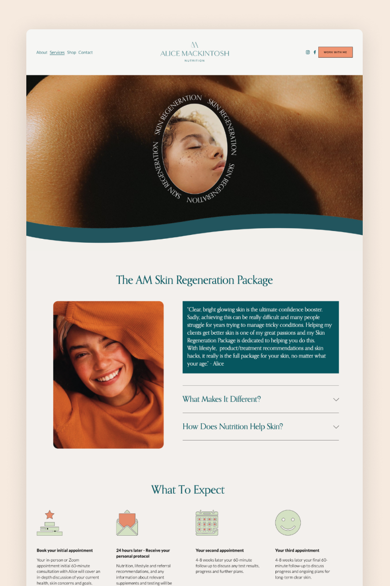
Alice Mackintosh's website features a simple but stunning design fit for a nutritionist. It begins with a split hero section and a soothing blend of beige and green, creating a warm and welcoming atmosphere. The website also plays around with shapes, featuring rounded images and square, outlined banners that add a touch of boldness to the design.
One of its most striking features is the use of a gallery reel to showcase the business’s media appearances, which makes the design a lot more dynamic.
Adele D. Yoga & Movement
The website for Adele D. Yoga & Movement has a clean, inviting design that aligns with its focus on yoga and mindfulness. It uses a modern, airy layout with calming colors and spacious sections. Adele shares inspiring images and puts emphasis on personal connection.
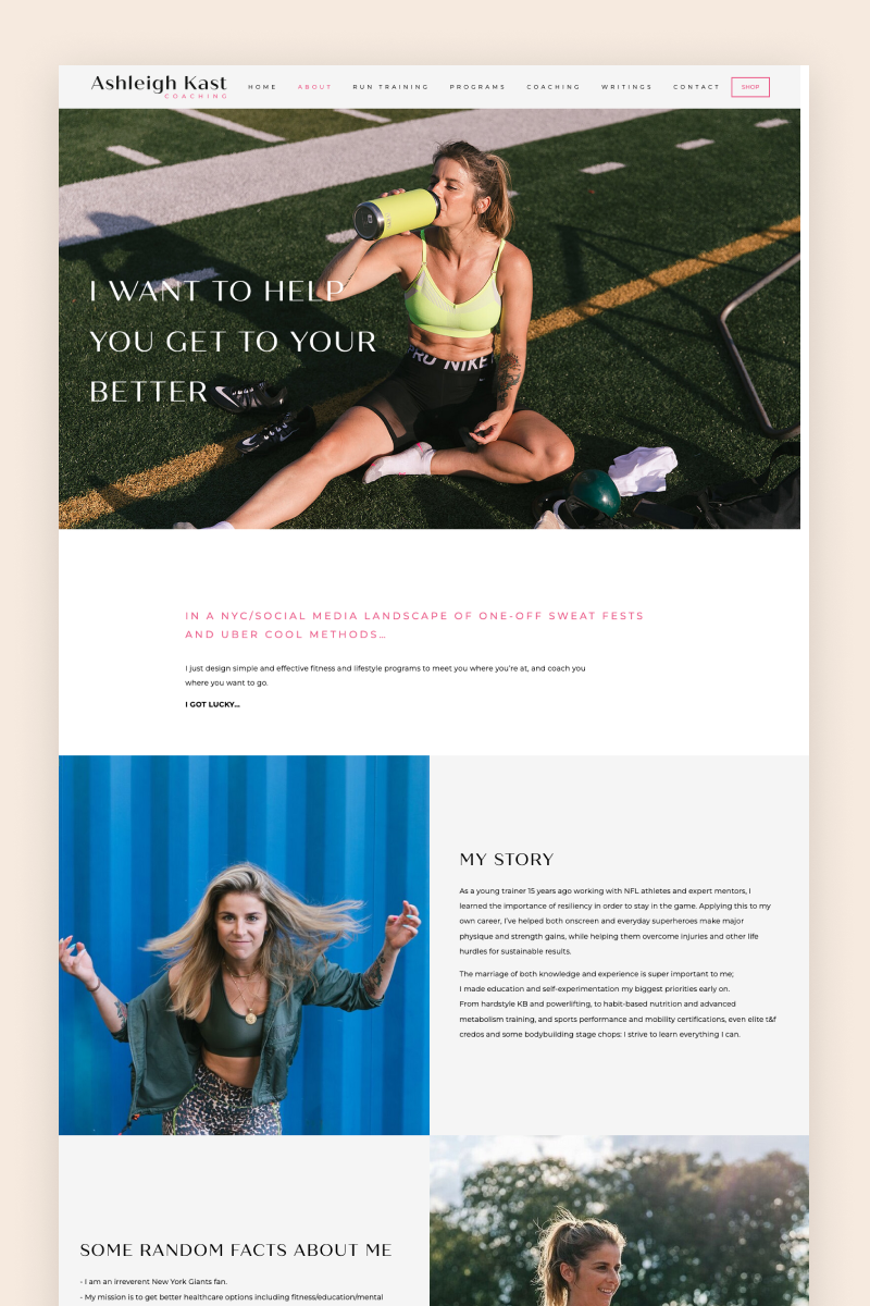
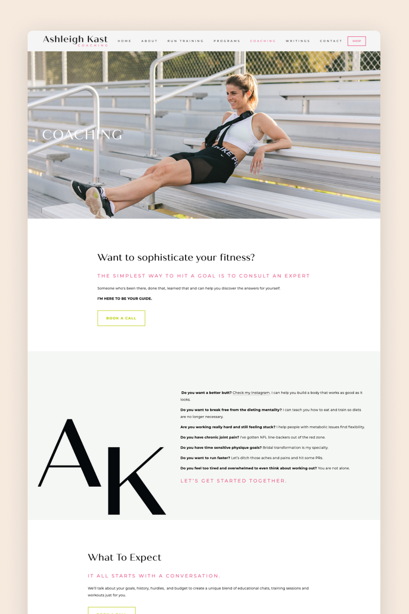
Ashleigh Kast
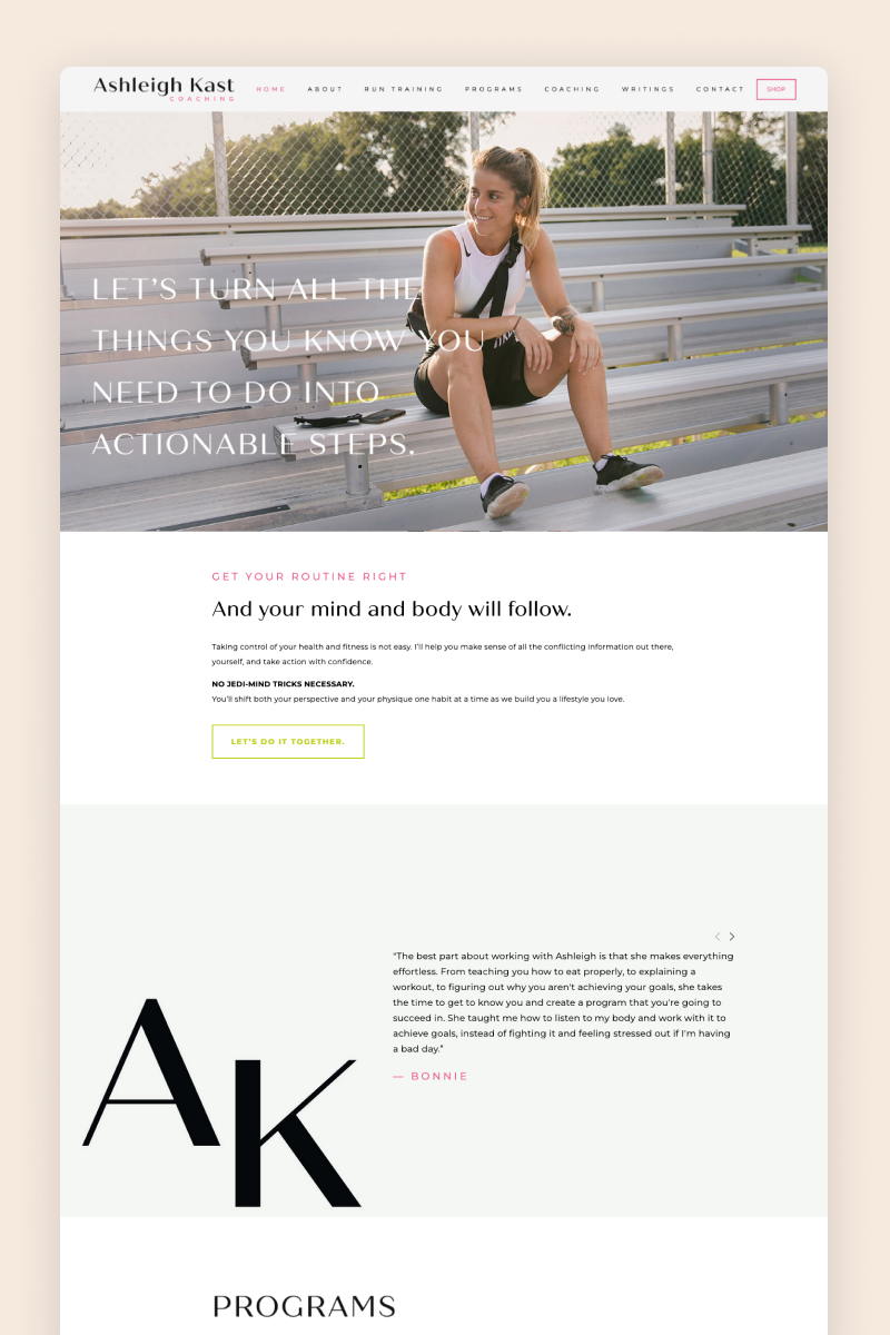
Ashleigh Kast’s website is a clean, modern design marked by striking details in bright pink and green. In a masterclass on website photography, Ashleigh uses images that match that color palette and make the website feel well-rounded.
The website features dynamic animations and makes excellent use of Squarespace’s various blocks. It also includes a Shop where Ashleigh sells her training programs.
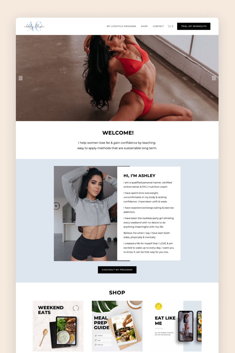
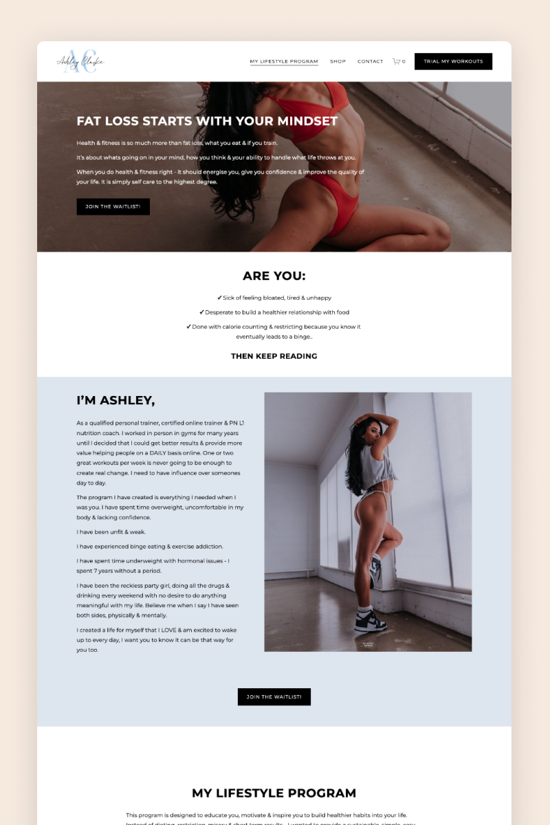
Ashley Clarke
This website features a clean and contemporary design. Its color palette is a calming combination of white and soft shades of blue matching the business’s logo, which creates a serene atmosphere to inspire visitors to work on their well-being.
On the homepage, Ashley uses a gallery block to showcase products from her Squarespace shop straight away, and another one to showcase the results of her clients, as well as an Instagram block to further engage with visitors.
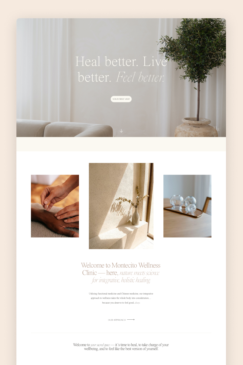
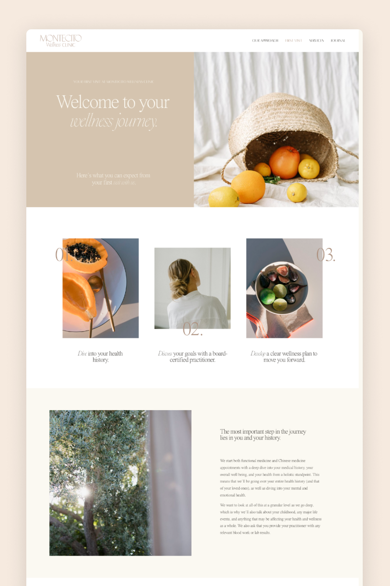
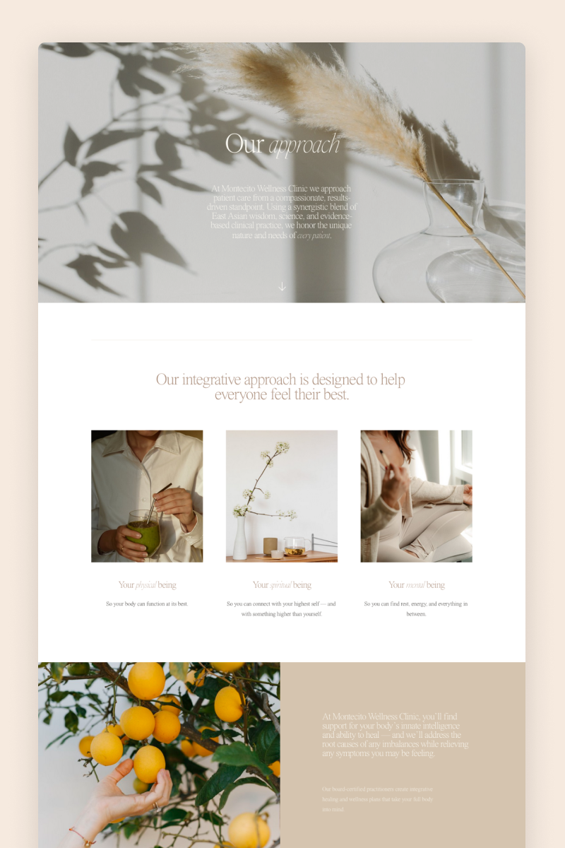
Montecito Wellness Clinic
With a full-bleed hero section featuring a slideshow of calming, on-brand images, the website for Montecito Wellness Clinic takes visitors into a peaceful state of mind almost immediately. Combining a relaxing earthy palette and delicate fonts, the website seamlessly reflects the business’s mission.
The website features slightly animated sections, on-brand imagery, and eye-catching CTAs to guide visitors toward conversion. It also includes Instagram and newsletter blocks to help the business expand its other channels.
Virtual Nutrition Experts
This website is the odd one out in the blog post because it is built with WordPress, not Squarespace. We included it anyway because this design could be easily implemented on Squarespace. Virtual Nutrition Experts’ website is our custom project, you can read the portfolio case here. For this website, we created unique visuals and style: the color palette consists of calm beige, dusty pink, and white spiced up with mustard and terracotta accents. For the decoration, we designed many appealing food cut-outs for the section backgrounds to create a collage effect.
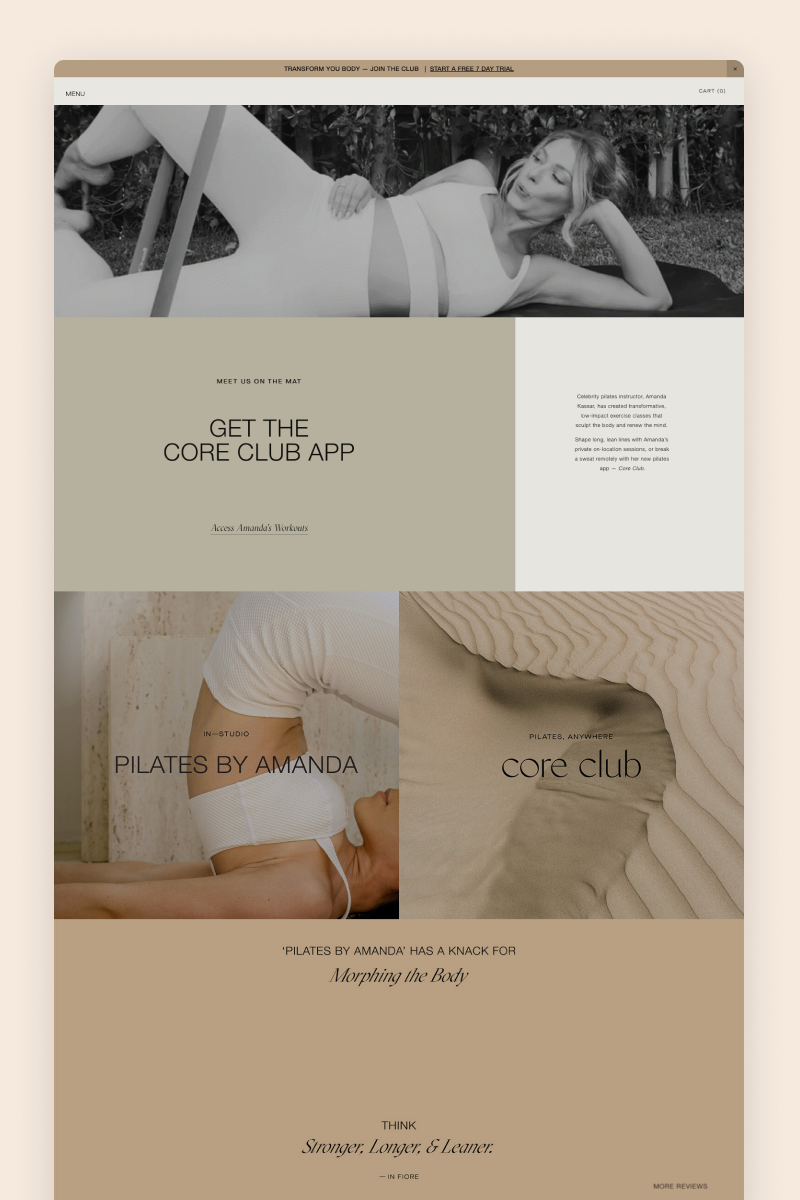
Pilates by Amanda
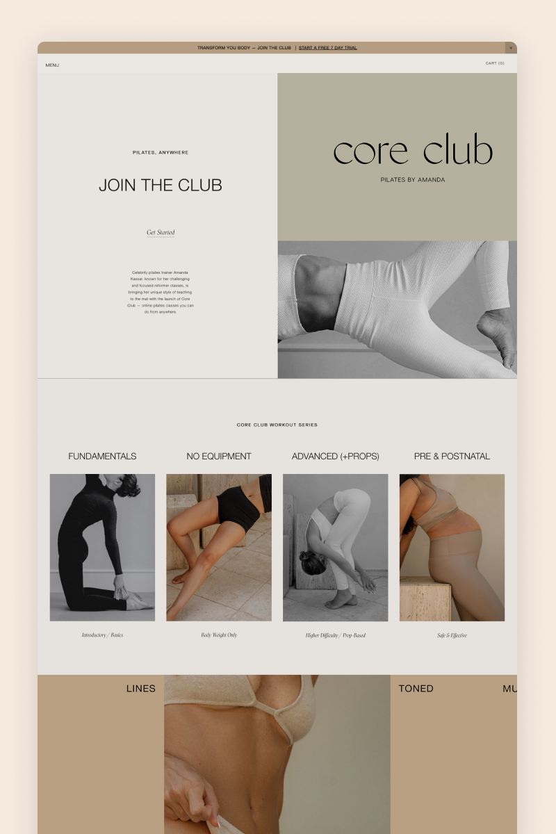
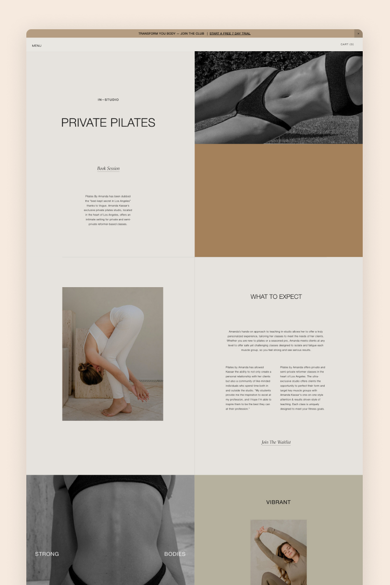
The website for Pilates by Amanda boasts a spacious and sharp design marked by a color palette of soothing beige and moss green. Its hero section displays a video and is followed by a split section with the relevant content and a full-bleed gallery block featuring her offering.
Unlike most websites, Pilates by Amanda features testimonials on a separate page. They are organized into a gallery reel, allowing visitors to easily browse through them.
Bathhouse
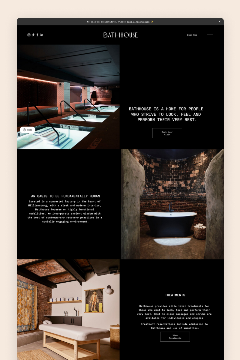
The Bathhouse website features a sleek design with a solid black background and details in white. Its large imagery and split sections come together into a well-structured design populated with engaging content in a curious font combination.
The website uses an announcement bar to proudly let people know that this SPA center doesn’t have walk-in availability and it features a customer support widget that offers visitors a multilingual bot to chat and answer their questions.
IN8LOVE WELLNESS
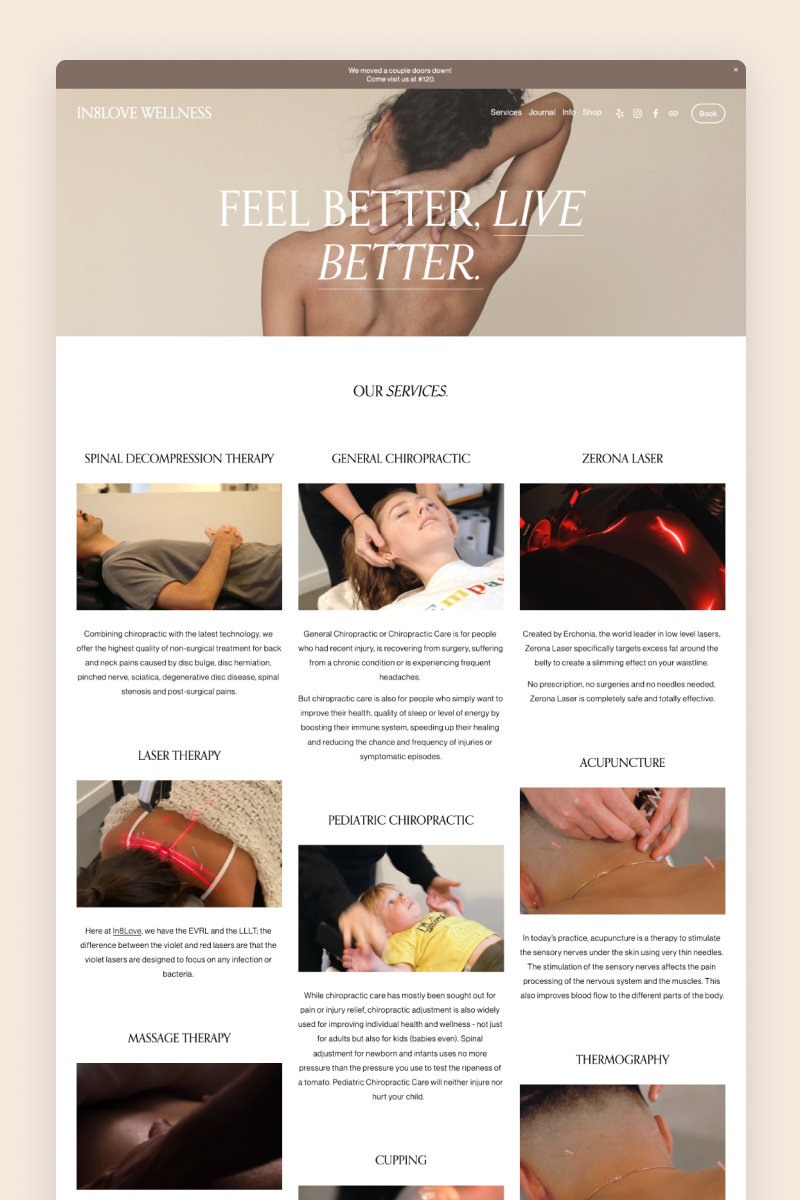
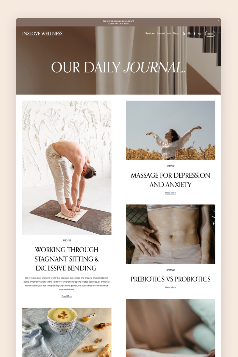
The IN8LOVE WELLNESS website keeps it short and to the point: The homepage features a full-bleed, video-based hero section with three huge links that take customers to their booking, services, and shop pages.
An interesting feature is the use of Squarespace’s scheduling tool to allow customers to book a chiropractor, acupuncture, or massage appointment directly on the website. This saves time and improves the browsing and purchasing experience for users.
Lavada
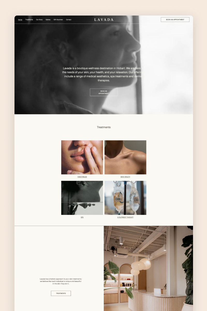
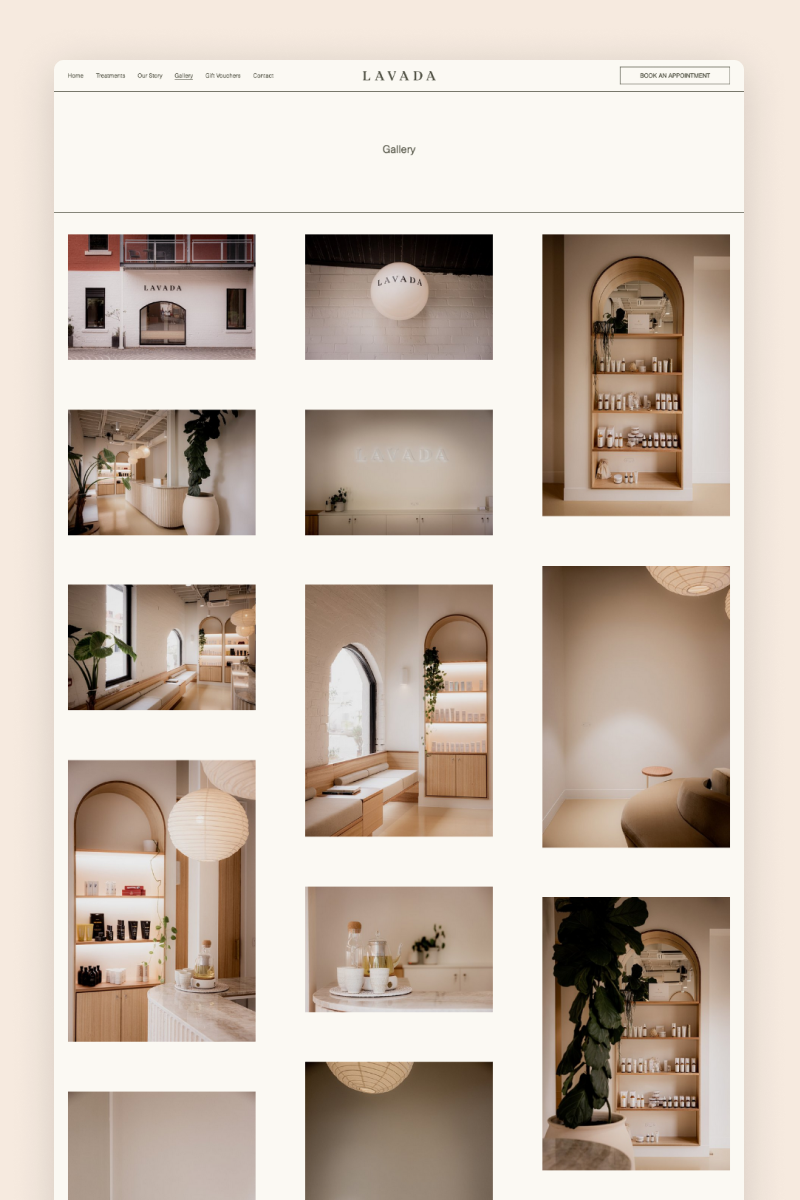
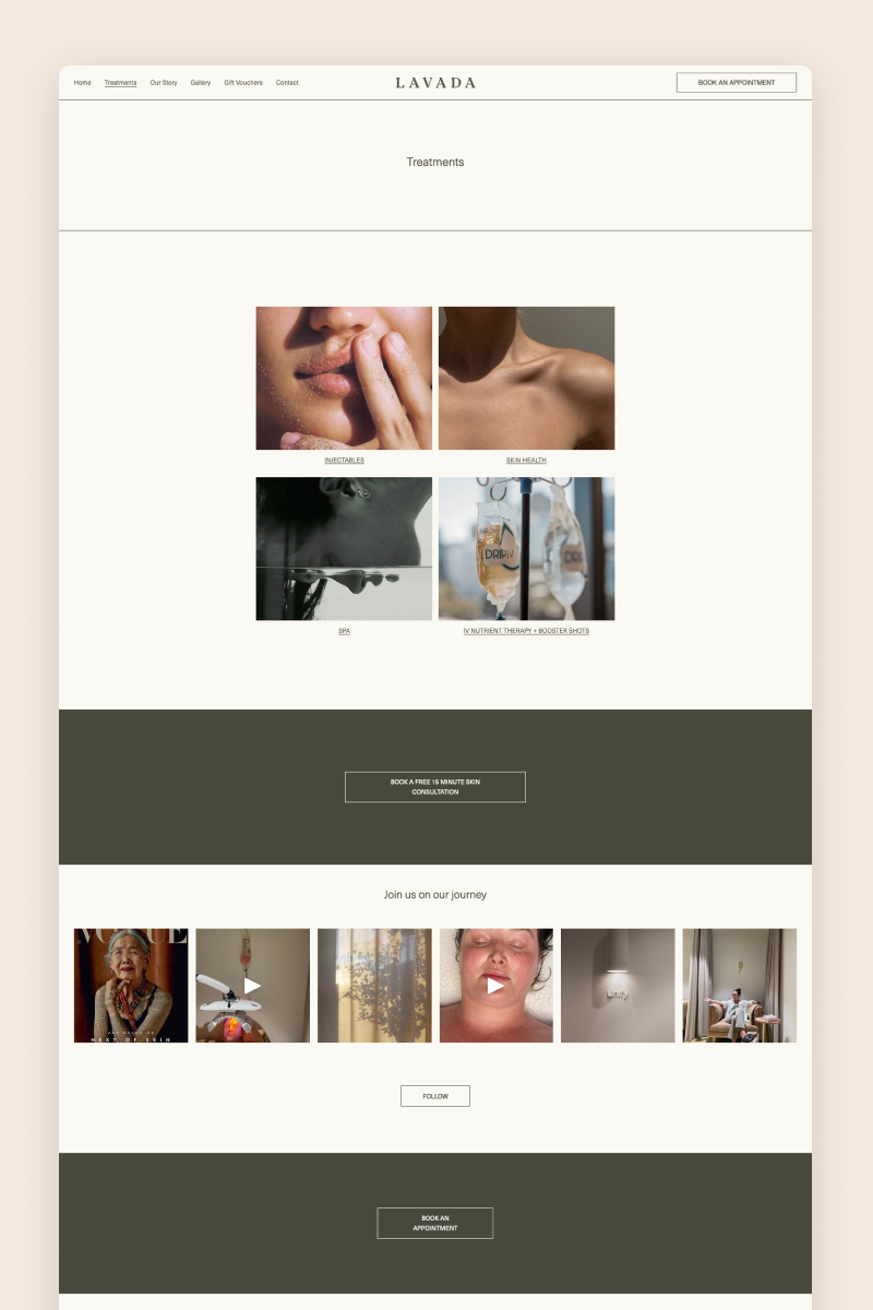
With its full-bleed hero section featuring an ethereal video in black and white, the Lavada website creates an inviting environment for visitors to explore the services of a boutique wellness destination. It features a clean, spacious layout defined by split sections and large on-brand images.
The website includes a testimonial block on the homepage to start building trust from minute one and well-placed CTAs leading visitors to their booking system.
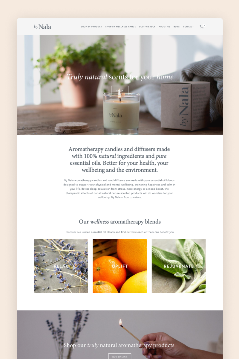
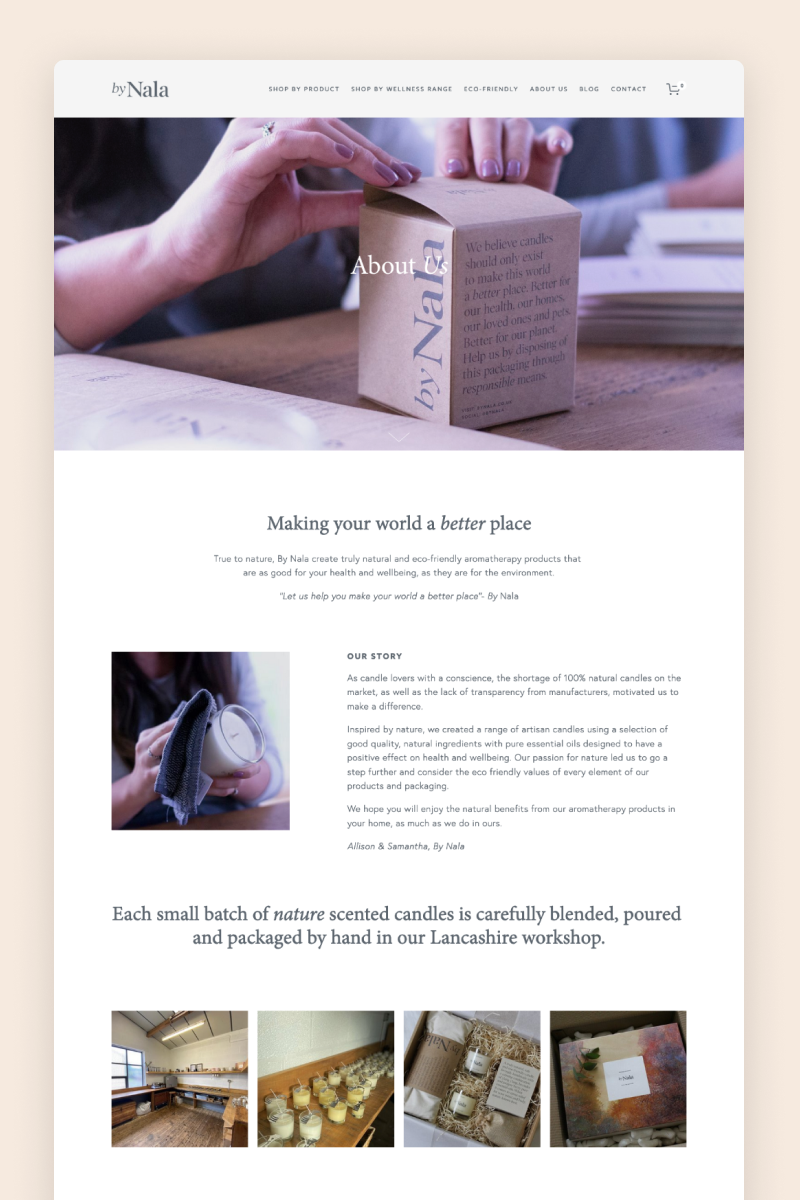
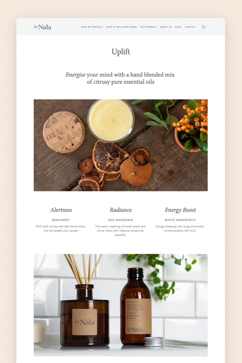
By Nala
The By Nala website boasts a minimalist design in white and grey that perfectly reflects the calming values of this aromatherapy brand. Splashes of color are brought to life by the chosen imagery, adding a little flair to the design.
Built as an e-commerce site, the website features a page dedicated to shoppers looking to buy products by wellness range. It’s organized into different sections by collection, each including a product block.
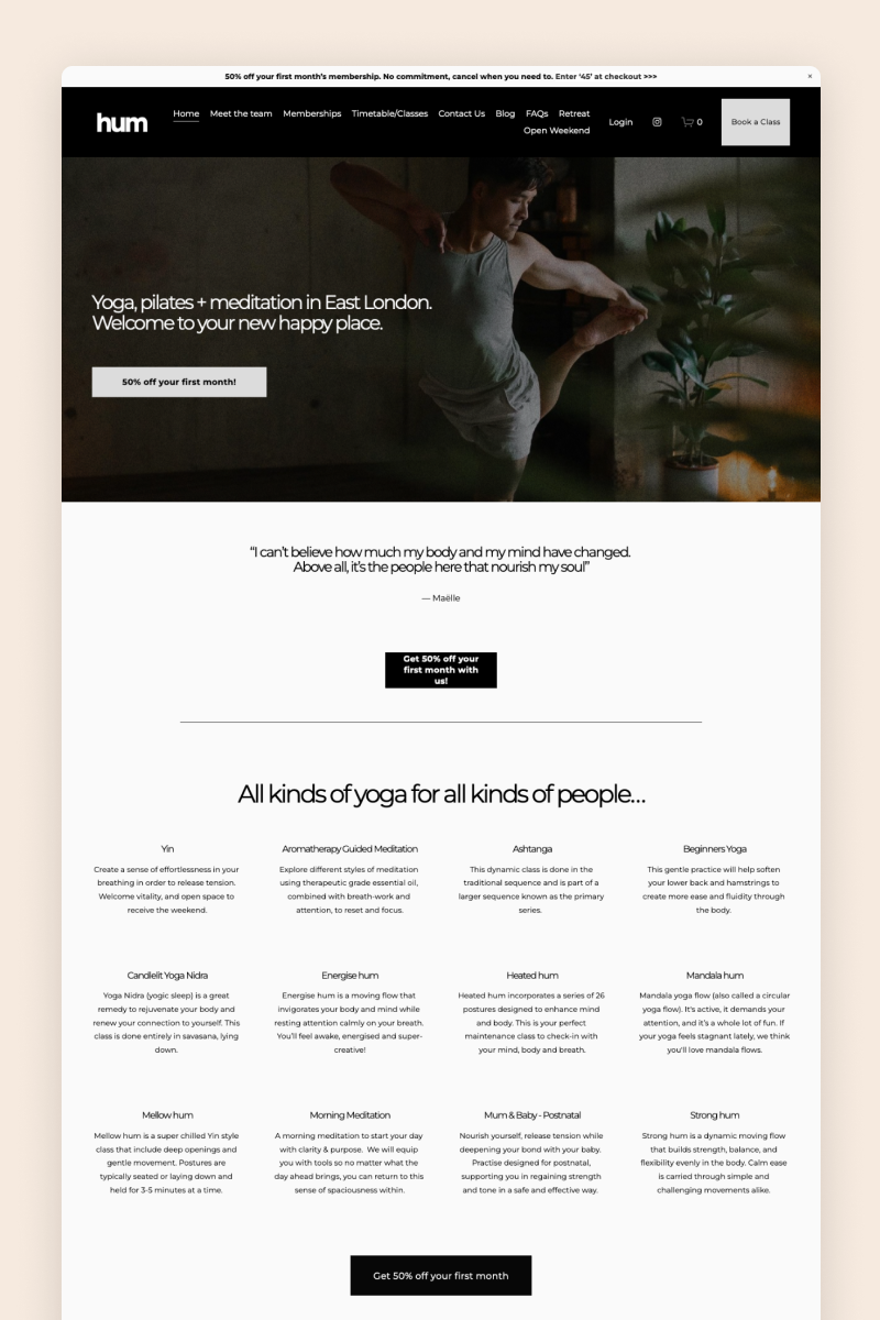
Hum
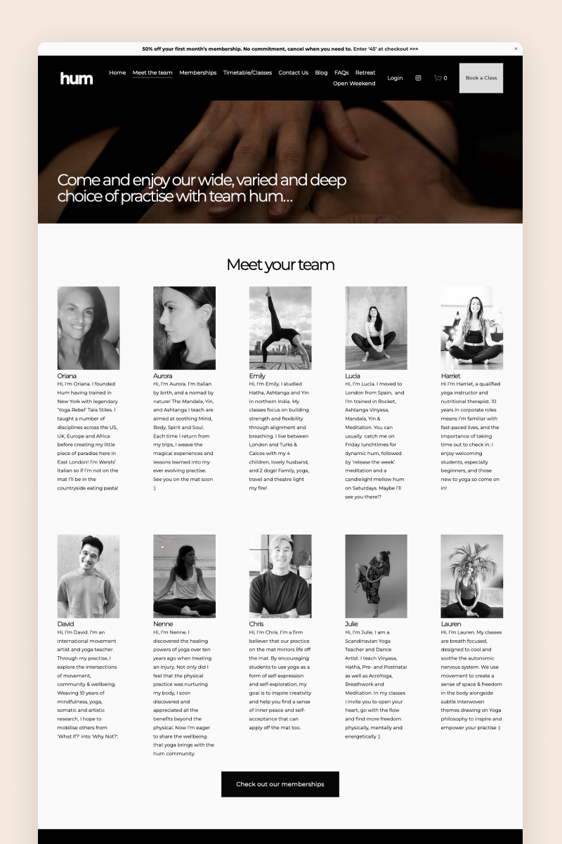
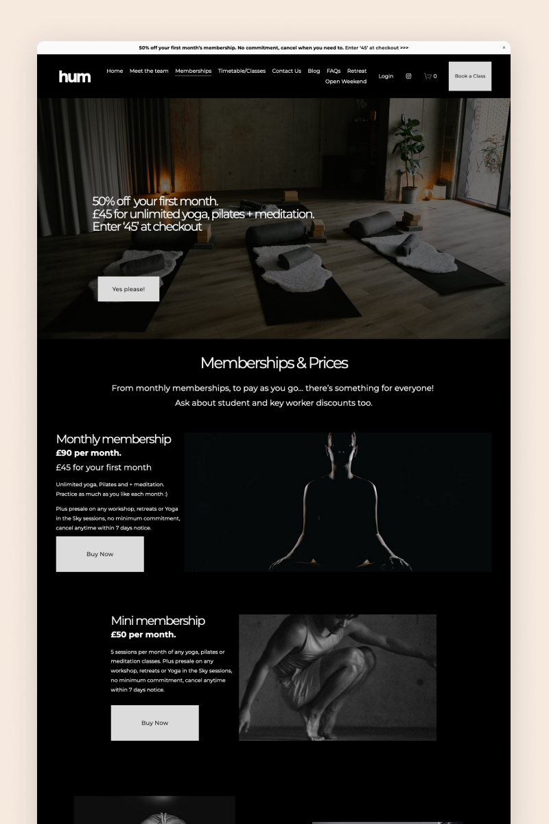
Modern and bold, the Hum website breaks the mold of conventional yoga sites with a sleek, vibrant design in black and white that exudes intrepid vibes. It features a sleek font combination and leverages gallery blocks to showcase the business’s offering.
To allow visitors to easily access their yoga lessons, Hum uses a scheduling widget to enable easy bookings on their website.
The Massage Center
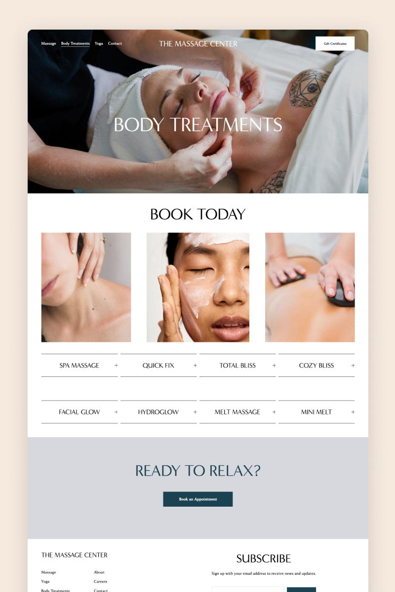
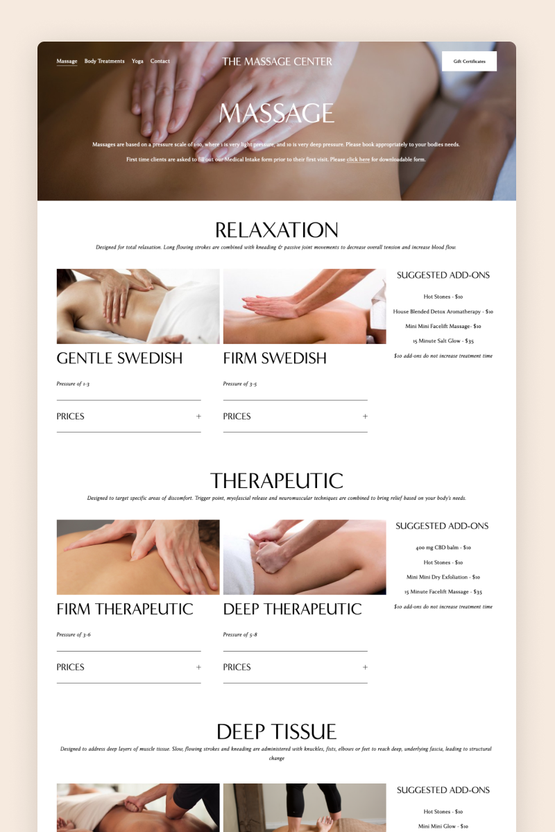
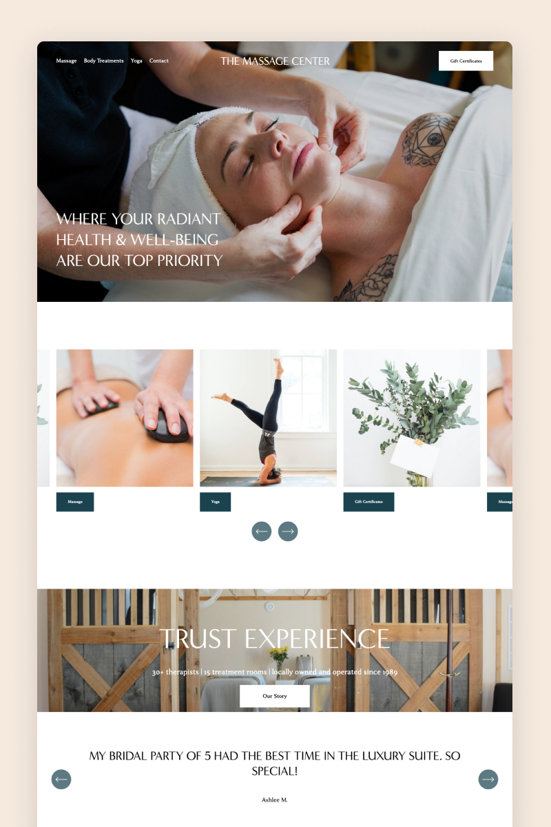
The website for The Massage Center boasts an image-heavy design in white and dark green. It displays the business’s services on the homepage with a minimalistic carousel block and builds trust with visitors with lovely testimonials of its clients.
To share details about each massage treatment and its fees, the website uses drop-down boxes. It also includes a scheduling widget so that users can jump into a yoga class whenever they want.
Canmore Hot Yoga
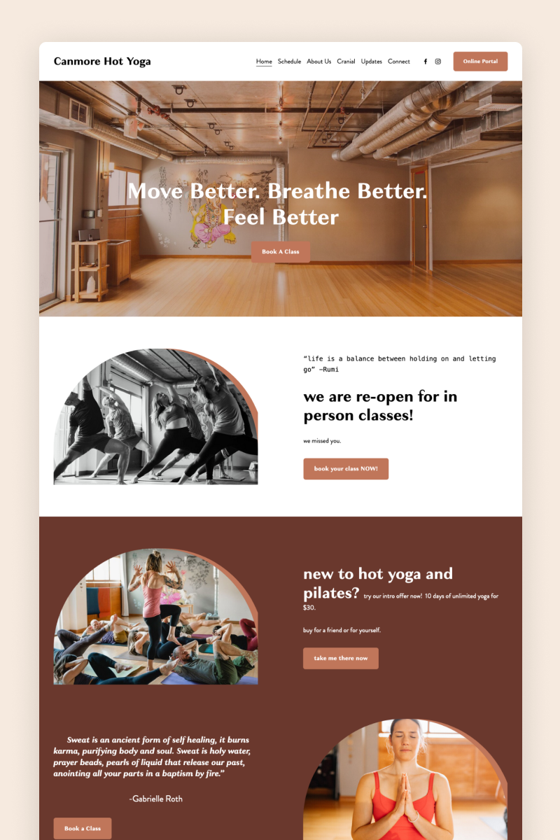
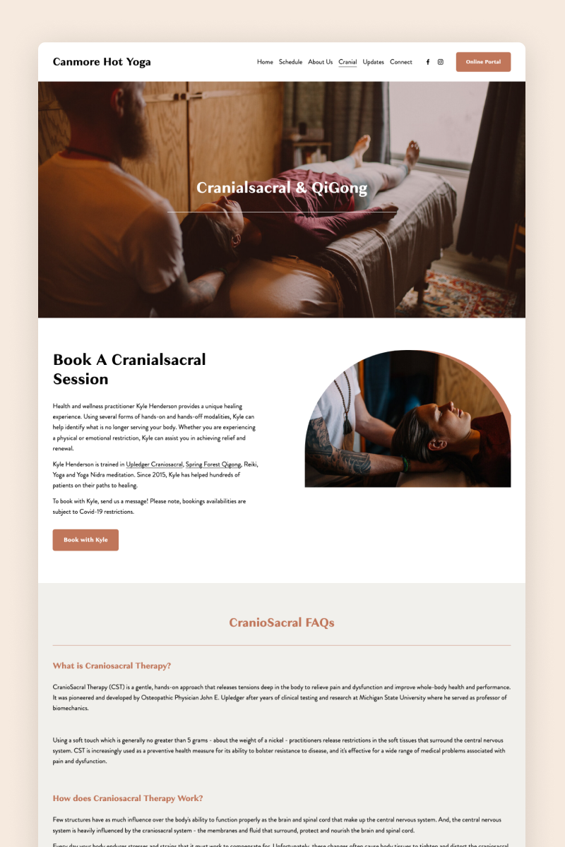
The website for Canmore Hot Yoga is designed around a striking color palette combining shades of terracotta and modern typography. It features rounded images that match the business’s vibes and show the team in action.
It uses a full-bleed summary block to present visitors with detailed information about each class they offer and integrates a scheduling widget to allow them to sign up.
Awaken
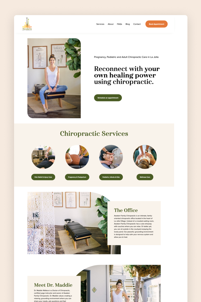
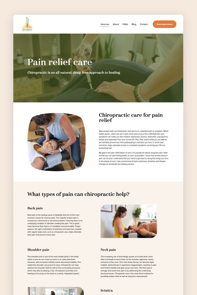
The Awaken Family Chiropractic website features round-shaped images and interesting overlaying elements that merge into a visually appealing design. It boasts a fresh color palette combining beige and moss-green tones with some splashes of bright orange.
It presents visitors with a well-structured service menu organized into a minimalistic summary block on the homepage, and then it expands on each offering on dedicated pages.
Orku
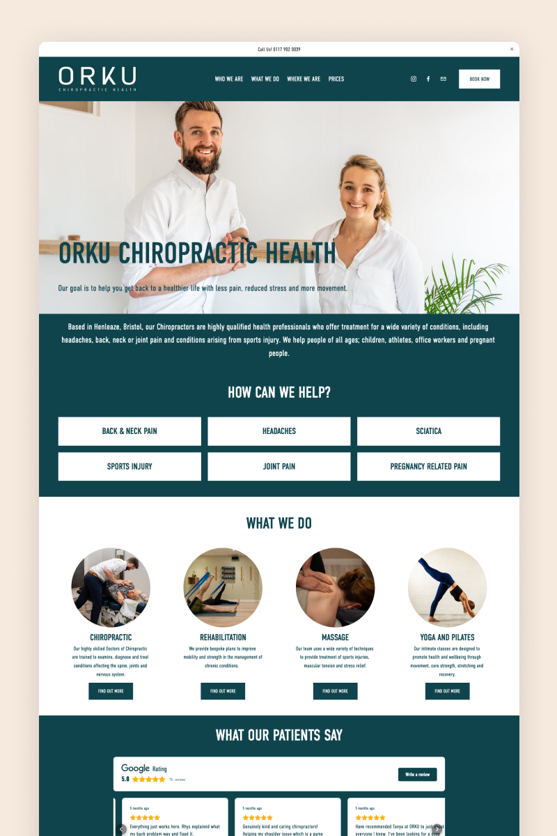
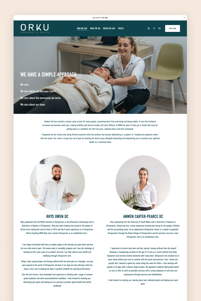
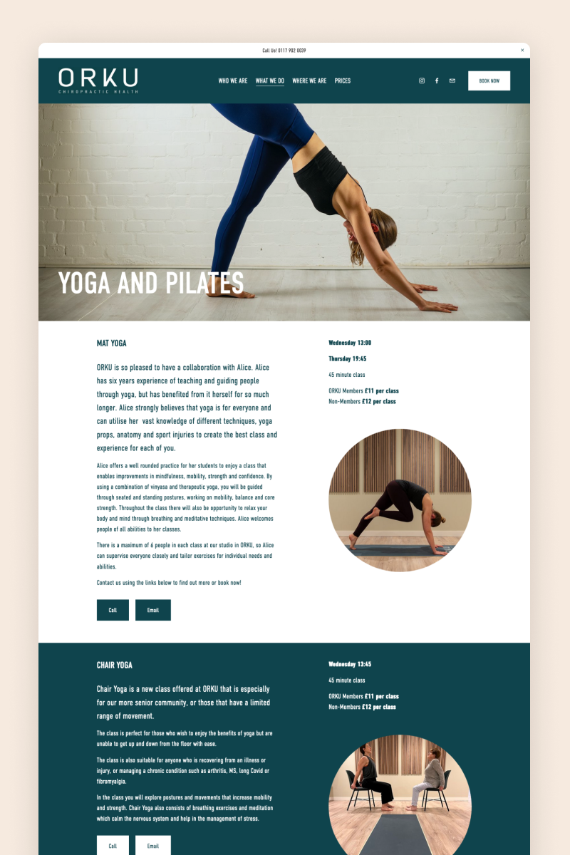
The Orku Chiropractic Health website welcomes visitors with a large image of the team, which immediately creates a welcoming atmosphere. Designed in dark aquamarine and white, the website is a clear representation of the business’s professionalism.
It leverages Squarespace’s announcement bar to display their contact information and make it readily available for visitors. Another interesting feature is the use of a third-party widget to showcase Google reviews on the homepage.
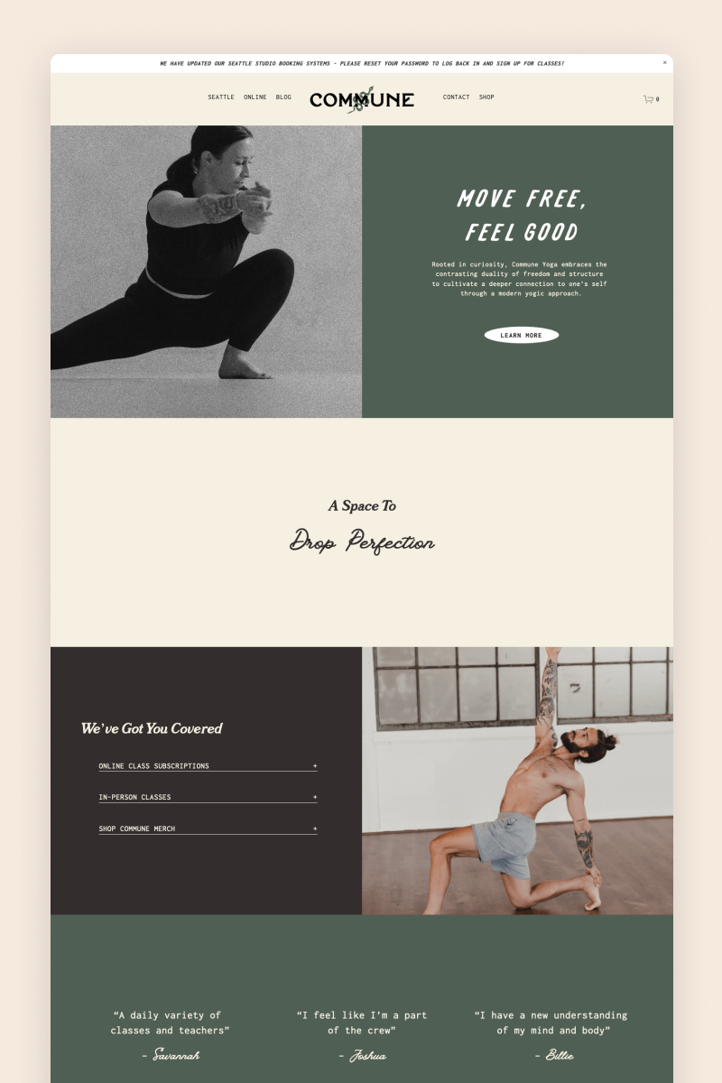
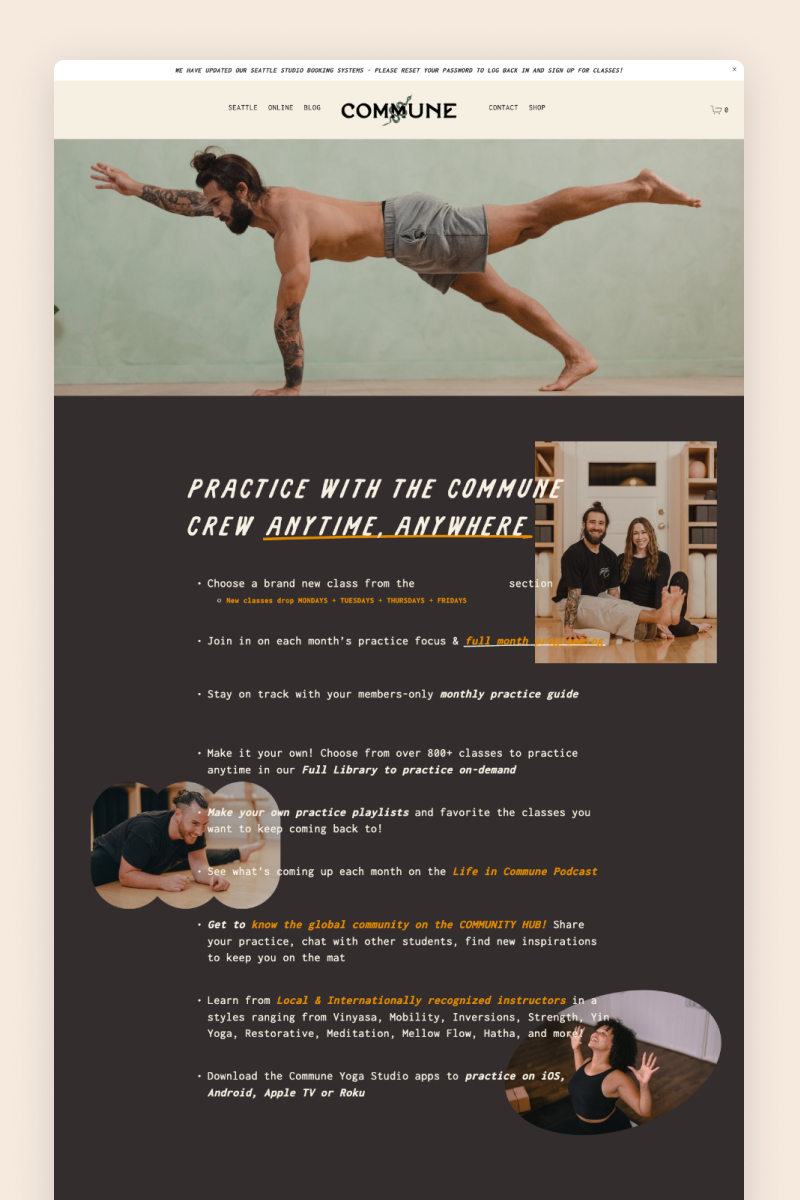
Commune Yoga
The Commune Yoga website features a split hero section followed by a well-structured design in beige and emerald tones. It throws various different fonts into the mix, and they work together pretty well.
This vibrant design includes a newsletter block inviting visitors to sign up, surrounded by personalized brand images that bring credibility and a sense of professionalism to the business.
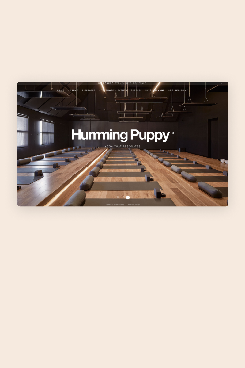
Humming Puppy
Elegant and smart, the Humming Puppy website features a static homepage with nothing but a background image, the business logo, and its slogan. The navigation bar on top allows visitors to browse through the content of the website and find what they are looking for.
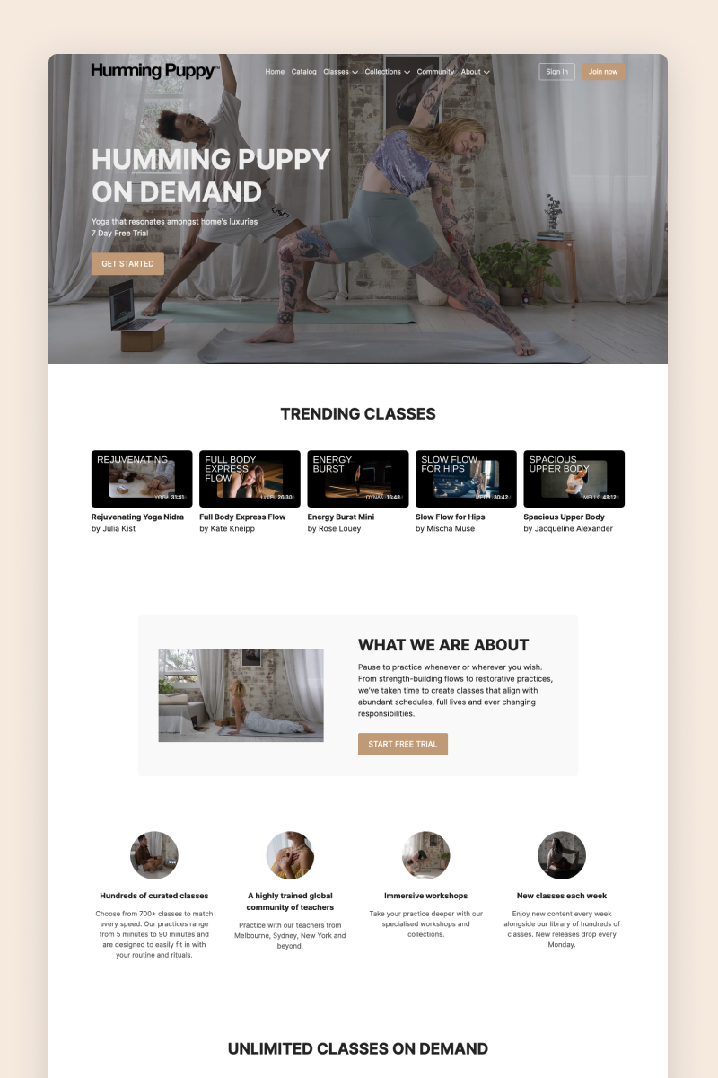
The website uses Squarespace’s members-only feature to create an exclusive area within the website where customers can sign in and access exclusive content, like personalized yoga classes and more.
Hands On
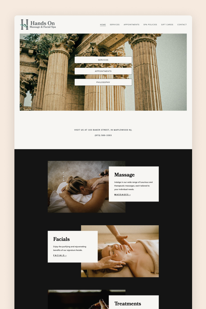
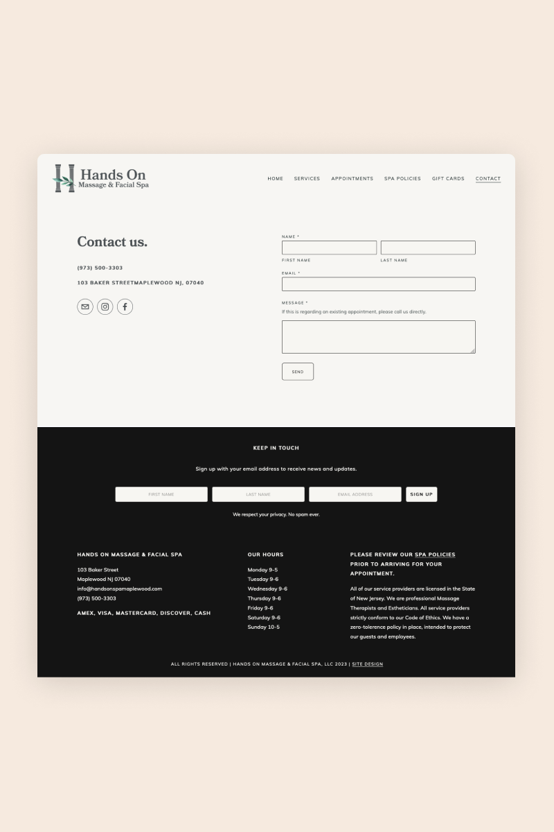
The Hands On Massage & Facial SPA website is a minimalist design featuring overlaying elements, eye-catching animations, and an undisturbed black background, with the images bringing in all the color.
On the Services page, Hand On uses drop-down boxes to present visitors with detailed information about their treatments and massages in an orderly way. By the end of each page, the website includes a section with clear CTAs to help visitors navigate the pages seamlessly.
1912 Aromatherapy
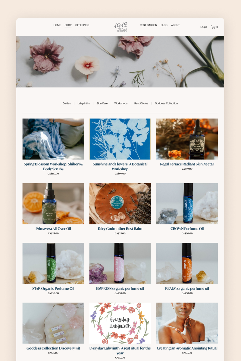
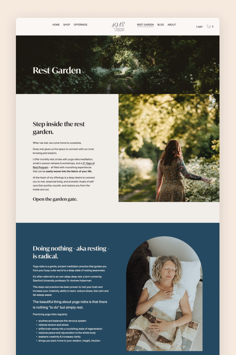
Combining tones of deep blue, emerald green, and bright pink, the website for 1912 Aromatherapy creates a soothing atmosphere that perfectly represents the mood of the business. Its sophisticated fonts and calming images quickly draw visitors in.
The website uses a summary block to briefly describe its offering on the homepage and a testimonial block to share lovely customer words. It also leverages Squarespace’s members-only feature to create a safe space for subscribers to access exclusive content.
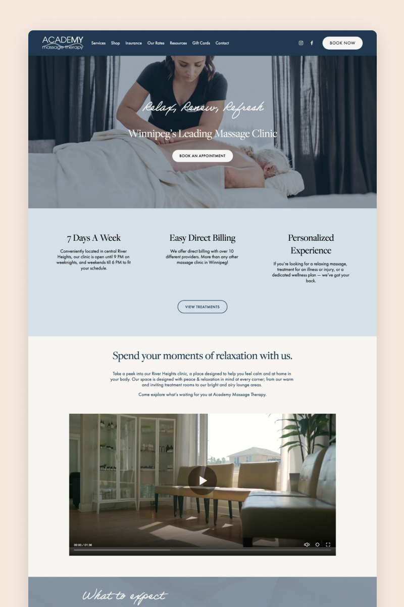
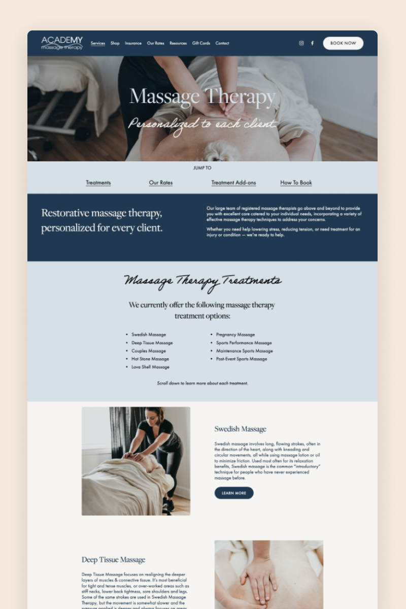
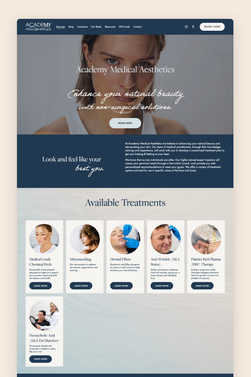
Academy Massage Therapy
The website for Academy Massage Therapy boasts a calming color palette of different shades of blue that reflects their professionalism and expertise. It includes images of the team members and a well-produced video to immediately build rapport with potential future customers.
It uses drop-down boxes to describe the business’s services and approach concisely on the homepage and directs visitors to their dedicated pages, where they go into each topic in full detail.
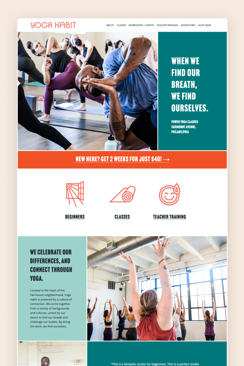
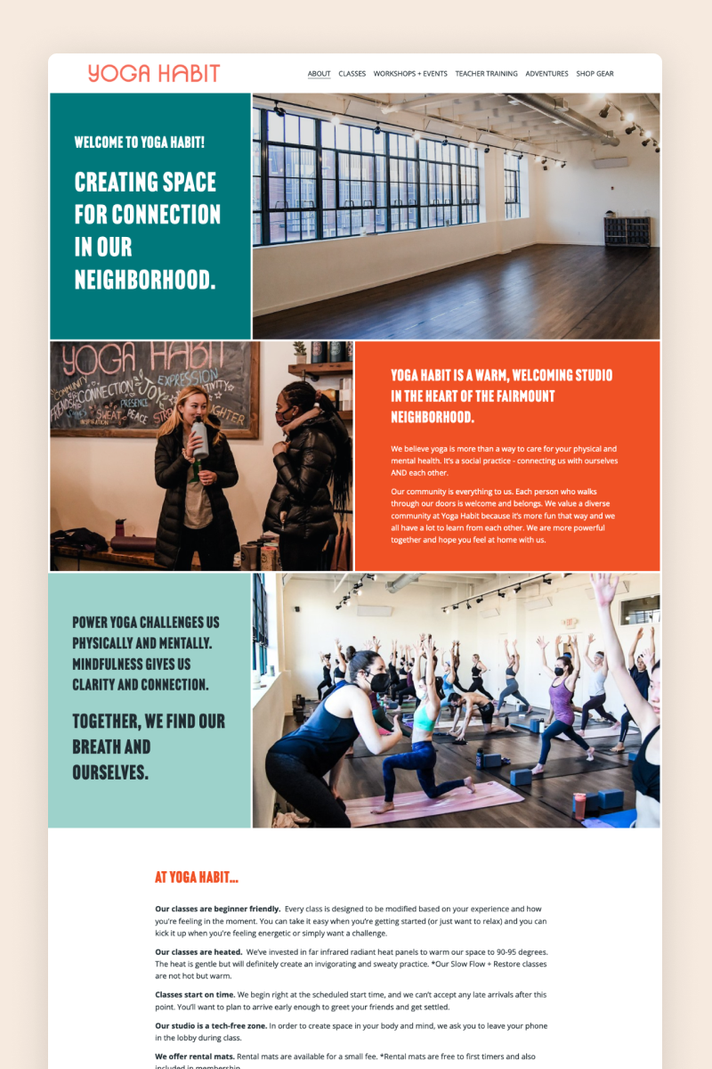
Yoga Habit
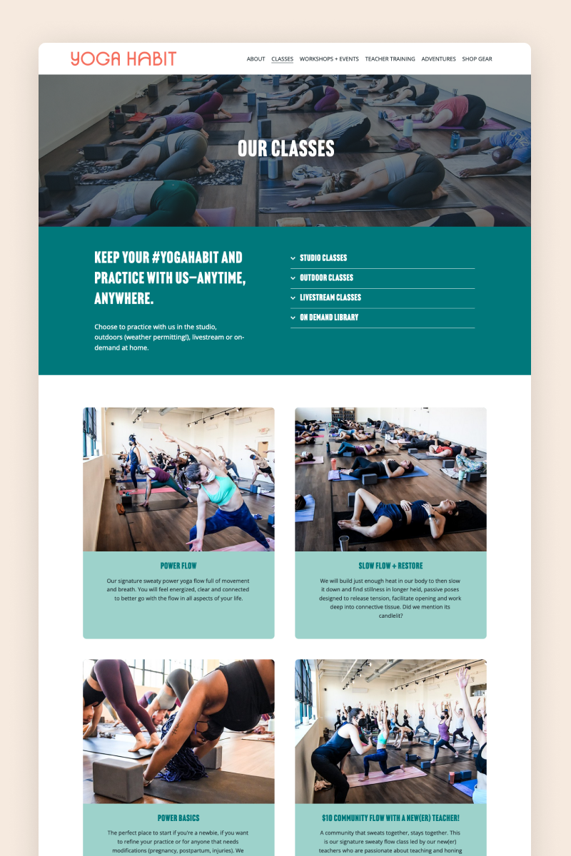
The Yoga Habit website hosts a vibrant design marked by a bright, colorful scheme that makes the business stand out from the rest in the field. It includes bold fonts and original images from the yoga studio that would make anyone want to grab their mat and join in.
The website uses split sections to pair copy and testimonials with images seamlessly and it includes an Instagram block by the end of each page to invite visitors to access more content. It also integrates a scheduling feature and leverages Squarepace’s e-commerce capabilities to offer awesome yoga-related products.
Creative Workshop Series for Squarespace
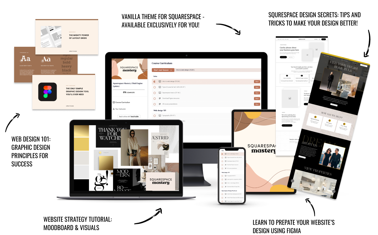
The workshop is jam-packed with design goodness. Inside, you’ll find the following topics:
What size should I design for? Responsive layouts and industry standards
Typography 101: How fonts can elevate your design & look professional
My approach to using colors in web design
Complete Figma tutorial
How to use layout grids to direct the attention of your website visitors
How to create a mood board and plan your website visuals
Squarespace Vanilla theme build-out: Complete walk-through, CSS snippets and Figma wireframe
Massive Squarespace design practicum: We go from a mood board to a finished design on Squarespace in a matter of an hour. Two designs included along with CSS plugins and Figma templates
Redesign 2 real websites with me in real time
How to grow as a designer and how to look for creative inspiration
Plus, there are some really helpful documents included: Complete Squarespace development checklist, copywriting and branding guides, sample client questionnaire and so much more!


