Therapist Website Must-Haves
It’s no secret that a well-rounded website is a powerful driver of business – it can help you show your expertise and establish yourself as a professional in your field.
As an online therapist, a well-crafted website is key in reaching new clients. But simply setting up a page and launching it will not cut it. There are certain key elements that you need to include in your website to bring in your ideal customers and start guiding them towards a healthier and happier life.
Let’s explore the essentials that every therapist website should include.
1. Homepage
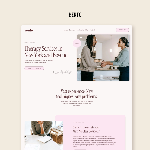
Your homepage is a snapshot of who you are, what you do, and how you can help your visitors. You have only a couple of seconds to grab people’s attention and convince them that you’re the professional they’ve been looking for.
So, use those seconds wisely.
Make sure your clients can easily find out who you are, what you do, and how you can help them right there on your homepage. It’s essential to stick to the point. If you present visitors with a cluttered page and too much information, this might backfire and lead them towards the exit.
Remember: When presented with too many choices, it is likely your website visitors will simply choose to leave. Don’t give them that option and leverage your homepage to answer their most immediate questions before inviting them to find out more.
It’s also a good idea to add a clean, professional picture of yourself on your homepage. People will be more prone to trusting you if they see your face smiling back at them. And as you well know, in this field trust is key.
Finally, invite them to do something after scanning your homepage. Use a call to action to lead visitors to your blog, newsletter, or free phone consultation with you (if that’s something you offer). Think about what you want them to do when they arrive at your homepage and place CTAs strategically to achieve that goal.
2. About Page
Your About Me page is not really about you. It’s about your ideal client.
Sure, you can go on and on about your education and certifications, describe your journey of becoming the talented professional you are today. But that’s not your visitors’ primary concern at the moment.
They want to know if you can help them solve whatever situation they are going through. So, focus on describing your target clients, their issues, and how you can help them get from point A to point B.
An optimal About Me page should begin by explaining who you typically work with and the desired outcome your counseling services will bring about.
Then, you can point out the problems and concerns your ideal client may be facing that would cause them to seek therapy and provide them with the answer to that problem: Your services.
That’s when you introduce yourself, your counseling services, and what a session with you usually looks like. Last but not least, share your credentials to establish your authority.
3. Your Counseling Services
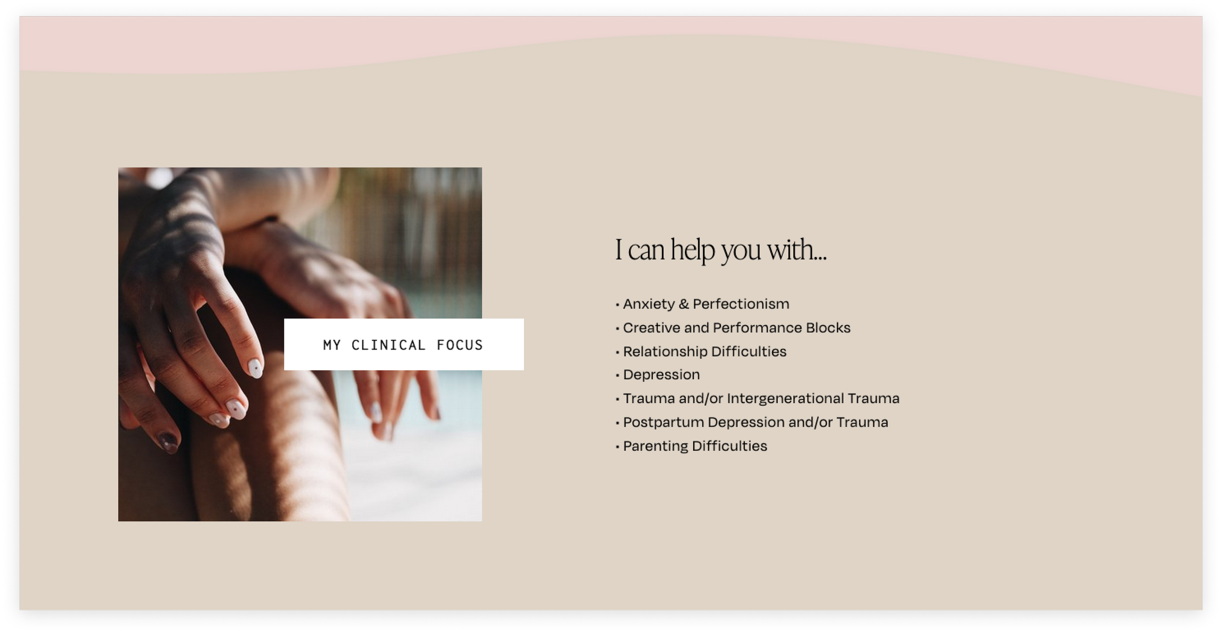
One of the critical elements of any counseling website is the Services page. It’s a good idea to dedicate an entire page to introducing the services you offer and the topics you help your clients with.
A Services page offers visitors a quick recap of all you can do and assures them that you are the right fit to address the issues that led them to your website in the first place. So, for instance, if you help clients go through a rough divorce, deal with childhood trauma, or navigate depression, you should make that clear on your Services page.
A page like that should provide a clear, uncluttered, and concise overview of the areas you specialize in, but it should also allow potential customers to learn more about each service by leading them to dedicated, in-depth pages.
This means that, apart from a general Services page, each of your offerings or areas of expertise should have an exclusive space on your website (like specific landing pages). This will help clients delve deeper into each service to see if it’s the right fit for them.
On each dedicated service page you should try and match specific clients to specific services you offer and provide those potential clients with an accurate picture of what they will get from working with you.
Remember that asking for help is sometimes scary, so put your visitors’ minds at ease with accurate and complete information. That way, they’ll know what to expect and will feel more comfortable getting in touch with you.
4. Blog
A blog is an excellent way to let your expertise and personality shine. But, more importantly, it’s a great tool to position yourself as an expert in your field.
In this line of work, confidentiality and trust are essential. You might not be able to use testimonials as a way to prove you know what you’re doing. So, use a blog to establish your authority instead.
The best approach to blogging is to address the most pressing questions your potential customers have about online therapy, how it works, and how it can help them. Do some research and find out what your ideal customer is searching for on Google. Then, provide accurate and direct answers to their questions.
This will not only help you establish yourself as a trustworthy source and show your expertise, but it’ll also allow you to better position your website on Google.
Search engines organize results based on the value and experience websites offer to users. So, by putting out quality content that serves your audience and answers their questions, you have a better chance of appearing among the first results – which essentially translates into more website traffic and more business.
5. Contact Page
Last but not least, your therapist website needs an accessible and easy-to-navigate contact page.
Again, asking for help is sometimes scary and takes a lot of courage, so you want to make the process as seamless as possible for your potential customers. This page needs to present a simple, straightforward way for them to contact you and begin their healing path.
If possible, eliminate anything that may drive customers' attention away from the desired outcome – that is, them getting in touch with you to set up a meeting.
On this page, you can include your email and phone number for customers to actively contact you. However, it’s also a good idea to set up a contact form for them to fill out and wait for you to get in touch with them. That takes some of the pressure off.
Other Key Aspects
So, those are the basics. Now, if you want to take your website to a whole new level, check out these quick tips:
Branding
Have you chosen a color scheme? Do you have a professionally designed logo? Are you using a specific font pairing? What’s the tone of voice you use to address your visitors on your website?
All these elements add to your branding and are essential in how you present yourself and your practice online. Having consistent branding across your website – and your entire online presence, for that matter – can help you come across as professional and reliable.
Search Engine Optimization
SEO can sound a bit scary. But at its core it is quite straightforward – essentially, it involves implementing certain practices to help Google rank your website better and, maybe, deem it worthy of a place among top search results. Being among the first several links on Google can help you increase your website traffic and attract more business, so it’s crucial to pay attention to SEO.
There’s a lot more to SEO than this, but here are a couple of quick steps you can take to boost your optimization strategy a bit and get closer to that first page:
Add keywords to your pages strategically to help Google find them.
Update your blog constantly with valuable articles that answer people’s most pressing questions.
Make sure your website is easy to use and navigate.
Establish your reputation online through high-quality content.
Bonus Points for a Video
We’ve briefly discussed how a professional and updated headshot on your homepage can motivate your visitors to trust you. It’s nice to know there’s a human behind the screen, especially when it comes to online therapy. So, a picture of yourself is an absolute must.
Now, if you want to strengthen your initial bond with potential customers and build even more trust, why not add a video? An introductory video where visitors can actually see you and hear you can put their minds at ease and lead them to contact you.
Final Thoughts
Building a well-rounded website that helps you turn visitors into customers is no easy task – especially in a field where the target audience is probably going through a tough time.
By making sure your website has all these elements and is designed with your target patients in mind, you’ll be able to reach more people and help them with whatever is troubling them.
Are you not sure you have the time and skill to build your Squarespace therapy website from the ground-up yourself? You don’t have to! Check out our newest Squarespace template Good Vibes built specifically with the needs of therapists and counselors in mind. It has nine pre-made pages to serve your professional needs – Home, About, Services, Individual Service, Blog, Contact, Investment, Locations, and Team. The template is easy to customize with your own fonts, colors, and content. Includes access to our template restyle mini-course Easy Squarespace.


