Must-Have Code Snippets We Add to Every Squarespace Website
Top-needed CSS snippets for your website
There are CSS snippets so useful, that we cannot live without them and take them to almost every Squarespace website we design. We include them both in our custom websites and in Squarespace templates in our shop. They are the essentials that can improve any design. In this article, we are sharing these CSS snippets with you. Check them out and take the ones you need for yourself.
Style social icons in the header
Squarespace doesn’t give much flexibility in design when it comes to social icons in the header. There is an option to regulate their size, but that’s about it. If you want to tweak the looks of your social icons, you can insert this snippet of CSS code in Design>Custom CSS.
// Header menu social icons
.header--menu-open .icon, .header-actions-action--social .icon {
  background: #FAEBE3;
  padding:6px;
  border-radius: 50%;
  margin-right: 0px !important;
}
This snippet gives you more freedom to style your social icons. There is a possibility of adding a background behind the icons. To change the background color – swap the HEX color in the code (the hex code is a color for code that starts with a hashtag). Also, if you reduce the border-radius to 10-20% you will get a square background shape with rounded corners. To have the circle-shaped background set the border-radius to 50%. Padding makes the circle around the icon bigger or smaller, while not changing the size of the icon itself. It is reasonable to keep it at 6px, but if you need to, you may tweak it. You may also add the margin if you’d like to space out the icons.
Tailor dropdown menu: change line height, margins, and color
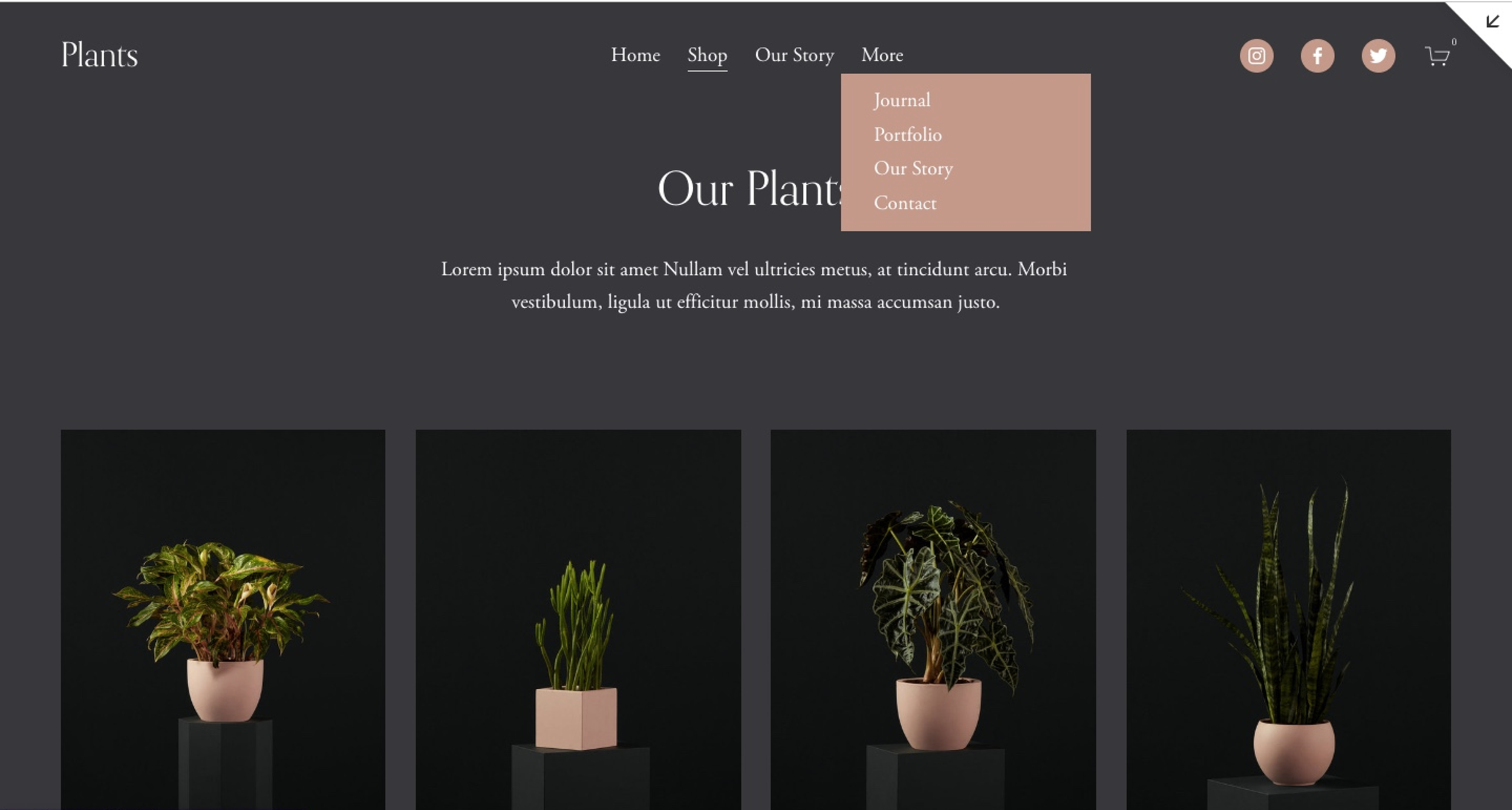
To tell the truth, we are not huge fans of drop-down menus in the header menu. They make it harder to find things on your website and also they are a signal of thin content. However, we are all sinners and keep on having them anyway. And if you have it, it is a good idea to at least style it nicely.
//This changes line height and color in the dropdown menu

.header-nav .header-nav-item--folder .header-nav-folder-content .header-nav-folder-item {
line-height: 2.5 !important;
margin-left: 12px !important;
}

.header-nav-folder-content {
background: #ff0000 !important;
}
The following CSS snippet gives you more options for styling drop-down menus. When you increase the line height, items become more spread out vertically. You can also add wider margins by tweaking either the left or right margin, depending on the menu alignment. Finally, change the background color, by replacing the color HEX code. Keep in mind the color contrast ratio between the background and text to keep the menu items readable.
Replace a font in a summary block
Summary blocks have many practical applications on Squarespace websites: we use them to display blogs, testimonials, and shop items. You may have noticed that there isn’t much innate platform flexibility to change fonts in summary blocks. But it is easy to fix with a bit of code.
The following snippet allows you to tweak the parameters of the headlines in the summary block. You can change the font size, the font-weight (make the text thinner or bolder), or even swap the font altogether.
//This replaces the font in summary block
.sqs-block-summary-v2 .summary-block-setting-text-size-large .summary-title {
font-size: 2rem;
font-family: neue-haas-grotesk-display;
font-weight: 300;
}
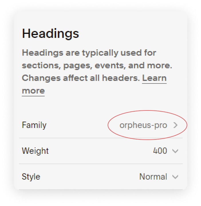
If you are not sure how to type in the font name in the CSS snippet for it to work, jump into the Fonts menu (Site Styles>Fonts) and find the name of your font hyphenated there. If you want to upload your custom font, follow the first three steps of this tutorial.
Change the text size of the mobile menu
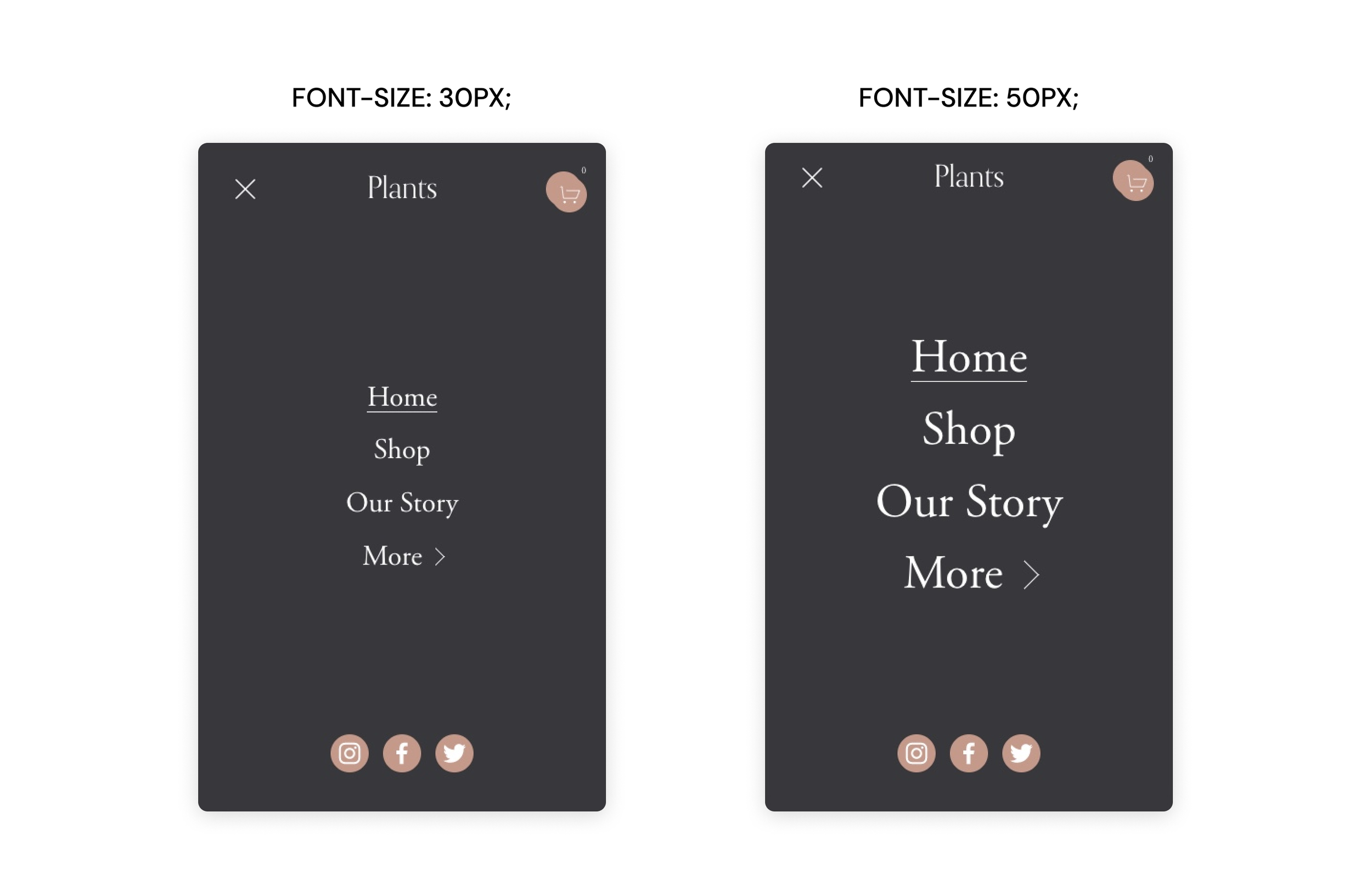
To make your website more mobile-friendly, you might want to regulate the font size of the mobile menu. If you notice that it is difficult to tap the menu items with your thumb – it is a sign to make the font bigger. On the other hand, if the menu doesn’t fit on one screen, you might want to make it smaller.
Switch to the mobile view in the upper right corner of your website and click on the menu – this would be an ideal place to observe the changes. Insert the snippet in Design>Custom CSS and change the values of the font size and font weight until you will find the perfect look.
// This changes text size in mobile menu

@media screen and (max-width: 767px) {
.header-menu-nav-item a {
font-size: 20px;
font-weight: 300;
}
}
Here is more advice on how to make your Squarespace website more attractive on mobile.
Remove underlines in the footer
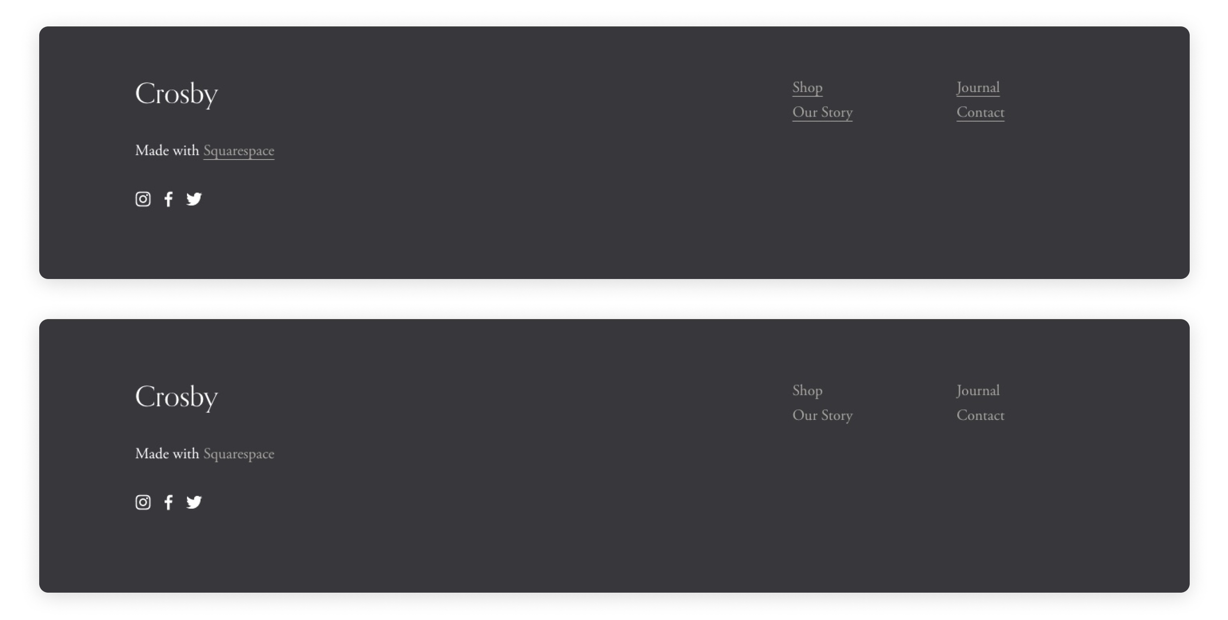
Design is in small things and sometimes little details can irritate for no obvious reason. Say, you don’t like the underlines of the links in your footer. It is absolutely possible to get rid of them with CSS.
//Remove underline from footer links

footer .dark a {
text-decoration: none;
}
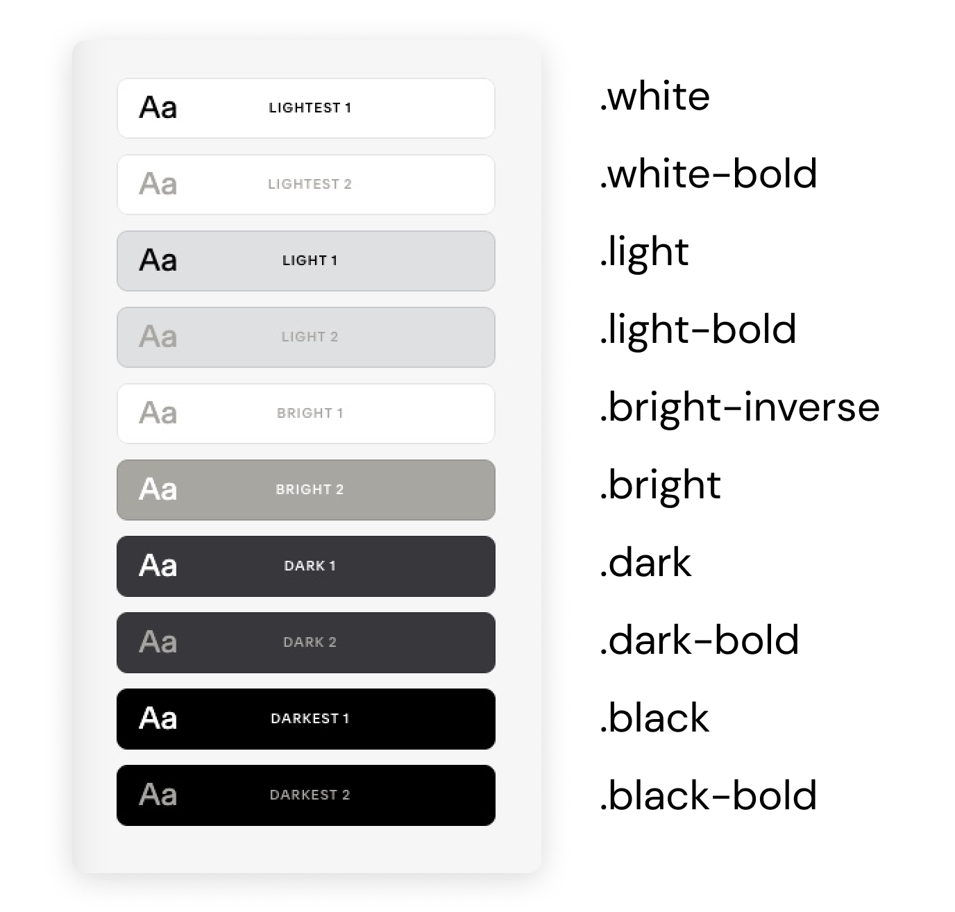
In order for this snippet to work, you will need to change one thing in the code which is a color theme name. To find out the color theme you are using in your footer click Edit on any page of your website, scroll down to the footer, and click Edit footer > Edit section > Colors. For example, our footer uses a Dark 1 color theme.
The thing is, the color themes have different names in the code. To find a corresponding name use our cheat sheet e.g. Dark 1 is .dark (where the dot is a part of the name).
Smooth scroll for anchor links
Anchor links are a great solution for long-scrolling pages. They help users jump to a different section on the same page. Let’s create a menu in one of the upper sections of the page to help users navigate more easily.
Then, add a full-width code block to one of the sections you need to scroll to. Insert this snippet in the code block. Give a different name to this section in the snippet. For example, we will call ours orchids.
<span id="orchids"></span>
Now go back to the top section that contains the menu, highlight the text of the first menu item and link it to the section. The format of linking will be /url slug of the page #name of the section (without spaces) e.g. /catalog#orchids.
Rinse and repeat – link other menu items to their corresponding sections.
You also want the scroll itself to be smooth. Go to Design > Custom CSS, insert the snippet below, and click Save.
// Smooth scroll

html {
--scroll-behavior: smooth;
scroll-behavior: smooth;
}
Unicode characters as custom bullet points
If you want to change old plain bullet points on your Squarespace website to some other symbols – there is a whole Unicode symbol library at your fingertips with tonnes of options.
First, you need to choose a symbol you like and find its CSS code. Check out one of the many Unicode and emoji libraries on the internet, like this one. CSS code of a symbol will be either mentioned separately (like in our example picture), or you just need to change U+ for a backward slash.
Swap \2611 in the snippet below for the code of your symbol. You can also recolor your bullet points by changing the HEX code of the color in the snippet. Increase the font-weight value to make your symbol look heavier.
Insert the snippet in Design > Custom CSS and click Save.
//Unicode character as custom bullet points
ul[data-rte-list] li>*:first-child::before {
    content: "\2749" !important;
    font-weight: 400;
    color: #00000;
}
We hope you have found a useful snippet or two for your Squarespace website. Check out other tutorials on our blog for more web design, marketing, and business advice to make your website look and function its absolute best.

