How to Turn a Figma Concept Into a Fully Developed Squarespace Page
A complete walkthrough of my real workflow as a Squarespace designer
“How do you set up your Squarespace design so that it follows the Figma prototype?” This is easily one of the most common questions I get — and honestly, it’s one of my favorite things to teach. There’s something incredibly satisfying about taking a visual idea, even a small loose concept in Figma, and turning it into a real, functional, responsive website inside Squarespace.
In this tutorial, I decided to open up my actual process. As a Squarespace template designer, I constantly sketch ideas in Figma — sometimes entire templates, sometimes just a few hero sections to explore typography, colors, layout, and vibe. I have dozens of these “half-formed” designs living quietly in Figma.
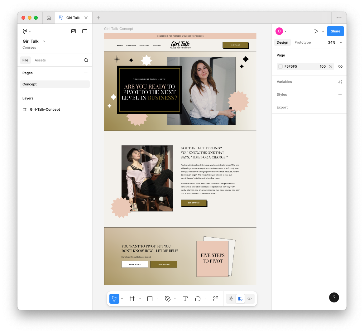
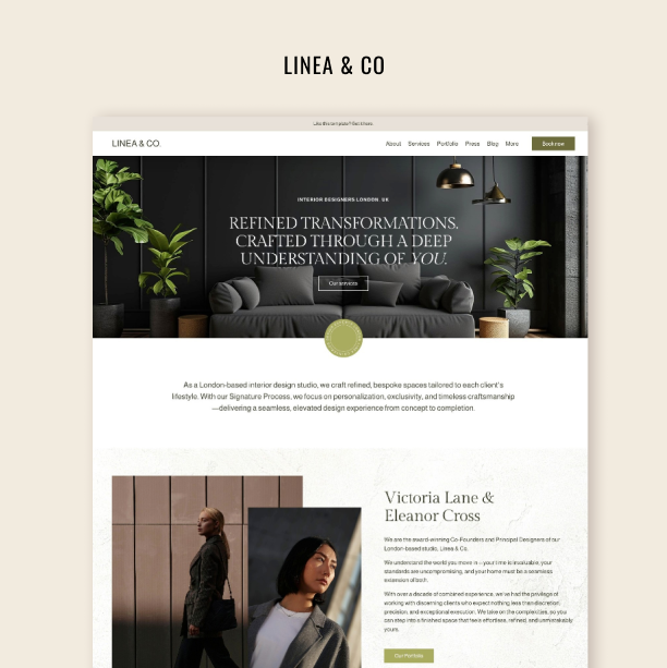
Here’s the prototype: clean divider lines, a soft gradient background, little geometric embellishments, a drop-shadow button, and a color palette pulled straight from my brand. The main heading uses Butler, the body text uses Poppins, and the header has that super editorial top-and-bottom border that I love. Some of these details translate easily. Some need CSS. And some require a creative workaround because Squarespace just works differently from Figma.
Let’s walk through the process step by step. Watch the video and read the instructions below!
Try Squarespace for free – and save 10% when you purchase a subscription with code APPLET10
Download all creative assets for this tutorial:
Step 1: Export all your assets from Figma
Start by grouping and exporting anything you’ll need:
Logo
Hero image
Decorative elements
Shape outlines
Icon clusters
Save them into a dedicated folder for the project. For real builds, name everything SEO-friendly (“girltalk-hero-katie.jpg”), but for a tutorial or demo, quick naming is fine.
While you’re in Figma, take note of:
Your exact color hex codes
Your typography (weight, line height, letter spacing)
Any spacing patterns
These details matter more than people think — they’re what make the final site “feel” like your design.
Step 2: Start fresh in Squarespace
Open a blank template (or strip down a starter theme). Before designing anything, clean up your foundation:
Settings → Domains: rename your temporary URL to something readable like
girltalk-by-applet.Site Availability: set the site to Private / Password Protected.
This matters if you plan to share previews with clients or team members.
Step 3: Build the navigation structure
In Pages, create your top navigation items: About, Coaching, Programs, Podcast. At this stage, use links instead of fully built pages — the goal is to shape the header first without committing to content.
If your design calls for a “Contact” button in the header (like mine does), skip adding it to the navigation and place it inside a button instead, styled exactly like the prototype.
Step 4: Rebuild your colors and fonts
Go into Site Styles → Colors and manually recreate your palette:
Neutral beige or off-white for main backgrounds
Soft pink or coral highlight
Dark text color
Accent blue for occasional contrast
Then move to Fonts. You can upload your exact heading font (in my case, Butler) or use a near match from Squarespace’s library. Set Poppins (or an equivalent neutral sans-serif) for paragraphs.
Adjust:
Letter spacing
Uppercase styling
Navigation font size
Announcement bar text
These tiny refinements are what make a Squarespace site feel custom instead of “templated.”
Step 5: Construct the header
Upload your logo and place it according to your design — centered, left, or right. Adjust the header height, logo size, and padding until it visually matches your Figma reference.
Then:
Add the top and bottom thin border to achieve that editorial framed look.
Enable the announcement bar and style it with uppercase Poppins, subtle spacing, and your accent color.
Add your “Contact” button and ensure it matches your menu styling (same font, same size, same weight).
Your header sets the tone for the whole site.
Step 6: Recreate the hero section
Add a blank section and begin building your hero:
Add your H1, matching size, spacing, and weight.
Add your subheading / eyebrow text.
Add your image block and upload the hero image you exported.
Create outlines or frames using the built-in Shape blocks or your exported shapes.
Apply the gradient using Squarespace’s Art background feature, which allows you to mimic Figma-style gradients without uploading giant images.
Add decorative shapes (stars, squiggles, bursts) either with your own assets or Squarespace’s built-ins.
Tip: press G to view the grid and adjust the Page Width under Spacing so you can place elements comfortably around your hero area.
Step 7: Build the remaining sections
Duplicate your first well-designed section to maintain consistent spacing and typography. Then replace:
Images
Text
Buttons
Shapes
Add dividers (1px black lines, as in your prototype) and apply them consistently throughout. Recreate your program block, your newsletter block, your podcast teaser — whatever your concept includes.
This is where the site begins to “click” into place.
Step 8: Add small CSS refinements
Squarespace can get you 90% of the way there. That last 10% is where CSS comes in. Use simple snippets to fix:
Heading text wrapping
Button drop shadows
Mobile full-width buttons
Smaller mobile menu
Tighter spacing around text and images
These are micro-adjustments — not full custom coding. If you want to be able to do these CSS adjustments yourself, check out our CSS Mastery course for Squarespace Designers.
Step 9: Optimize everything for mobile
Switch to mobile view and rethink the layout carefully. I like to:
Hide decorative shapes to keep load time fast
Reorder blocks so text appears before large images
Center-align most elements
Make all buttons full width
Adjust the mobile logo size
Change the mobile menu background color for readability
Squarespace’s newer tools make this stage much easier — you can disable elements per device without deleting them.
By the end, you’ll have a Squarespace page that’s extremely close to your original Figma concept. Not identical — because Squarespace is its own environment — but aligned in hierarchy, vibe, typography, and color.
This is exactly the process I teach inside Squarespace Mastery, the course I’ve been running since 2020 with over 700 students. If you want to learn how to design in Figma and develop confidently in Squarespace, you’ll love it.
Frequently Asked Questions
Q: Can I export my design from Figma directly into Squarespace and be done?
A: Not quite. There’s no one-click export from Figma → Squarespace that reliably preserves layout, responsive behavior, typography, etc. Instead, you manually rebuild the design in Squarespace — copying over assets (images, icons), matching typography and colors, then refining layout and responsiveness. Just follow all the steps we covered in this tutorial one by one, and you will be able to easely transfer your concept from Figma to Squarespace.
Q: Will the final Squarespace site look exactly like the Figma design?
A: You can get very close — in terms of hierarchy, vibe, colors, typography, and layout structure. But it probably won’t be pixel-identical across all devices. Differences come from how Squarespace handles responsiveness, how the browser renders layouts, and some limitations of the builder.
Q: Do I need coding skills to replicate complex designs in Squarespace?
A: For basic to moderately complex layouts, you can often manage with Squarespace’s built-in tools (Style Editor, drag-and-drop sections, blocks). But for advanced styling — custom spacing, decorative shapes, drop-shadows, mobile-specific tweaks — you’ll likely need some CSS (and occasionally small JS) to refine and polish the site. Check out our CSS Mastery course if you consider learning Squarespace CSS coding.
Q: Why do I need to use Figma? Can’t I just build everything directly in Squarespace?
A: You can build directly in Squarespace — and for very simple sites, that’s totally fine. But Figma’s role is different: it lets you explore ideas before committing to them. In Figma, you can experiment with layout, colors, spacing, typography, images, and visual hierarchy without breaking anything on your live site.
Figma helps because:
You see the whole page at once, not just one block at a time
You can iterate quickly without rebuilding sections in Squarespace
You avoid hours of trial-and-error in the editor
Stakeholders (or you!) can review visuals before development
Think of Figma as your sandbox, and Squarespace as the place where the final version lives. Using the two together gives you a cleaner build, fewer revisions, and a site that turns out much closer to your vision.
Q: What are the biggest benefits of starting with Figma when building a Squarespace site?
A: Here are the benefits:
Clear visual blueprint: Figma lets you explore layout, typography, spacing, and design vibe before committing to code.
Brand consistency: Consistent colors, fonts, and spacing across your site — easier to replicate across multiple pages.
Faster, smoother build: Having a well-prepared Figma file reduces back-and-forth and guesswork during Squarespace build, speeding up development time.