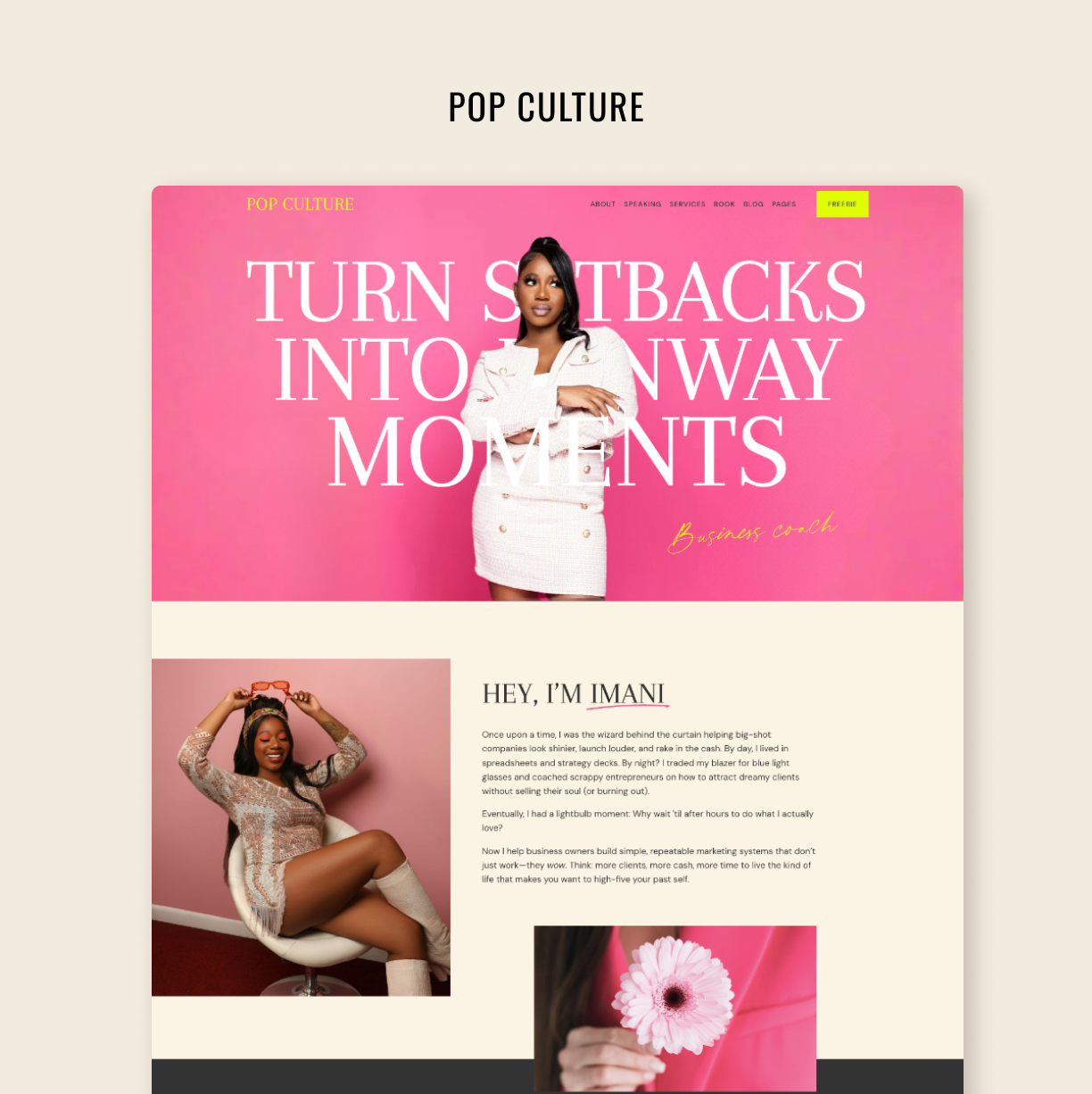
Unique Squarespace Editor Features We're Loving in 2025
Make your editing process fast and smooth with the latest features
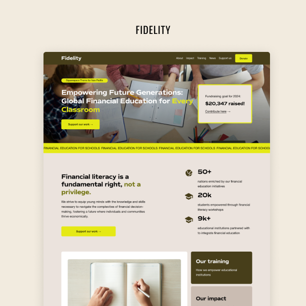
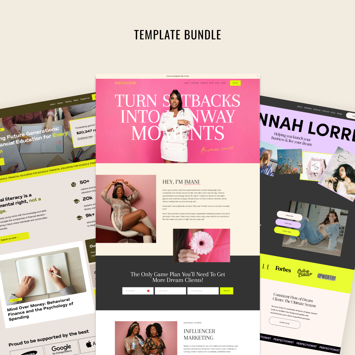
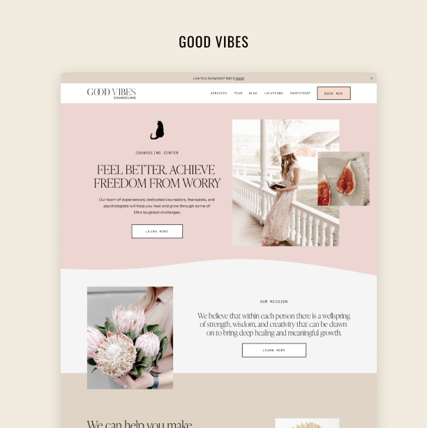
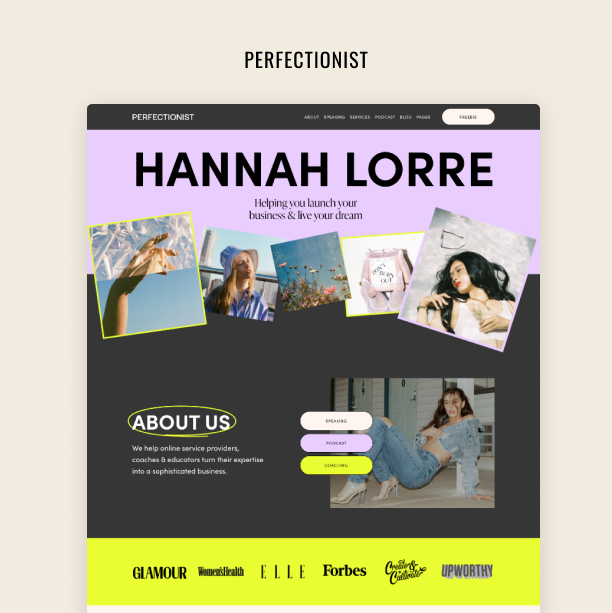
Squarespace is our favorite platform for creating website templates and sites for our clients. We've been using it for more than 5 years! The innovation journey this company has embarked on in the last couple of years is incredible, and every month, Squarespace launches cool new features to help you create dynamic, engaging, and personalized websites.
Consider the list below as our way of tracking what's new with Squarespace and highlighting super helpful features we love!
Table of Contents:
Try Squarespace for free – and save 10% when you purchase a subscription with code APPLET10
Fluid Engine - the complete drag-and-drop!
Launched back in 2022, Fluid Engine is the Squarespace’s drag-and-drop WYSIWYG editor. It’s as easy as it is powerful. Since the launch, Squarespace has been improving the blocks available and adding new features. Read our overview of Fluid Engine here. Also, if you’re new to Squarespace, read our comprehensive Squarespace tutorial here.
Switch between versatile form designs with one click
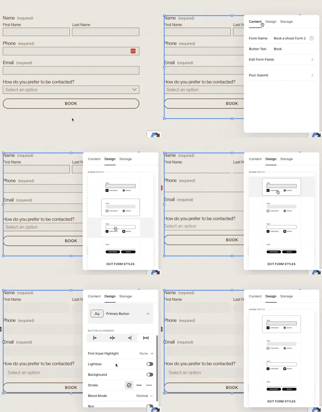
Squarespace comes with built-in form and simple CRM capabilities, plus they keep adding significant improvements to the form styling options. Switch between multiple form designs with one click and try on different “Style packs”, customizing the look and feel of your form. No need to invest in a separate form software! There are 4 form packs available – and from there, you can add any additional touches, like, shapes, borders, and typography.
Add animation to your site with a scrolling block
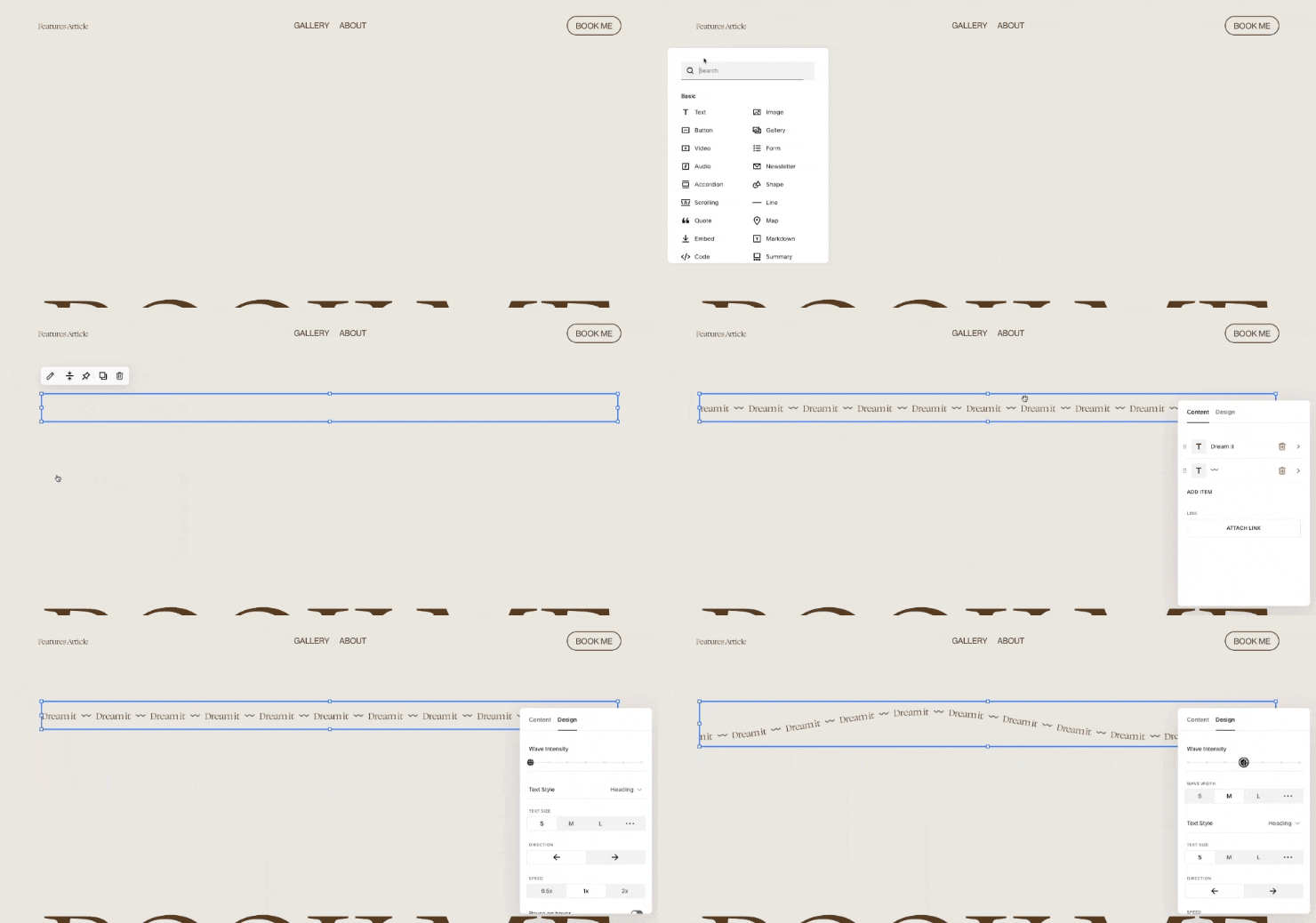
You can add a little bit of trendy flair to your website by using the Scrolling Block! This block makes your text move on a horizontal plane. The primary applications involve dynamically showcasing marketing initiatives and promotions, including free shipping, coupon codes, and flash sales. Additionally, the Scrolling Block can be used to craft engaging web design experiences. Add a scrolling block to the Block Picker and adjust things like direction, speed, wave intensity, etc.
Creative buttons to add that “wow” to your site
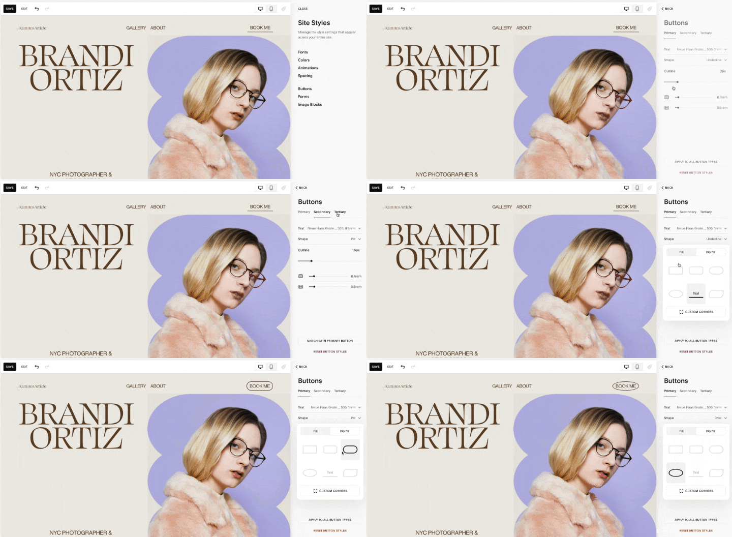
Creative buttons can spice things up dramatically on your new website! There are three button styles – Primary, Secondary & Tertiary – all of which can be used simultaneously. You can choose between Pill, Square, Oval, Rounded Rectangle, Underline, and Petal shapes. Dial in things like outline thickness, fill, and margins! And if you still feel restrained by out-of-the-box buttons, consider adding some CSS to your website using our comprehensive Squarespace CSS cheat sheet and a collection of code snippets to do that.
Embellish your text with highlights
Text highlight effects are very useful if you want to accentuate a few words in a particular phrase. It serves two purposes: it's a decoration and it draws attention to the key words that are not to be missed. But as with any decor, use it sparingly.
To highlight text, click a text block, select a few words, and click an icon that looks like an A underlined with a zigzag in the formatting toolbar. Adjust highlight type, color, thickness, or even add animation. You have twelve design options to choose from: underlined, freehand slash, double-underlined, marker highlight, wavy, circle, over and underlined, scribble, jagged, crossed, diagonally crossed, and striked through.
Make your headlines responsive
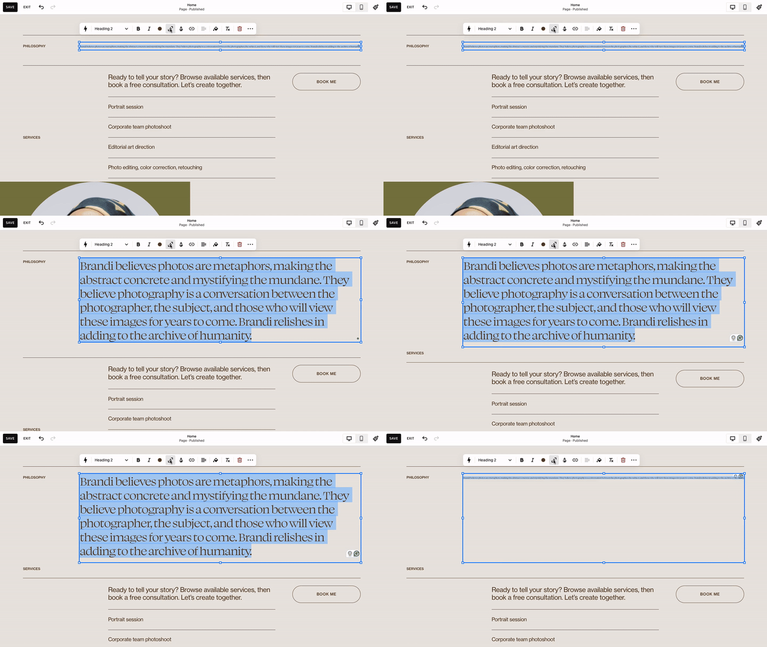
Another useful formatting option for text is scaling. If you have a text block and you want to fill it with text of the right size without line breaking no matter which browser size is used, this feature is for you. Highlight your text and click the text scale icon in the formatting tab (it looks like an A framed with corners). This won't affect text sizes set on your website in Fonts settings.
Decorate the space between sections
There is a beautiful way to customize breaks between website sections with designs to add extra style to your pages. Go to the section settings and turn on the Divider toggle in the Styles tab. Play with shapes, stroke, color, and thickness – just remember to stay consistent with the general style of your dividers across your website.
Animate background images
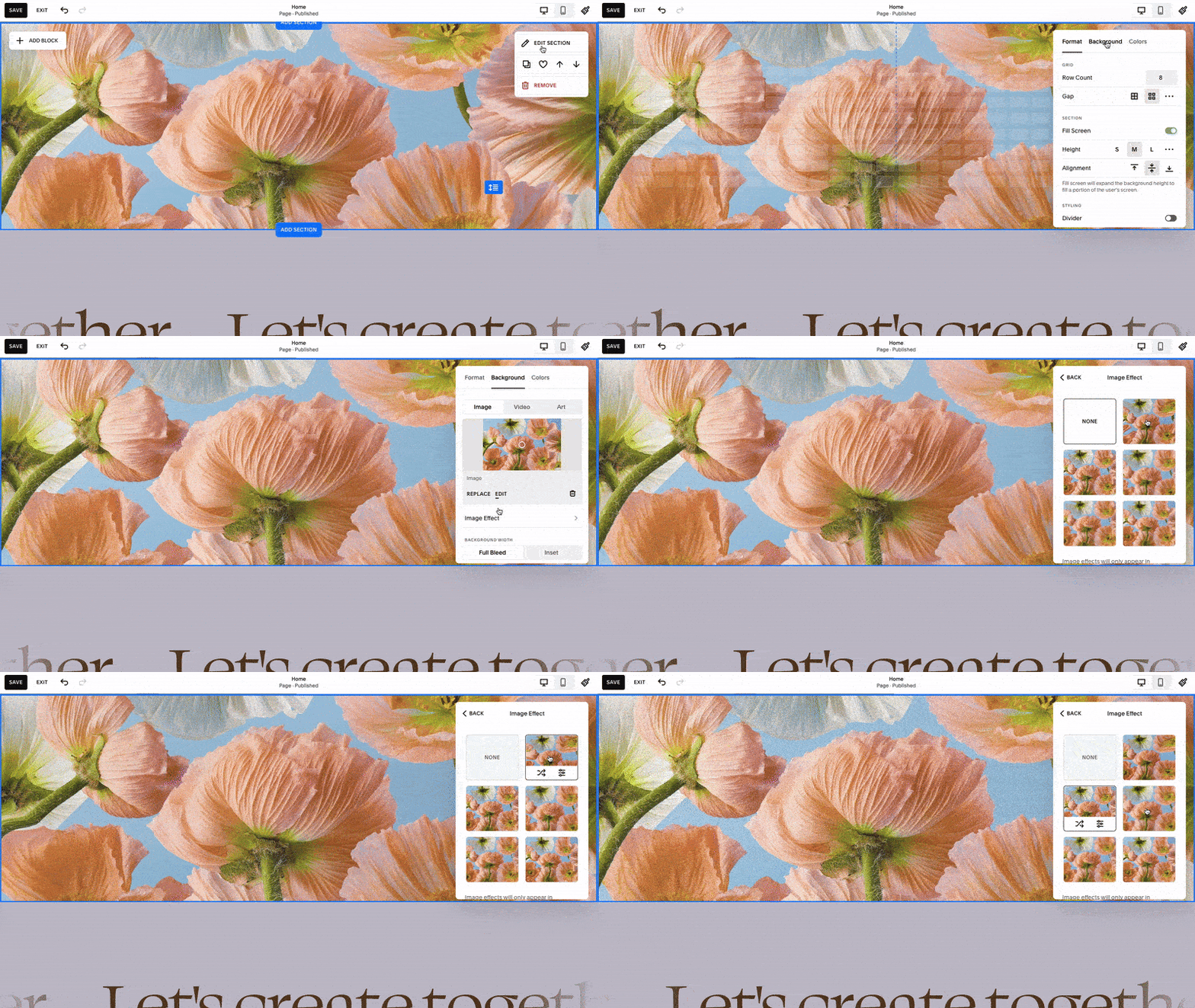
You can now spice up your website design with an animated full-bleed image with little to no efforts. First, go to the section settings and add a background image in the second tab. Click image effects to choose between five options: liquid, film grain, parallax, circles, or lines. All of these animations are very subtle, but they add liveliness to the website design.
Add stunning effects to you images
Squarespace has many innate ways to add effects to your images without you ever needing to use third-party tools. We have an extensive tutorial on how to shape your images inside your website, including giving them the trendy arch-shape look. Additionally, you can add the same animated effects as to your background images. More than that, you can soften the corners of your image by tweaking corner radius settings.
Perfectly resize several blocks at a time
Ever wanted the ability to resize multiple blocks at once in Squarespace? It’s finally here. Picture this: you're tweaking your site, and you need to shrink a text block, an image block, and a button block all in one go. Now you can just highlight them, drag, and bam! They all resize perfectly, keeping those proportions on point. No more messing around with individual blocks and risking wonky ratios. It's not just a gimmick – we promise a time will come where it will come seriously handy.
Hop into edit mode, select your section, grab those blocks, resize them however you want. Important note – when resizing text blocks you may see them looking all worky at first. Just hit save, refresh, and you will see everything scaled properly.
Straightforward header editing
Gone are the days when you tried to edit the Squarespace website header only to find confusing menus pop up with strange settings. Now the header editing design is much more clean with user-friendly pop-up option menus allowing you to select exactly what you want to show in your header, alter main menu items, add or remove buttons, and more. And you still have the familiar design editor where you can adjust the overall design and settings.
Reuse sections around the website
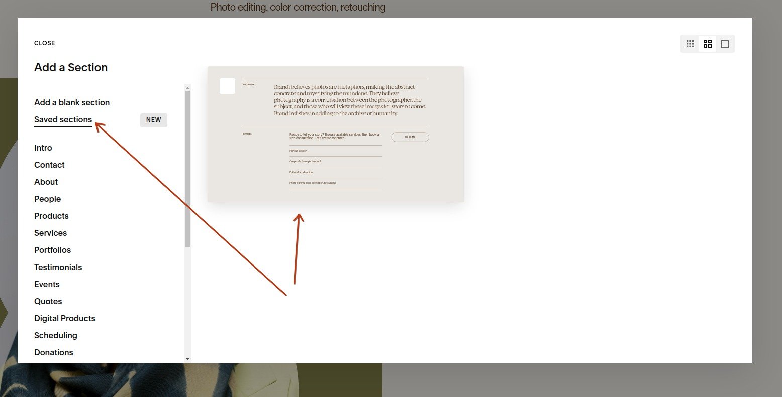
Worked on a section for hours and now want to reuse it? It’s a matter of just a click now. Get into the edit more on your website, hover over a section you like, and click the “heart” icon in the pop-up menu in the top right corner. You have just saved that section design! Now, when adding a new section, click the “Saved sections” option and select the one you just saved. Easy as that!
Note that saved sections stay the way you saved them - meaning if you save a section and then edit it, those edits won’t go into the saved version. Which means you can also use this functionality to experiment with designs and changes without any fear of breaking things - you can always simply delete what you have messed up and add the previously saved version.
Quickly generate your website copy with AI
With more and more companies joining the AI adoption race, using AI-generated text in Squarespace is now also a reality just a few clicks away. All you need to do to utilize this feature is add any text block, click the pencil icon to start editing it and then click the lightning icon situated on the far left side of the editor panel. You can now write direct prompts, asking the Squarespace AI engine to generate any text for you. You can even write blog posts with it! Although we do recommend being cautious with it and using AI-generated text as a starter rather than publishing what you get from it without any edits. Especially now that Google is paying close attention and might make unexpected decisions, like ranking pages that feature too much of purely AI-generated text lower than those with copy produced purely by humans in their search results.
