How to Add More White Space to Your Layout in Squarespace
Do you want to add more consistency to your layout in Squarespace 7.1? Great design starts with consistency in spacing - meaning, you need to add the same amount of white space at the top and bottom of your sections.
White space is empty space between design elements, text, and images. White space is a great tool to balance out design elements on the page.
Does your design feel busy? Your layout simply needs more room to breathe. In this post, we will show you how to add more space to your layout by controlling the height and width of your sections.
How to change section height and content width with Squarespace settings
To change the section height and content width you need to click on Edit in the upper left corner of the page. Put the cursor on the section you want to edit and take a look at the little pop-up menu on the left.
This is the About Page design from our Indie Studio Squarespace Template
Find the pencil icon, and click on it. Here, in the Format tab, you have 3 pre-defined sizes for section height and content width – small, medium, and large. However, if you need to fine-tune the sizes, you have this option too. Click on three dots on either of the settings and you will get the toggle to move around. You can also type in a number from 10 to 100 for section height and from 30 to 100 for section width.
If you type in specific numbers, try to remember them, to use them again in the similar sections around your website for visual consistency.
How to make the section higher in Squarespace 7.1 using spacers
Sometimes you need to make your section higher than 100% (the maximum setting in Squarespace). In this case, we can add a few spacers to the section.
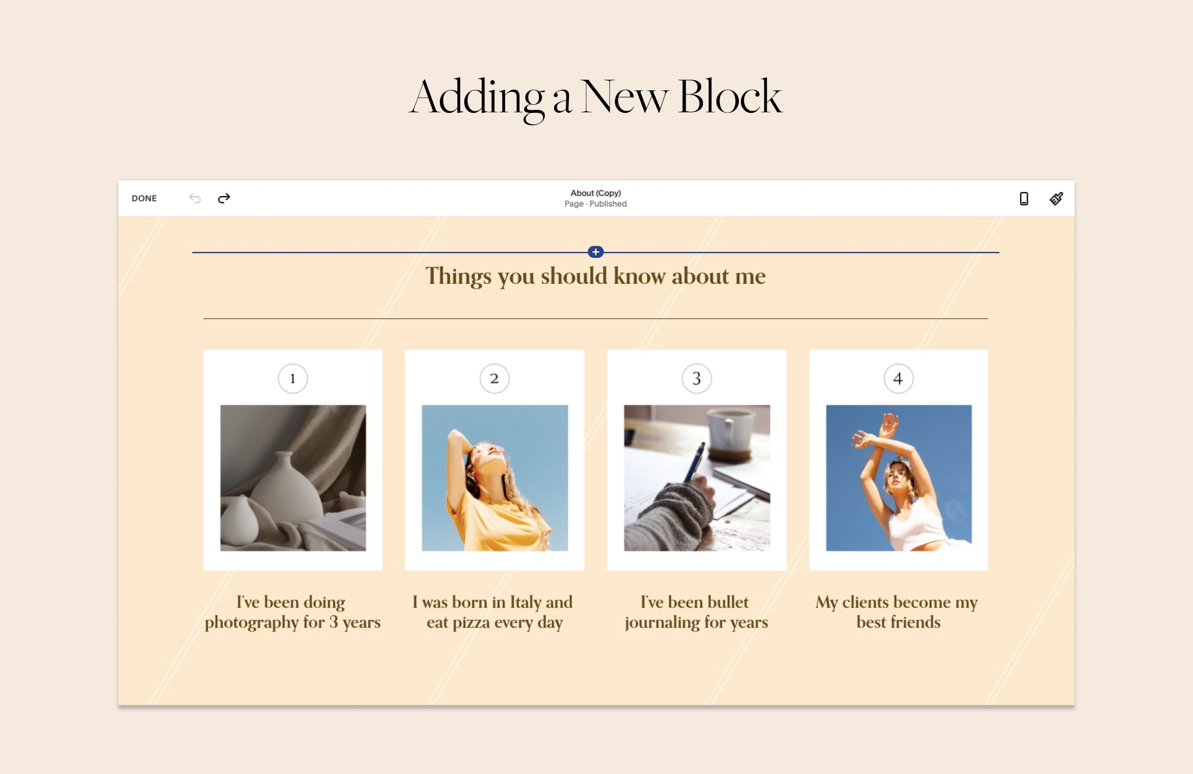
Click on Edit in the upper left corner of the page. Hover over one of the existing blocks on your page, preferably next to the block where you want to add your spacer. Click on the insert point (plus icon) that appeared and choose Spacer.
The insert icon – the blue line with a white cross on it – is over the headline.
Add more spacers if you need to make the section even higher. However, remember that spacers disappear in the mobile view.
How to make section smaller than Squarespace minimum height
To make the section even smaller we will need to use a bit of CSS code. You can use these small sections to add white space between sections.
In the left-side website, menu go to Design > Custom CSS and insert this snippet of code in the window you see.
//Reducing section height
[data-section-id="your-section-id"] {
	min-height: unset !important;
	height: 50px !important;
}
In order for the code to work, we need to tell Squarespace which section to reduce. For this, you will need to find out page section ID.
To quickly grab the section ID, install a Chrome plugin Find Squarespace IDs. Once you install it in your Chrome browser, it will appear among the extensions in the upper right corner of the browser window; the icon looks like a hashtag. When you click on it using the Squarespace website, it shows all the section and block IDs. You need to click on the white&blue line that has appeared over the section you need. Click on a section ID to get it copied.
Now find the line in the code that says [data-section-id="your-section-id"]. Paste delete it and paste your section ID instead. Click Save to apply the changes in the upper left corner.
Jump into the comment section below this blog post if you have more questions. To illustrate this post we used sections from our Indie Studio Squarespace Template, check it out here.
Creative Workshop Series for Squarespace
The workshop is jam-packed with design goodness. Inside, you’ll find the following topics:
What size should I design for? Responsive layouts and industry standards
Typography 101: How fonts can elevate your design & look professional
My approach to using colors in web design
Complete Figma tutorial
How to use layout grids to direct the attention of your website visitors
How to create a mood board and plan your website visuals
Squarespace Vanilla theme build-out: Complete walk-through, CSS snippets and Figma wireframe
Massive Squarespace design practicum: We go from a mood board to a finished design on Squarespace in a matter of an hour. Two designs included along with CSS plugins and Figma templates
Redesign 2 real websites with me in real time
How to grow as a designer and how to look for creative inspiration
Plus, there are some really helpful documents included: Complete Squarespace development checklist, copywriting and branding guides, sample client questionnaire and so much more!
Are you in? I’ll see you in Squarespace Mastery!


