Premium Squarespace Template Customization Masterclass: Boho Social Edition
Got a custom Squarespace template? Make it your own!
Today I’m breaking down how to redesign a custom Squarespace template like a pro. For this exercise, I picked one of my best-selling templates - Boho Social. I launched this product in April 2020 and it’s still one of my favorite designs I ever created with Squarespace.
Before I started my design biz and moreover a template shop, I’ve been setting up client websites from WordPress templates for years. I am saying “setting up” because I was using someone else’s design as a base before I learned how to design myself.
A premium template is a legal way to use someone’s work without being accused of plagiarism =)
My goal is to help you see how easy it is to edit a custom Squarespace template and infuse it with your own personality.
Step 1. Study the template’s color palette
Before we begin: Let’s study the template! Before you start making any changes, let’s take a closer look at the design and analyze what makes it so unique and catches our attention.
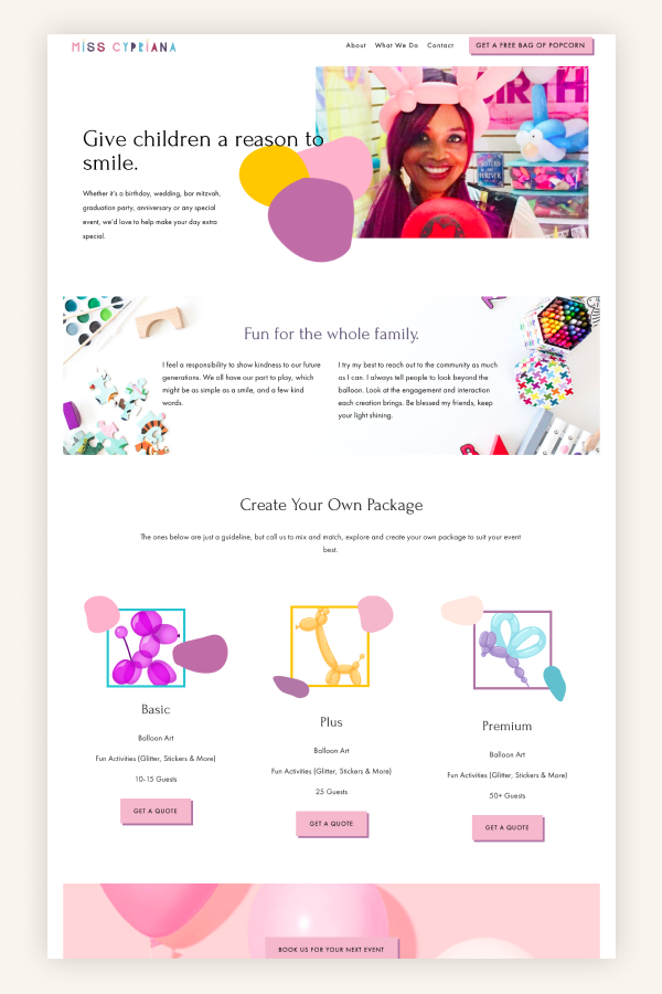
Boho Social boasts a trendy and warm color palette. This palette really makes a statement, and while you really like it, it might not work for your brand.
Another thing that really brings this design together is the images which are color-coordinated with the main palette.
This is a complex palette - there are two major highlight colors with their tints and several complimentary colors and their tints. To make it work for your design, you need to recreate this color logic. But let’s not overcomplicate it, right?
Our first step in customizing this template is curating our own collection of color-coordinated photos - just like the Boho Social collection.
I am going to work with one image that I wish to use as a key visual - it’s a photo of myself from a recent photoshoot.
Step 2. Pick colors from your chosen key picture
Next, I am going to pick colors from my chosen image and I will try to repeat the Boho Social color logic as much as I can.
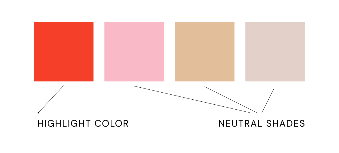
I used the color picker tool to pick the shades from my image. Red from my lips and nails and pastel shades from the chair and my sweater.
Red becomes my highlight color similar to how the mustard yellow works in Boho Social template. Pink and beige shades supplement green and muted pinks colors in the template.
Some tips for this stage of the process:
Try changing ONE color in the template palette - for example, use a different shade of yellow or blue instead of green
Pick one central highlight color that’s present in your photos and choose secondary colors
It’s really important to pick one central photo or illustration that will work as your key visual. Once you have that, the rest in customizing a premium Squarespace template will feel easy.
Step 3. Curate the rest of the images
Now I know my key colors so I can curate the rest from the images on Unsplash. Remember that the red color is a highlight so we need to have more neutral shades in the images.
I added black to the palette because it is also an important color that will be used with the typography.
While it’s tempting to pick images that have more red in them, I’m going almost totally pink. Why? Because my key visual image has more pinks. I need to create a cohesive look so I’m choosing pictures that have more pinks, beige and neutral tones. I also added one more image from my photoshoot - the one where I am holding an iPad.
Step 4. Edit your graphics
Instead of the Boho Social blobs, we are going to use a bunch of hexagons as graphic elements in collages and in the logo.
It’s really easy to create such shapes in Figma with a polygon tool. Create several polygons, put them next to each other, recolor them and keep playing until you are satisfied with the result.
Alternatively, you can search for ready-made graphic packs on Creative Market. You can load vector files into Figma and recolor and rearrange them.
I placed my own images as well as replaced the headline font with one of my favorite Creative Market fonts. The logo practically designed itself - it’s the brand name written in a distinctive type plus some polygon shapes.
Here’s my final concept:
Step 5. Load your graphics and website copy into Squarespace
When you did all the prep work and, hopefully, wrote your website copy using our Click-Worthy Website Copy guide, loading it all up into Squarespace is easy!
Each of our templates comes with video tutorials that teach you how to use Squarespace. You’ll get a Figma source file you can use to play with the design just like I did in this tutorial.
On top of that, you’ll get access to our Squarespace Mastery class that will make you a better Squarespace designer.


