How to Use Buttons in Squarespace (CSS Snippets Inside)
Everything you can do with buttons in Squarespace using the native editor and a little bit of custom code
Pro tip: Want to improve your website conversions? Use more buttons and logical calls to action.
Squarespace has a built-in collection of button designs, but sometimes they seem pretty limiting.
The platform just recently added a bunch of new button shapes to the mix – now you can add oval, underline, and petal-shaped buttons (on top of the standard square, rounded, and pill shapes).
While we love the Squarespace platform for its simplicity, a lot of button options are still clearly missing. In this post, we are showing you how to style your Squarespace buttons using a little bit of easy custom code – to make your buttons more conversion-friendly and consistent across your whole website.
Try Squarespace for free – and save 10% when you purchase a subscription with code APPLET10
Understanding how buttons work in Squarespace 7.1
There are four types of buttons in Squarespace 7.1:
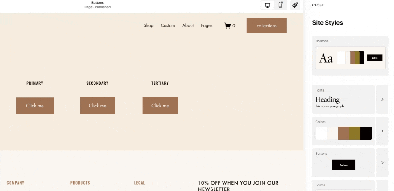
A button as a stand-alone block (it can be added to any page if you click a plus sign when editing a page). There are three types of standalone buttons: primary, secondary and tertiary, and each of them has unique settings which means you can have 3 unique button design on your website.
A button as a part of the image layout that consists of an image, text, and a button. There are 5 image layouts available (card, collage, overlap, poster, and stack). You can add these as a block to any page (by accessing the block menu). More about what you can do with image blocks here.
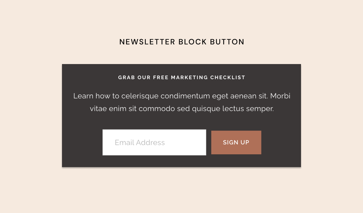
A button as a part of a form or newsletter block
A button as a part of a list section – this is a section type that has a bunch of different settings to create layouts
All of these button types inherit the master settings that we apply through the Site Styles menu.
In Squarespace, button styles are managed under Site Styles → Buttons.
Here, you can customize the appearance of your Primary, Secondary, and Tertiary buttons. Squarespace provides predefined button packs—collections of coordinated styles with different combinations of fill, shape, and corner settings.
When you click All Button Packs, you’ll see various style options that can instantly change the look of your buttons. Each button type (Primary, Secondary, and Tertiary) can have its own completely independent design—or you can keep them consistent by applying the same settings across all three.
As you adjust properties like font, shape, or outline, a conditional option appears, allowing you to apply those changes to all button types at once. This gives you the flexibility to maintain a cohesive style or create visual hierarchy by differentiating your buttons.
Changing the colors of your buttons
Squarespace 7.1 introduced a streamlined way to apply colors. Go to Site Styles → Colors. Here you can set up a color palette that will automatically apply to your entire website. Squarespace will also generate 10 section themes – 10 unique color profiles that apply to different sections of your website. When you enter the page editing mode, click the pen icon at the top right corner of each section to can change a color theme of a particular section.
To change a color of a particular button (or any other block whatsoever), go to Site Styles → Colors and click on a color theme of an appropriate section. You’ll see a list of blocks and their colors. You can change the color to anything you want – you are not limited to your initial palette and can choose any custom color.
Changing the button font
To change the font of your buttons in Squarespace, you have two options.
The first way is through Site Styles → Buttons. Under Primary Button Font, you can adjust the typography specifically for that button style.
The second way is through Site Styles → Fonts. In this menu, select Buttons, and you’ll see separate style controls for all three native button types: Primary, Secondary, and Tertiary. From here, you can adjust the font family, size, weight, letter spacing, and more.
Keep in mind that the header button (the button that appears in your main navigation area) inherits the Primary Button styles — except for the font. Its font can be customized separately inside the Site Styles panel under your Header settings.
How to align the button on a page in Fluid Engine Editor
When working in the Fluid Engine Editor in Squarespace, button alignment can sometimes get tricky—especially on smaller screens. A common issue is that adding a button directly beneath a text block can cause the layout to shift or “jump” when the page adjusts for tablet and mobile views.
Here’s a simple trick to keep your spacing consistent:
Align your text block to the bottom — the one that appears right above the button.
Align your button to the top.
Leave intentional spacing between the two elements (for example, one grid row).
By anchoring the text and button in opposite directions, you prevent the spacing from collapsing or stretching unpredictably across screen sizes. The layout will stay balanced, and your text and button will remain visually connected without breaking on mobile.
Follow the official Squarespace tutorial on buttons
Fixing common Squarespace button problems with CSS
After we are done applying the native styles to buttons, we usually find that our buttons are somewhat inconsistent. We want them to behave in a certain way – for example, to be the same size on mobile.
Let’s fix some of these issues via custom code.
Change the button color in the newsletter block
Change the HEX code in the following snippet and add it to Website → Website Tools → Custom CSS.
// Newsletter block buttons
.newsletter-block {
  .newsletter-form-button-wrapper {
    .newsletter-form-button {
      color: #FFFFFF !important;
      background-color: #FF9230  !important;
    }
  }
}
Make all buttons the same width on mobile
Add more consistency to your design – make all your buttons the same width on mobile. Let's say that using the Site Styles → Buttons menu you set the width of your Primary buttons to 2rem. If you then add a button block and set it's design to be "Fit", those 2rem is the maximum width you will get for all your primary buttons across the website, mo matter how large you make containers holding those buttons. While this can work great on desktop, on mobile you might feel limited. Quick solution is to make buttons stretch full screen width on mobile, which is exactly what we achieve with the snippet below. Notice we are only targeting Primary buttons - you will need to edit the code below to also target Secondary and Tertiary buttons.
// Make buttons 100% wide on mobile (except form and list section buttons)
.sqs-block-button {
  a.sqs-button-element--primary {
    @media only screen and (max-width: 767px) {
      width: 100%;
    }
  }
}
Want to also make all your form buttons and list section block buttons stretch full screen width on mobile? Here's the snippet for that:
// Make form and list section buttons 100% wide on mobile
.newsletter-form-button-wrapper,
.newsletter-form-button-wrapper button,
.form-button-wrapper button,
.list-item-content__button {
    @media only screen and (max-width: 767px) {
      width: 100% !important;
      text-align: center;
    }
}
Fix disproportionate button sizes in image layouts (Classic Editor Only)
Squarespace 7.1 removed the dynamic text option for buttons in image layouts (card, stack, collage, overlap, and poster). As a result, the default buttons in these blocks usually look disproportionately big. If you want to create a consistent, polished website design, all buttons should be the same size.
The following snippet does several things:
Changes the font size
Applies minimal width to all buttons in image layouts: 150px
Applies new padding to all buttons
Make all these buttons 100% wide on mobile

// Image card block buttons, only for Classical Editor blocks
.image-button,
.image-button.sqs-dynamic-text {
  font-size: 1.3em !important;

  a {
    min-width: 150px;
    text-align: center;
    padding: 1.5rem 4rem !important;

    @media screen and (max-width: 768px) {
      padding: 1.5rem 0 !important;
      min-width: 100%;
      width: 100%;
    }
  }
}
Best practices for button use for better user experience in Squarespace
Choose 2 interchangeable button styles – for example, a pill with a fill and a pill without a fill, and use them consistently throughout the site.
Pay attention to readability – choose a typeface that has enough contrast and is consistent with the rest of the website text
Don’t forget to apply the same button text styles to the header button (located in the website top menu). The header button inherits all the primary button settings except fonts. Header button text styles are located under Fonts – Additional settings.
Align your buttons with your text blocks. If you’re text is left aligned, you should do the same for the button!
Stick to either “fit” or “fill“ in button design settings – the “fill“ buttons stretch all the way to the width of the text block – to make sure all the buttons are the same size.
We hope this was helpful! Show off your websites in the comments below.
Need a few tweaks to your Squarespace website? Struggling with customizing your template? If you need help implementing this code on your site, you can sign up for a website tweaks and tutorial session here.
Interested in learning Squarespace web design? We have an awesome Squarespace masterclass!


